This week saw a vicious reversal in the energy sector and a few buy signals in other sectors. Starting with energy, this is a textbook example of an outside reversal bar. The price bar opens the week and moves higher, then reverses mid week and makes a lower low than the previous week, and closes near the lows. The RSI did not make a new bullish signal by touching 70, which is disappointing. In terms of relative strength in red, the energy sector made three month highs in relative strength, but that was about all. It was a short week with the holiday on Monday, and volume may look short, but prorating it with another 60 million shares for the extra day would have seen strong selling volume.
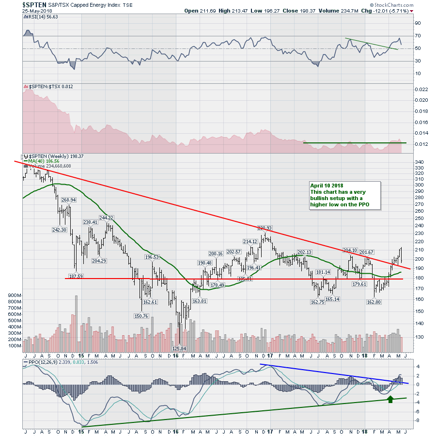
A few positive notes on the chart from a longer term perspective. The PPO broke a 16 month downtrend so that is encouraging. There is still a big uptrend in momentum with continuous improvement on the lows since 2015. We also made a higher high in momentum on this push up which is bullish. I didn't make want to add another trend line on the PPO yet, but now we will be looking to see if the rising trend of PPO lows from July 2017 and March 2018 can hold.
The price reversal bar holds a lot of weight in my experience. As I have mentioned a few times on the Commodities Countdown recordings, keep the stops nice and tight on energy to lock in profits. While the price action may just pull back and bounce off the 4 year downtrend line, it might need time to consolidate the gains.
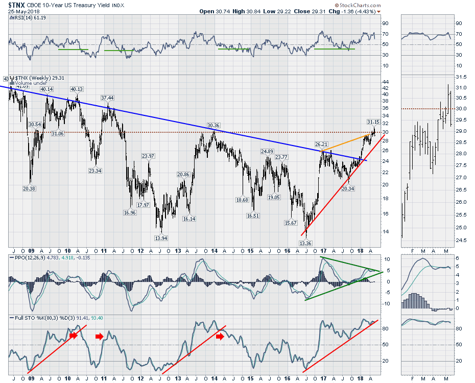
This week also saw some interesting action in US Treasuries. It's all about the rate, the rate, the rate. The magical 3% level is shown on the $TNX chart as 30 or 3.0%. We can see since the bottom in July 2016, it has been a stunning move higher with a doubling in the bond market! But oh, how quick we forget that we have seen this movie before from July 2012 to December 2013.
One of the things on this chart that may be more coincidence than reality are the three similar 18-21 month moves in the full stochastic indicator. When those trend lines were broken, it signalled a big change in direction. This week we closed on the red trend line on the full stochastic. While that would not be a buy/sell signal, we can see the full stochastic line is below the signal line based on the legend. The full stochastic has a divergence between the January 2018 high and the April 2018 high while the yield was much higher. This is the classical divergence work of George Lane. This is a significant development as George Lane loved stochastic divergences.
 Staying with the chart above on the PPO indicator, I like trend lines on the PPO for momentum. We have a couple of important trend lines in play here. First of all we have a rising momentum line that still looks valid from July 2016 through the September 2017 low. Bullish.
However, the top line shows a significant difference. From January 2017 through the March 2018 highs, we have negative divergence. But now we also have a second lower high on the PPO in May 2018 with a cross below the signal line this week. This looks like a classic exhaustion push on the chart where the Yield shot up above the 30 level to 31.15 and closed at 30.67 looking in the zoom box. This week it opened slightly higher, tried to push higher, then rolled over and wiped out 5-weeks of gains in yield.
While that might not mean much, the 3.0% level has been widely watched and the failure to close a second week above the 3.0% level sure seems to be significant. I will be watching for a continuation of the downtrend. The red uptrend line on the yield chart suggests 28 as a support level currently. Looking in the zoom box panel, that price action area looks meaningful. A break below that consolidation and I think that confirms the highs in yield are in for some time to come. Don't ignore this chart! While my analysis may or may not be right, the indicators suggest this can fall from here.
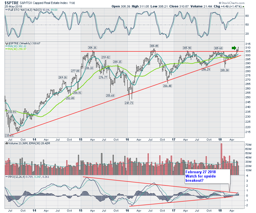
Bond yields obviously influence a lot of other areas of the market. So let's look for some corroborating evidence.
One of the responses to that yield action was an upside breakout in the Canadian real estate index. The full stochastic gave us a nice buy signal on the dip below 50, but we now have a breakout above a big base. While we don't know the future on the bonds, this chart is suggesting the interest rates are not going to be a problem so I would suggest it is confirming the highs in yields are in for now.
 Utilities are also interest sensitive. While the chart below is not breaking out to new highs, it looks like a fabulous setup with a test of a major support resistance area on the chart. If we define our risk, we would want to be out on any break of the low from two weeks ago, $222.00.
This week we made an inside week, which is the opposite of an outside week. We opened slightly lower, moved lower, then rallied and closed near the high of the bar. However, we were unable to take out the prior weeks low or high. This suggests one of two things. Consolidating in a downtrend, or the selling momentum has died.
The last price low at 222.45 was a hammer candle where we fell down, then closed the week higher than the previous close. A bullish price bar that suggested buyers stepped in at this low level.
The fact that the recent price action happened at such a major support resistance level is helpful. This also implies the selling momentum has stalled. Looking through the indicators, the RSI recently made a low below 30 which is bearish, but it is a higher low so that is better.
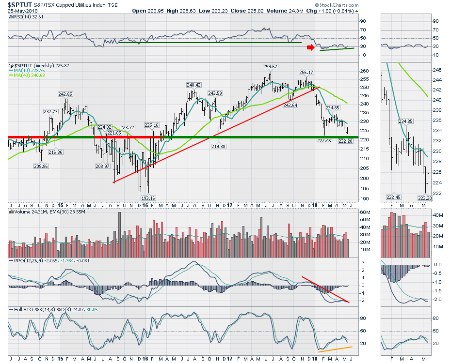 Staying with the chart above, the PPO is also making a higher low and briefly crossed the signal line as shown in the zoom box. This is an excellent place to look for a spirited move up and a break of the red downtrend line.
Lastly, the full stochastic is still pointed down. No signal has been given. If it breaks out here, this would be a higher low and a great entry on the long side.
In summary the Utilities chart still looks weak. But the tight stop and the potential for a positive buy signal to show up here on the back of the bond chart changes makes it a great target.
In the video I covered off a lot more information about the Canadian banks, Income trusts, technology, materials and industrials. The link to that video is below.
I host a new TV show on StockCharts.com called The Final Bar. It airs Thursdays at 5 PM ET and is repeated throughout the week on StockCharts TV. You can also catch it on my Vimeo channel or on the StockCharts.com YouTube Channel.
Good trading,
Greg Schnell, CMT, MFTA
Senior Technical Analyst, StockCharts.com
Book: Stock Charts for Dummies
Twitter: Follow @Schnellinvestor