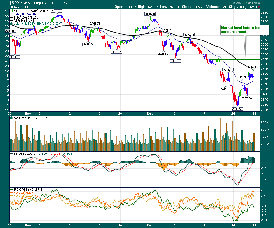
The selling finally stopped on the indexes. After the quadruple witching of last Friday, traders had to endure one more day of selling on Monday, December 24th. After that, though, the market recoiled and gained back a few days of losses. We still have not retraced the fed meeting drop yet, however.
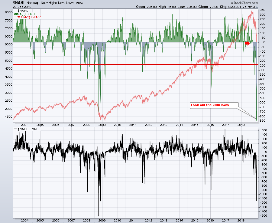
 From a breadth standpoint, the Nasdaq High-Low data has bounced up from a record low, using a moving average to take out single day swings. The accumulated weakness shown in the top panel was severe. Even these extreme lows did not mark the final lows for the overall market back in 2008. They do indicate, however, just how rare the selloff was. The individual daily lows on the High-Low chart are in the lower panel. The single day extreme low was not taken out.
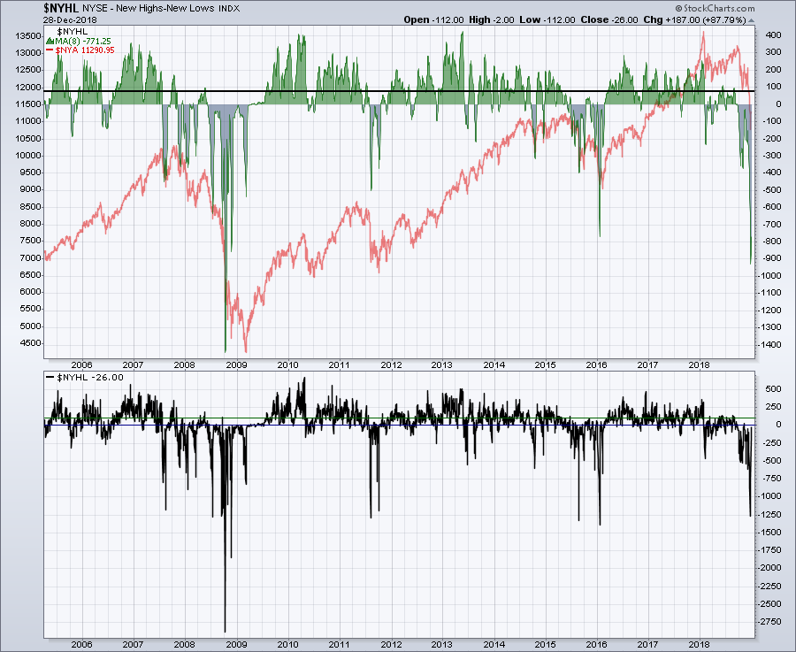
 The NYSE did not suffer as greatly as the NASDAQ. Notice the moving average was not down as hard as in 2008. Without question, though, it is still very severe. Additionally, the individual day spike low was not as bad as in 2008.
All of the fundamental analysts on TV suggest it is a great long-term buying opportunity right now. My expectation is for some consolidation to form over the next few months. By my work, so many indicators are showing scenarios seen during 2001-2002 and 2008. While the chart indicators may or may not have reached the same extreme depths of 2008, they have far exceeded what we have seen on normal pullbacks. Without hunting for trouble, my regular chart list shows lots of damage.
If you look at the McClellan Summation Indexes for the NASDAQ and New York Exchanges, the net new high indicators shown above, the advance-decline indicators, the percentage change over a quarter, the bullish percent indexes or the percentage of stocks above the 200 DMA, you can see that they all replicate chart levels or patterns seen only in major downturns, such as 2001-2002 or 2008-2009.
The price action in the USA has broken long-term trend lines, while the global indexes have weekly and monthly trend lines breaking. 52-week lows around the world are not seen to be in uptrends.
Momentum indicators are one of my key tools in understanding market moves. The momentum divergences on monthly and weekly charts are indicating a major top is in place. Momentum indicators are broken in North America and the global charts have momentum indicators (PPO) on weekly and monthly charts breaking long-term trend lines.
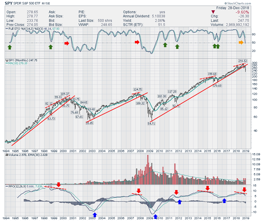
I published the chart below in the Don't Ignore This Chart blog to wrap up the week. Notice how, when the full stochastic stays above 50, the market usually continues the uptrend. With the week wrapped up and (for the most part) only one day left in the month and the year, we couldn't be at a more critical level for the full stochastic. Viewing the chart with an open mind suggests all the ingredients are in place for more downside.
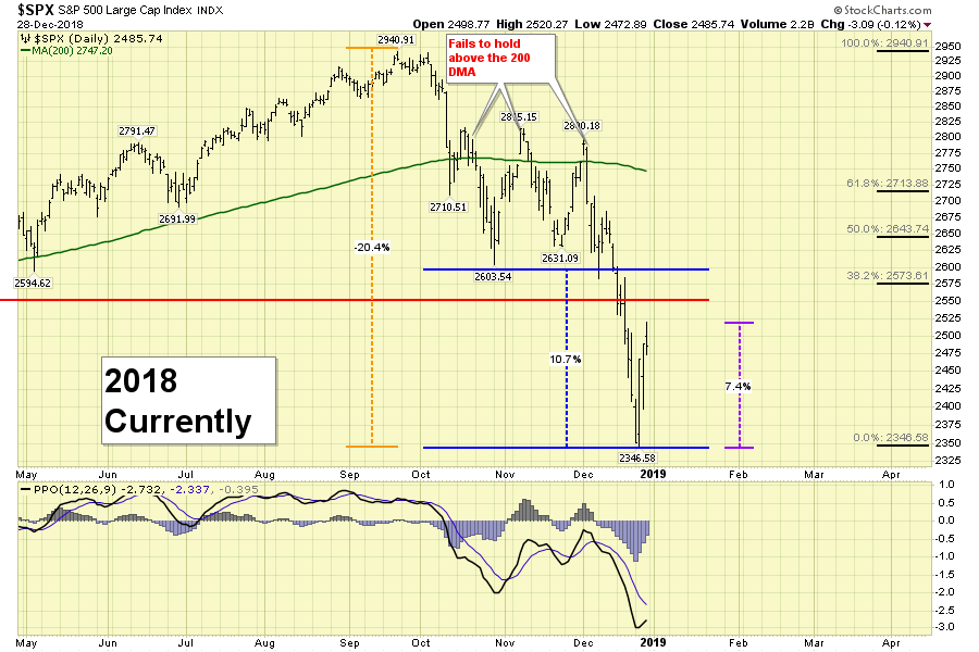
A quick look back at how the market settled in 2007-2008 gives us some guidance on what happened last time after the first big pull back. Below, we have a comparison of the 2008 market with the current market.
- -20% move off the Highs
- Failed to hold above 200 DMA
- Made new 52-week Lows
- Huge Spike low
 On the lower panel, we have already bounced up 7.4% (how crazy is that?!). In 2008, the price rebound stalled at the most recent low (mid-November 2007) before the breach of support. Putting a similar rebound on the current chart, you can see a 10% rebound to 2600. The first 7% was easy - it is the last 2-3% that will be more difficult. Notice the overlapping bars as the price reaches the top of the move in 2008. The market level before the Fed announcement was 2575. That's right in the thick of things.
We don't know how high this current bounce will go. Will it be 7.4%, 9%, 11% or more? Will it be a fib retracement level? Here is a zoomed in version of the last half of the year with Fibonacci retracement levels shown on the right. This chart reminds me once again that a 10% bounce is not half of a 20% fall. Whether the market stalls at the fib levels, at the previous low or the break of support shown by the red line, or at the 200 DMA, there are plenty of short-term hurdles to overcome.
 What is known is that, at some point, the human instinct of protecting capital we had before the move down started will be part of the traders' mindset. Traders and long-term scared investors will sell into the rally.
What else becomes obvious when we look at the chart? The momentum indicator (PPO) on a daily chart isn't going to help swing trade this at all. The moves are too extreme and the PPO uses the daily close to finalize the readings. The intraday moves have been 5%. While the big picture is ok to refer to in hindsight, it is not going to help trading through this market and keeping your capital.
If you can't stomach the wild swings in your portfolio, you'll need to wait until the $VIX settles down. Will that be in a week? A month? A year?
One of the more important charts to observe is always the $USD. It is slowly breaking this uptrend. It is not uncommon for the dollar to reverse near year-end. The last 3 years have had big dollar turns at year end. If emerging markets charts start to run, that should confirm the weakness in the $USD.
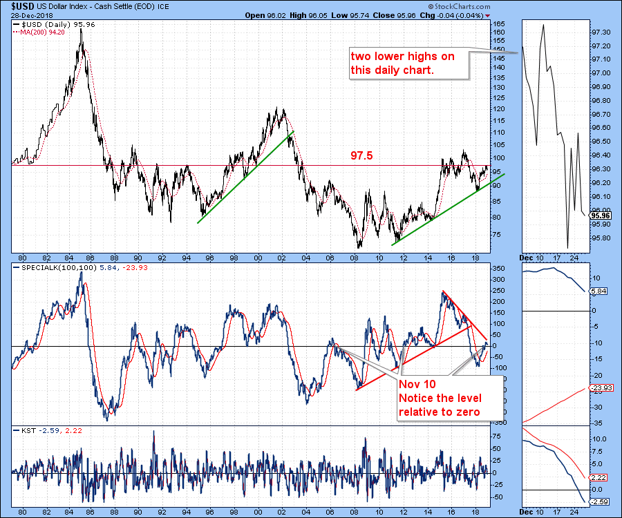
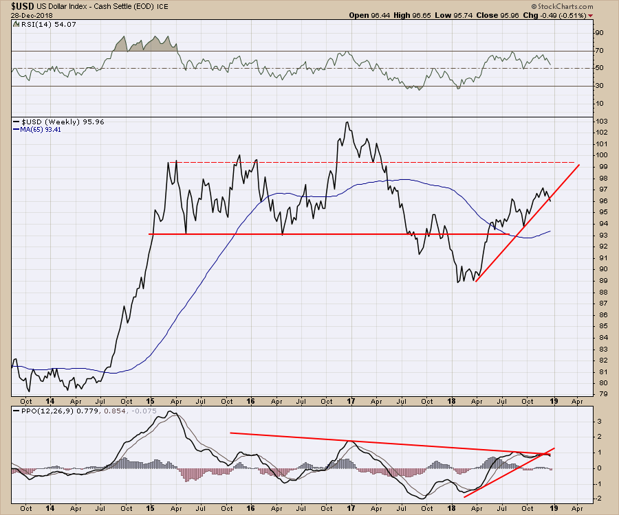 The $USD shown on this long-term chart is at a very precarious level. Notice the Special K indicator by Martin Pring rolling over right at the trend line. In the zoom panel, you can see that the KST has gone negative. The Special K is still above zero (at 5) but is pointing down. The red horizontal line at 97.5 has been a very important level for the $USD - it looks like we will close the month and the year below it.
 What makes this particular turn in the dollar so important is the potential for commodities to go on another bull market run. Check out this Australia stock market to US market ratio. It might take a year for the chart to change as it did in 2000. But it's definitely pay-attention-time!!!!!!!!
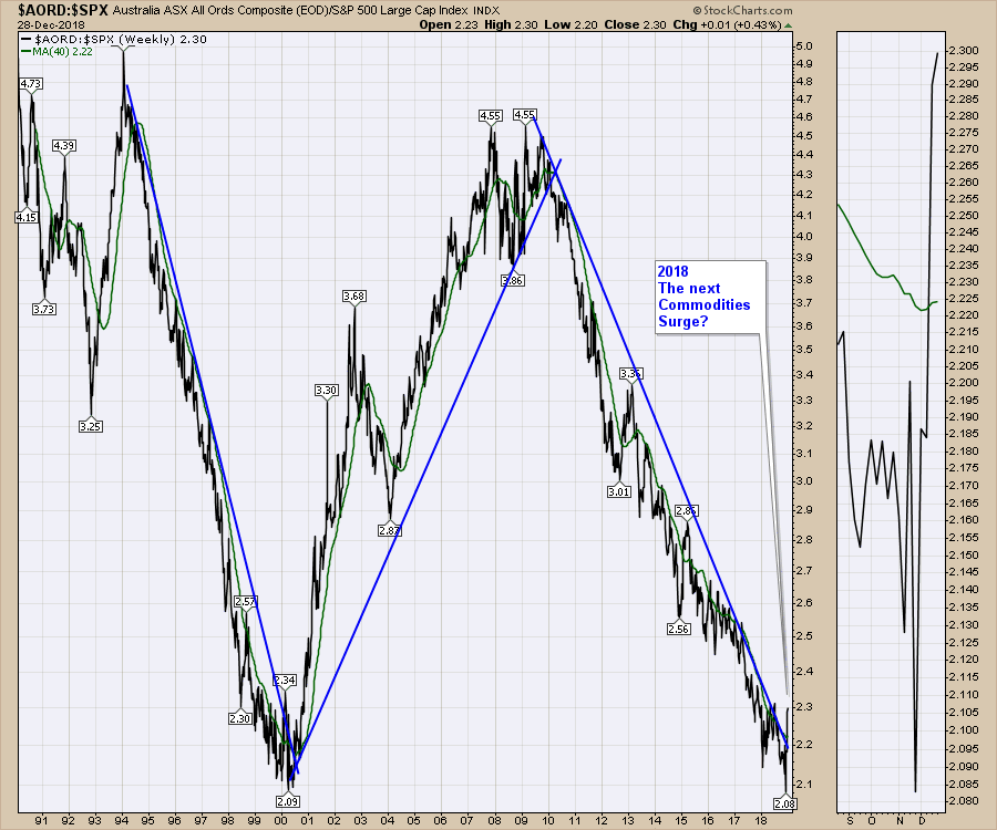
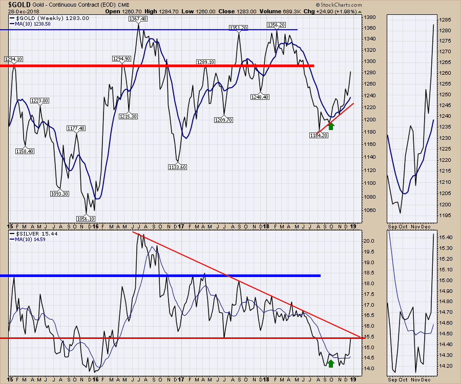
This Gold chart is suggesting that is the case. Silver finally got out of bed this week.
For a teaser about what is in this week's video, there is a lot more to the gold trade right now, which I've covered on the video. Also, you need to check out the charts of CRAK and FRAK. Compelling! What about Copper? That chart confuses the trend followers.
Lots more on this weekend's market wrap.
On The Final Bar, I mentioned a lot of negative sentiment indicators. If you are not familiar with sentiment indicators, you may find this video helpful. There are some other charts to take note of as well.
The Canadian Market Review goes through the significant breakdowns on the charts and what to look for.
If you would like to learn more about the basics of charting, check out Stock Charts for Dummies. The first section of the book walks through all the chart settings to get the charts you want, the second section explores why you might use charts for investing and the third section is about putting it all together.
Click here to buy your copy of Stock Charts For Dummies today!
If you are missing intermarket signals in the market, follow me on Twitter and check out my Vimeo Channel. Bookmark it for easy access!
Good trading,
Greg Schnell, CMT, MFTA
Senior Technical Analyst, StockCharts.com
Author, Stock Charts for Dummies
Hey, have you followed Greg on Twitter? Click the bird in the box below!
Want to read more from Greg? Be sure to follow his StockCharts blog:
The Canadian Technician