 In one of my recent articles, I high lighted that Relative Rotation Graphs can do (much) more than just show equity sector rotation by showing how RRG can be used to analyze rotation among the different commodity groups against a broad commodity index.
In this post, I want to expand that a little further and show how you can combine the relative rotation of the various segments of the (US) yield curve with the, relatively unknown, dynamic yield curve tool that we have available here on Stockcharts.com.
There is no holy grail
Those of you who read my RRG-blog on a regular basis or have seen my appearances in MWL will know that I do not believe in a one-size-fits-all technique, method, or indicator. Financial markets are simply too complex for that. And on top of that, the internal and inter-market relationships are constantly changing over time.
I much rather see this financial eco-system as one big puzzle with many participants trying to solve that puzzle. And because of the fact that different types of participants have different characteristics, there are multiple ways to solve this puzzle.
It's intriguing and addictive, and when you (think you) have solved the puzzle someone bumps the table and all the pieces fall on the ground and you have to start all over again. It never stops!!
For this reason, I do not see Relative Rotation Graphs as the sole solution or the holy grail. But I do see them as a great tool (yes, I am biased ;) to help you solve your particular puzzle and get a (completely) different angle of looking at things than you would get by using classical time-price based charting techniques.
Watching the yield curve
At the highest level, I use Relative Rotation Graphs to get a grip on Asset Allocation and to visualize asset rotation. I write about this regularly in the dedicated RRG-Blog. You can find a sample article here.
Once you are using RRGs for analyzing asset rotation you will soon find yourself looking at fixed income related instruments as well because, seriously, there are more investment opportunities than "just" the stock market. And from time to time we simply need an alternative for stocks.
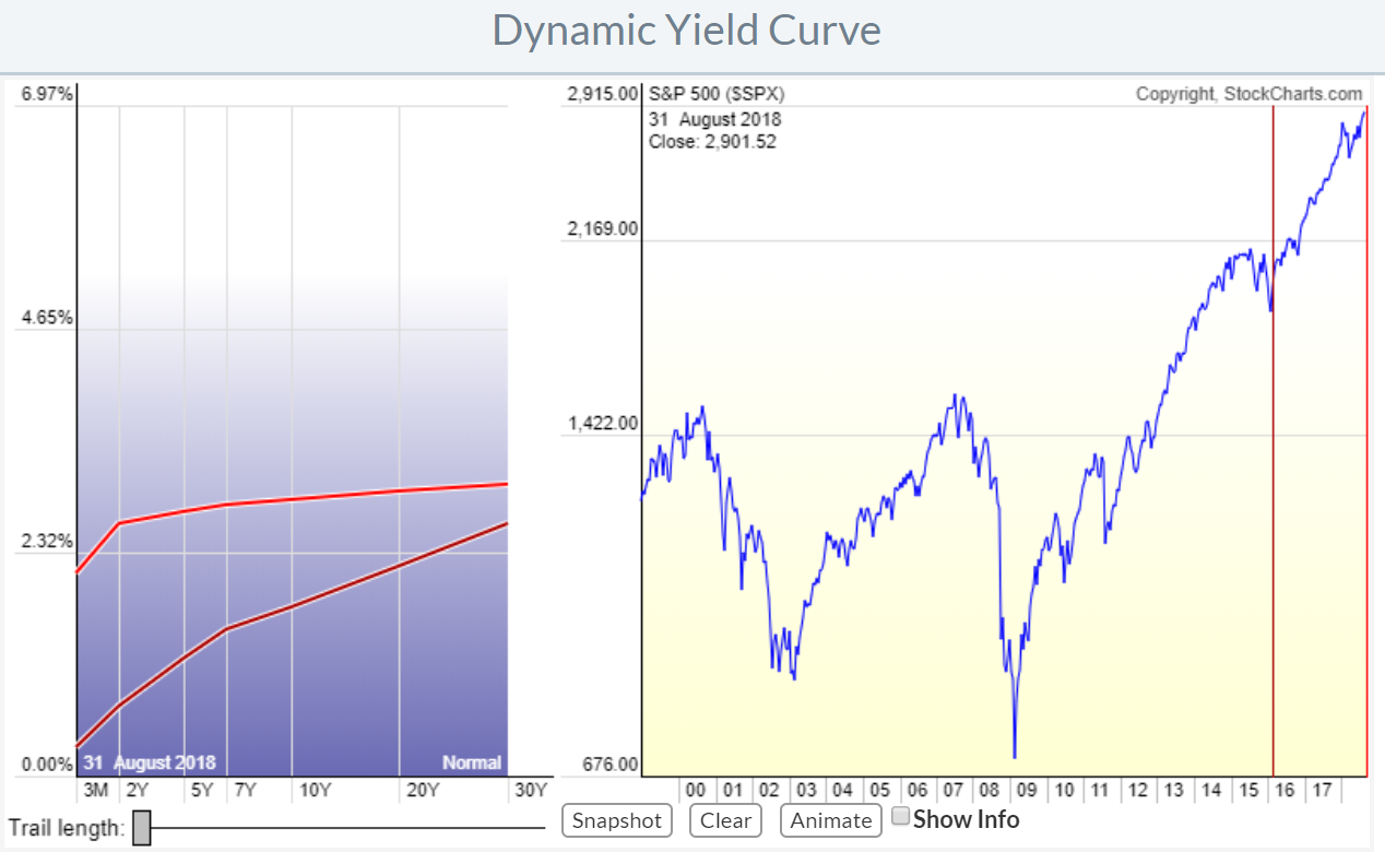
To analyze fixed income markets analysts often look at the "Yield Curve" and especially the changing of the shape of the yield curve over time. It shows the relationship between bonds that have different maturity dates.
The Dynamic Yield Curve tool that we have available here at Stockcharts.com helps to visualize that movement in a dynamic way.
In the TA world analyzing the yield curve is often done by comparing the spread or the ratio between 2-yr and 10-yr bonds but there are many more maturities between 3 months and 30 years which means that in order to get a handle on all those different relationships between the different maturities one would have to look at all the different spread charts. Just like you would need to look at all different relative strength charts between sectors for example to get a view on the complete sector universe.
This is where Relative Rotation Graphs can help.
The RRG below shows a set of ETFs that represent various segments of the yield curve. By using the 3-7 year (average 5 years) as the benchmark this RRG shows the rotation of the various maturities around that 3-7
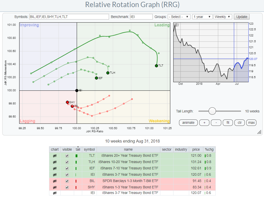 While reading this RRG you need to be aware of the fact that bonds and yield (on those bonds) move in opposite directions. The ETFs in this universe represents the underlying bonds. So when these ETFs move higher the yield for that segment drops and vice versa.
Therefore the interpretation of the RRG remains similar. The leading quadrant represents the segment(s) of the curve that outperforms or show a relative uptrend versus the benchmark. But rising prices means falling yields.
When the longer maturities move into the leading quadrant and the shorter maturities move into lagging that translates into a "flattening" yield curve. The opposite points to a "steepening" curve.
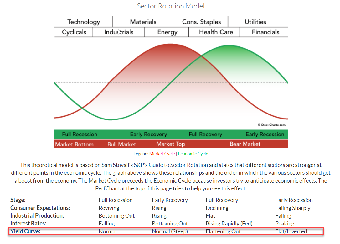
Integration with the sector rotation model
One of the ways this information can be used is to integrate it with the "sector rotation model" which looks at the business cycle in relation to the stock market and uses the movement of the yield curve as one of the items to help determine where we are in the business cycle.
 I hope this article helps you to get some insight into how you can use the various tools that are available on the website to broaden your view and help you to save your personal puzzle for the financial markets.
In my next RRG Blog I will expand a bit more on this subject using this post as a base.
Let me know what you think of this usage of RRG in the comments below. If you would like to receive a notification when a new RRG blog article is published, simply "Subscribe" with your email address.
Julius de Kempenaer | RRG Research
RRG, Relative Rotation Graphs, JdK RS-Ratio, and JdK RS-Momentum are registered TradeMarks ®; of RRG Research
Follow RRG Research on social media:
If you want to discuss RRG with me on SCAN, please use my handle Julius_RRG so that I will get a notification.