Don't Ignore This Chart! October 31, 2014 at 01:57 PM
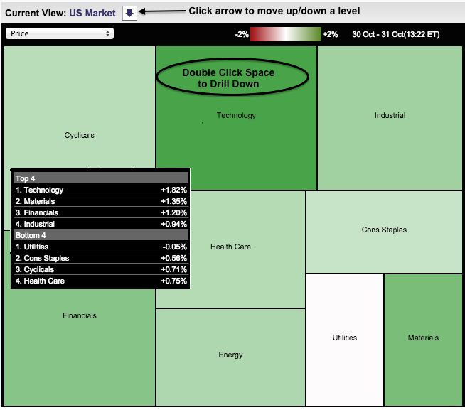
Stocks moved sharply higher on Friday with the Technology sector leading and the Utilities sector lagging. As the Market Carpet shows, the average utilities stock is down .05% and the average technology stock is up 1.82%. This shows a preference for higher risk stocks (offense)... Read More
Don't Ignore This Chart! October 30, 2014 at 06:34 PM
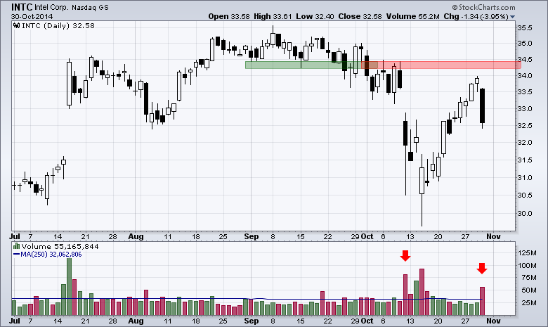
Intel (INTC) weighed on the semiconductor group Thursday with a gap down and high volume decline. The chart below shows the stock reversing near broken support, which turned into resistance... Read More
Don't Ignore This Chart! October 29, 2014 at 07:05 PM
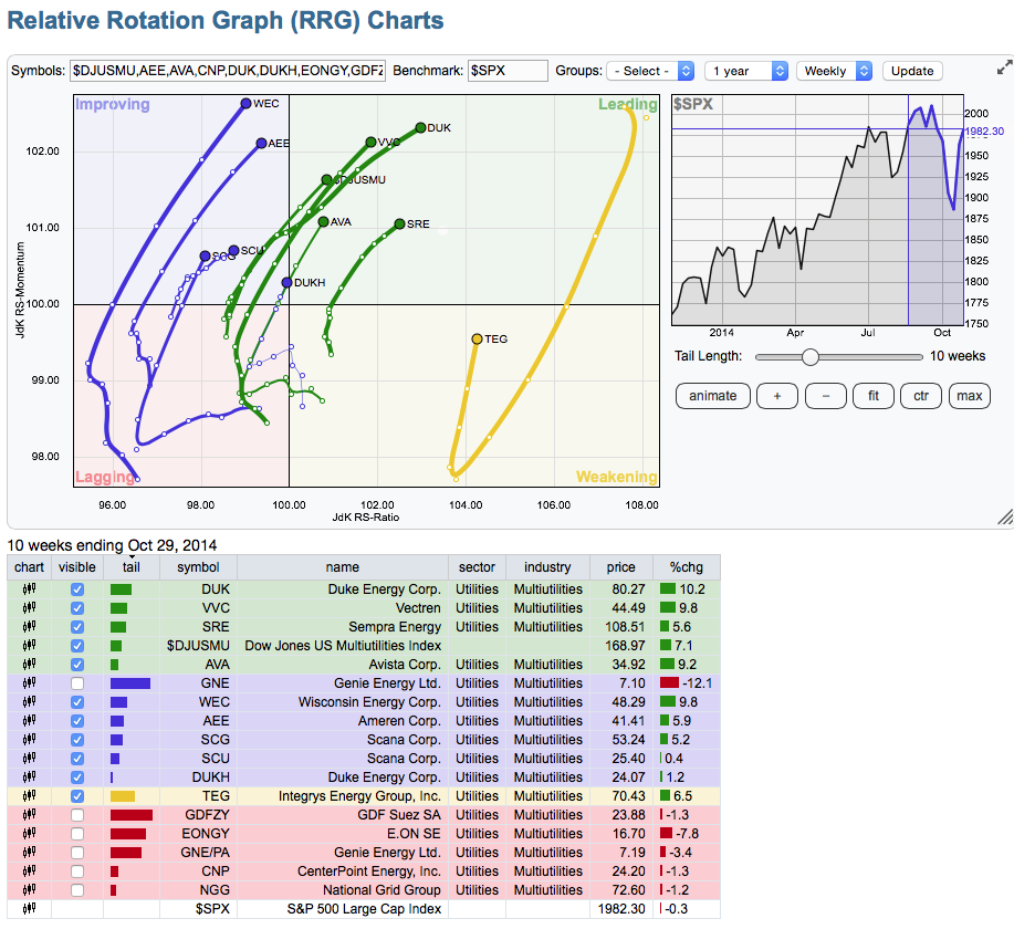
Here is a great looking industry group based on the RRG Charts. The Utility Sector has started to accelerate and this industry group looks great. I have deleted the lines on the other charts that are not that strong by removing the check marks on the list below... Read More
Don't Ignore This Chart! October 29, 2014 at 01:04 PM
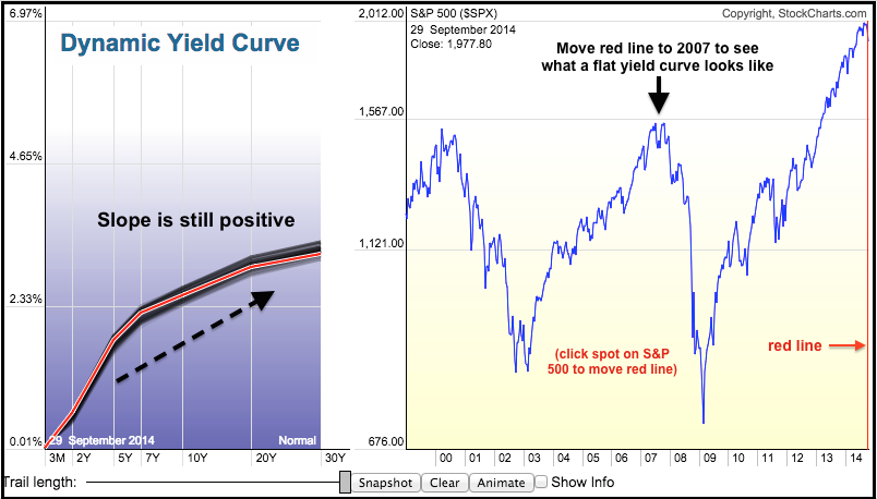
The end of QE may be on the table, but the yield curve shows that the Fed remains dovish overall. The image below comes from the Dynamic Yield Curve. Notice that short-term yields are the lowest and the yields rise as the maturities extend... Read More
Don't Ignore This Chart! October 28, 2014 at 09:05 AM
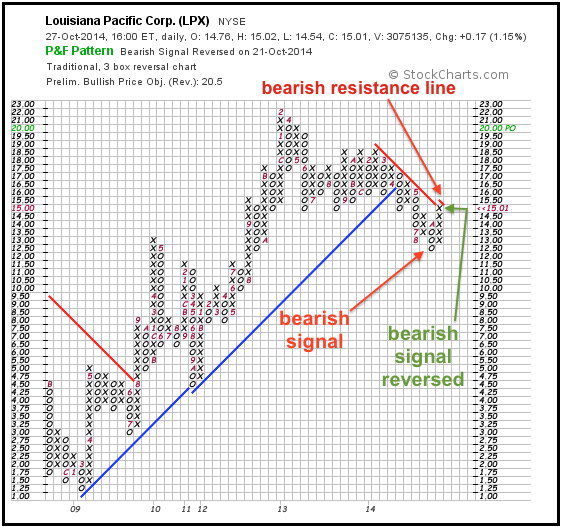
A failed signal is sometimes as good as a signal. In other words, a failed bearish signal is sometimes just as good as a bullish signal. StockCharts users can find failed P&F signals on the Predefined Scans page... Read More
Don't Ignore This Chart! October 27, 2014 at 08:38 AM
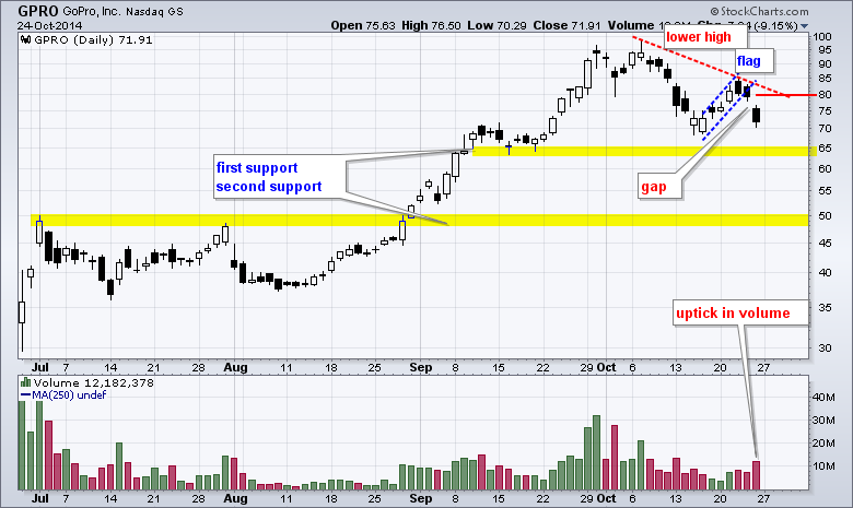
GoPro (GPRO) came under pressure last week as a lower high formed and the stock gapped down. Even though the Nasdaq 100 moved higher the last two days, GPRO moved lower and formed three black (filled) candlesticks... Read More
Don't Ignore This Chart! October 24, 2014 at 04:58 PM
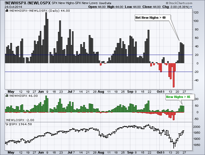
The surge in the S&P 500 over the last six days was accompanied by a surge in new highs the last few days. Notice that Net New Highs exceeded 40 the last three days and new highs exceeded 45 the last three days... Read More
Don't Ignore This Chart! October 23, 2014 at 11:36 AM
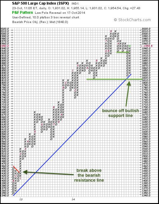
The chart below shows a long-term Point & Figure chart for the S&P 500. Each box is 10 points and a 30+ point move is needed for a reversal (3 boxes). This chart starts with the rally off the November 2012 low... Read More
Don't Ignore This Chart! October 22, 2014 at 08:55 AM
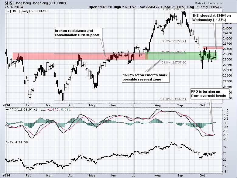
Protests and weakness in global markets weighed on the Hang Seng Composite ($HSI) in September as the index fell to its prior resistance zone. The index stabilized in October and got a nice bounce on Wednesday... Read More
Don't Ignore This Chart! October 21, 2014 at 01:34 PM
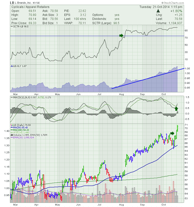
L Brands (LB) has been trying to break through previous highs over the last month. After chopping around it finally broke out conclusively yesterday and continued the acceleration today... Read More
Don't Ignore This Chart! October 21, 2014 at 06:37 AM
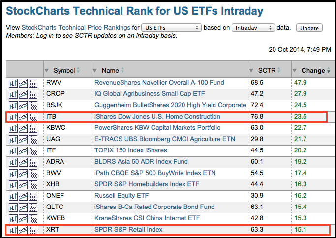
The table below shows the StockCharts Technical Rank (SCTR) for our ETF universe. This table is sorted by "change" with the biggest gainers at the top. In particular, the SCTR for the Home Construction iShares (ITB) surged 23... Read More
Don't Ignore This Chart! October 20, 2014 at 12:44 PM
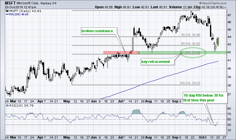
The chart below shows Microsoft (MSFT) falling to broken resistance, firming for two days and bouncing over the last two days. Also notice that this bounce occurred at the 62% retracement... Read More
Don't Ignore This Chart! October 17, 2014 at 10:46 AM
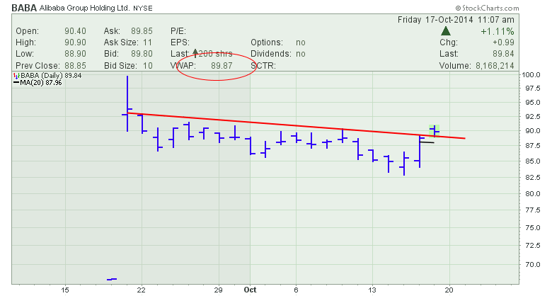
Alibaba (BABA) has been sliding sideways since the IPO. The $SPX made its high on Alibaba (BABA) initial public offering day which was September 19, 2014. Most stocks have been pulling back since the quadruple witching day of September 19, 2014... Read More
Don't Ignore This Chart! October 16, 2014 at 08:48 AM
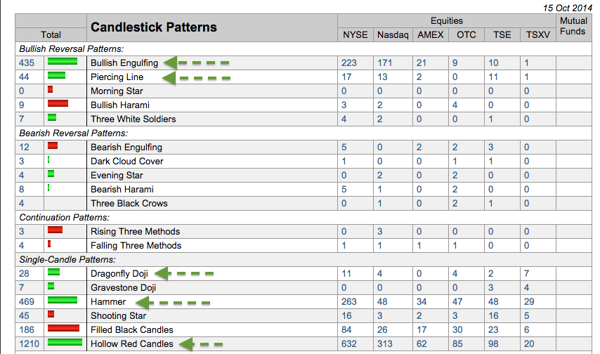
With weakness in early trading and a strong close, a number of bullish candlestick patterns formed on Wednesday. These include hammers and dragonfly doji. There were also hundreds of hollow red candlesticks... Read More
Don't Ignore This Chart! October 15, 2014 at 10:26 AM
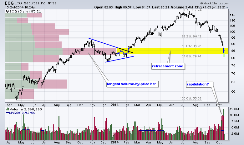
Most energy stocks have been in a free fall this month and EOG resources is no exception. The stock plunged over 25% from its summer highs and retraced 50-62% of the prior advance (Apr-2013 to July-2014)... Read More
Don't Ignore This Chart! October 14, 2014 at 06:54 PM
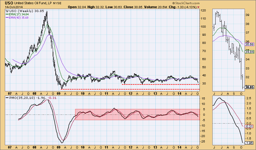
United States Oil Fund (USO) is one of the "big four" that I analyze on a daily basis in the DecisionPoint Daily Update which you can find in the "DP Reports" blog. The other three of the "big four" are UUP (Dollar), Gold and TLT (20-yr Bonds)... Read More
Don't Ignore This Chart! October 14, 2014 at 06:38 AM
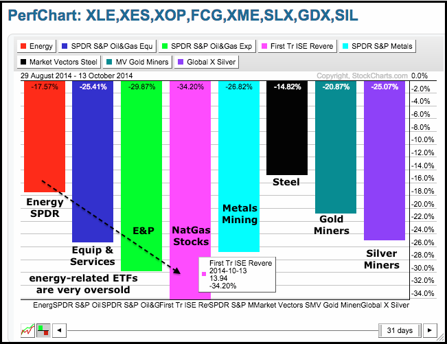
By most metrics, the energy related ETFs have hit oversold extremes with big declines over the last 31 days. The Oil & Gas Equip & Services SPDR (XES) is down around 25%, the Oil & Gas E&P SPDR (XOP) is down almost 30% and the FirstTrust Natural Gas ETF (FCG) is down around 34%... Read More
Don't Ignore This Chart! October 13, 2014 at 07:33 AM
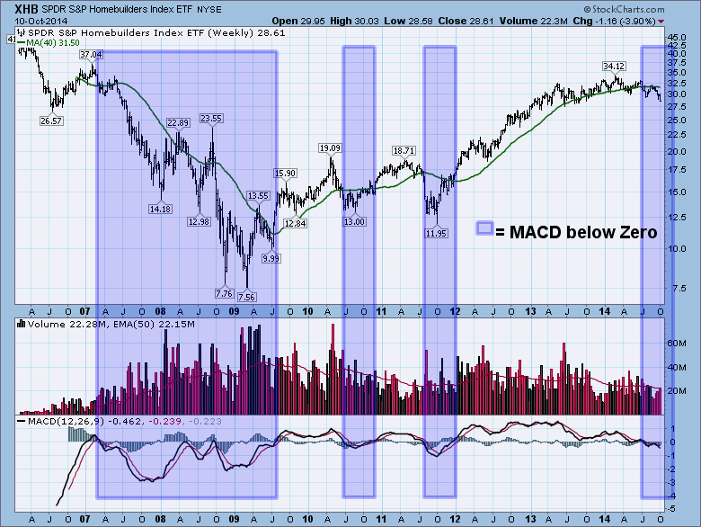
The Homebuilders ETF (XHB) is usually considered a broad indicator of the housing market. The housing market is usually associated with being an indicator of overall economic strength in the USA. We can see all of the major pullbacks in the $SPX have also shown up on the XHB... Read More
Don't Ignore This Chart! October 09, 2014 at 10:40 AM
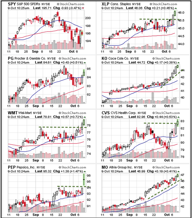
The Consumer Staples SPDR (XLP) shows more "chart" strength than the S&P 500 SPDR (SPY) because it broke out to new highs this week. SPY, on the other hand, remains well below its September high. The CandleGlance chart below shows six leading consumer staples stocks... Read More
Don't Ignore This Chart! October 09, 2014 at 09:37 AM
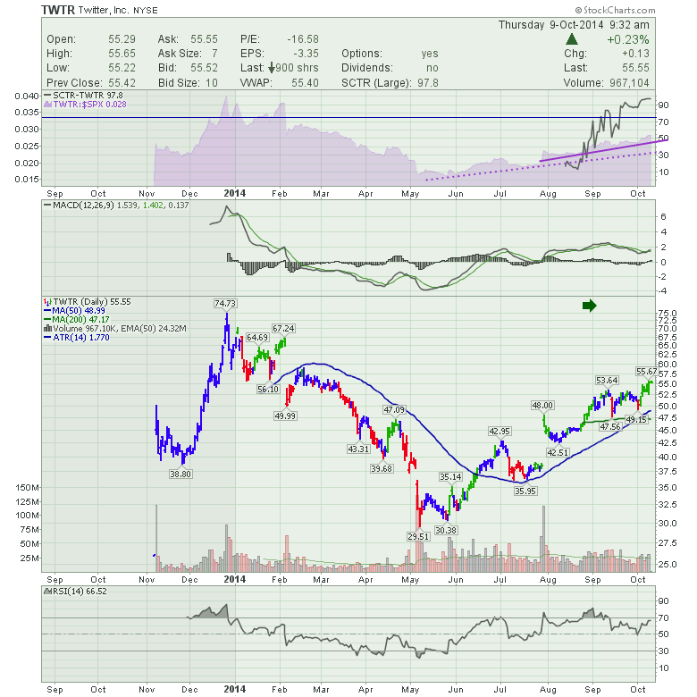
Twitter (TWTR) has been an interesting IPO. It showed great promise coming to the market and the stock behaved much better technically in the first few months than Facebook. After that, the two appeared to be the same pain for buyers. Twitter lost 60% from its highs... Read More
Don't Ignore This Chart! October 08, 2014 at 01:11 PM
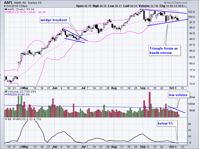
After a big advance from April to August, Apple (AAPL) turned dull as a tight consolidation takes shape. Notice that the Bollinger Bands are narrowing and a triangle is taking shape. The indicator window shows BandWidth below 5% for the first time since early July... Read More
Don't Ignore This Chart! October 07, 2014 at 03:59 PM
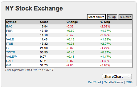
With all the red on the board today, I couldn't help but notice the strength of the Brazil based stocks as a follow on from their election. The only stock in the most active list that was not based in Brazil was Twitter.... Read More
Don't Ignore This Chart! October 06, 2014 at 03:15 PM
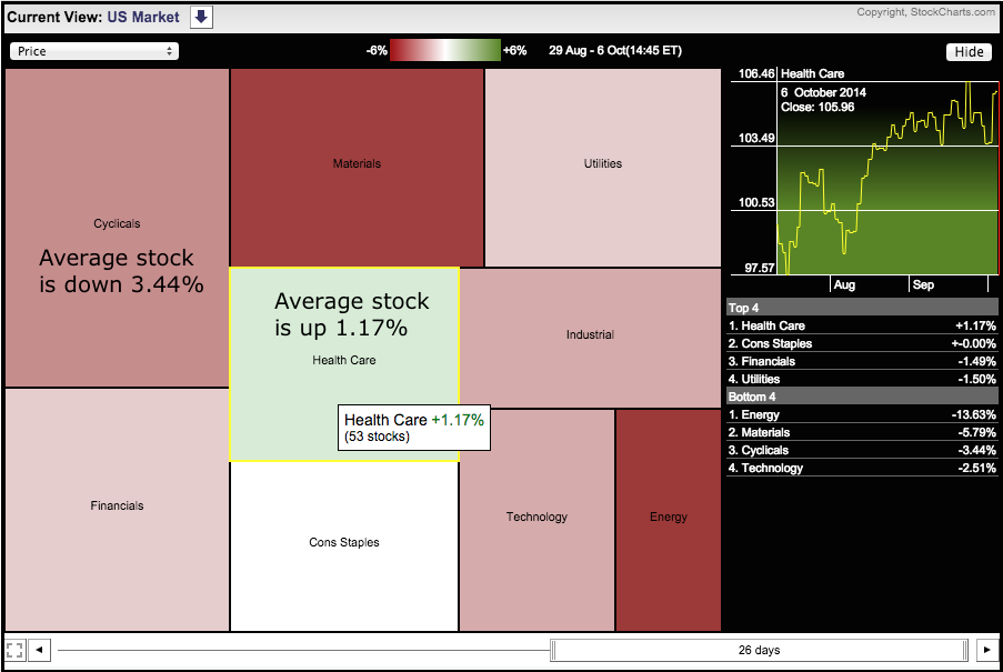
It has been a rough ride for stocks since September began. The market carpet below shows performance for the sectors as a whole. The average healthcare stock is up 1.17% since 29-Aug and the average consumer staples stock is flat... Read More
Don't Ignore This Chart! October 02, 2014 at 12:06 PM
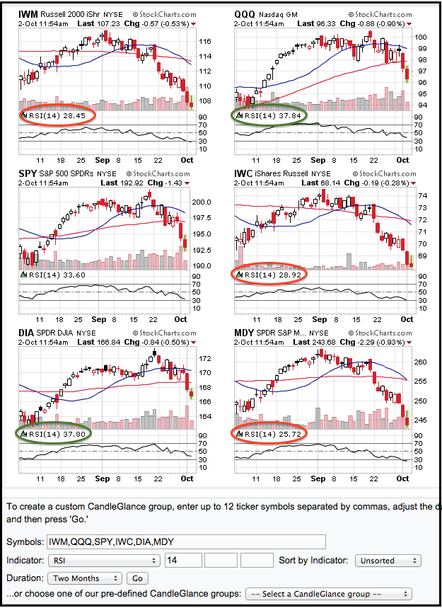
The CandleGlance chart below shows six broad-market ETFs with 14-day RSI. Notice that RSI is below 30 for the Russell 2000 iShares, the Russell MicroCap iShares and the S&P MidCap SPDR. With an RSI below 26, the S&P MidCap SPDR is the most oversold of the six... Read More
Don't Ignore This Chart! October 01, 2014 at 08:36 PM
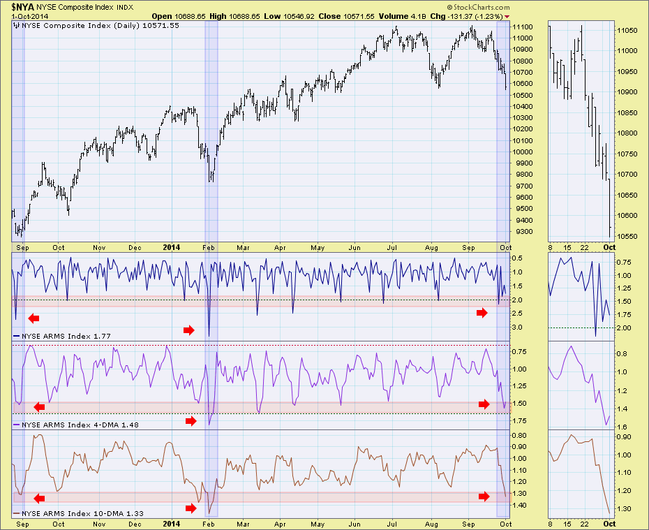
The TRIN or Short-Term TRading INdex, better known as the Arms Index, is a breadth indicator that was developed by Richard Arms in 1967. The index is calculated by dividing the Advance-Decline Ratio by the Advance-Decline Volume Ratio... Read More
Don't Ignore This Chart! October 01, 2014 at 11:05 AM
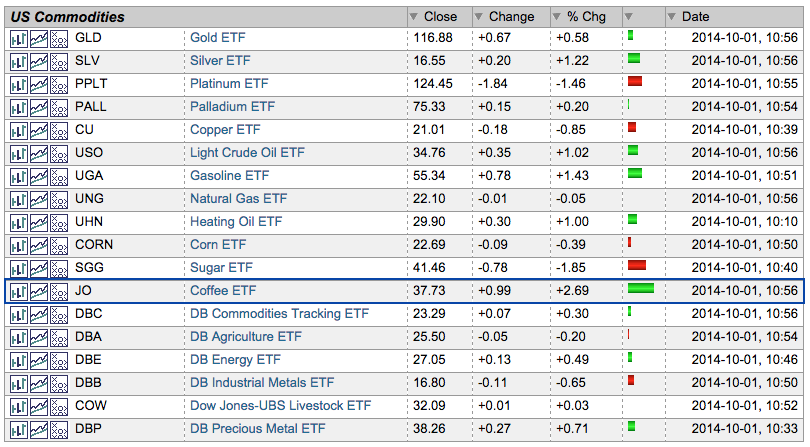
Commodities have been slammed over the last few weeks, but the Coffee ETF (JO) is holding up quite well. JO is up over 20% from its July low and showing relative strength again today... Read More