Don't Ignore This Chart! December 31, 2016 at 01:01 PM
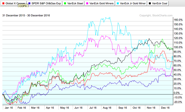
When we look back on 2016, we can add a few tips to our trading journals. Lots of key moments created great buying opportunities. After years of commodities being routed, it was a year for commodities to create fantastic returns... Read More
Don't Ignore This Chart! December 30, 2016 at 07:26 PM
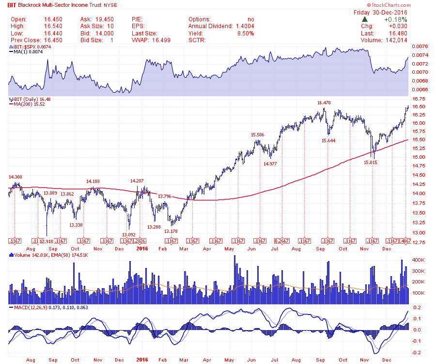
It was only a few weeks ago when the fundamental commentary was about the money that would be lost by owning defensive sector stocks. This BlackRock Multi-Sector Income Trust (BIT) generates 8... Read More
Don't Ignore This Chart! December 29, 2016 at 11:32 AM
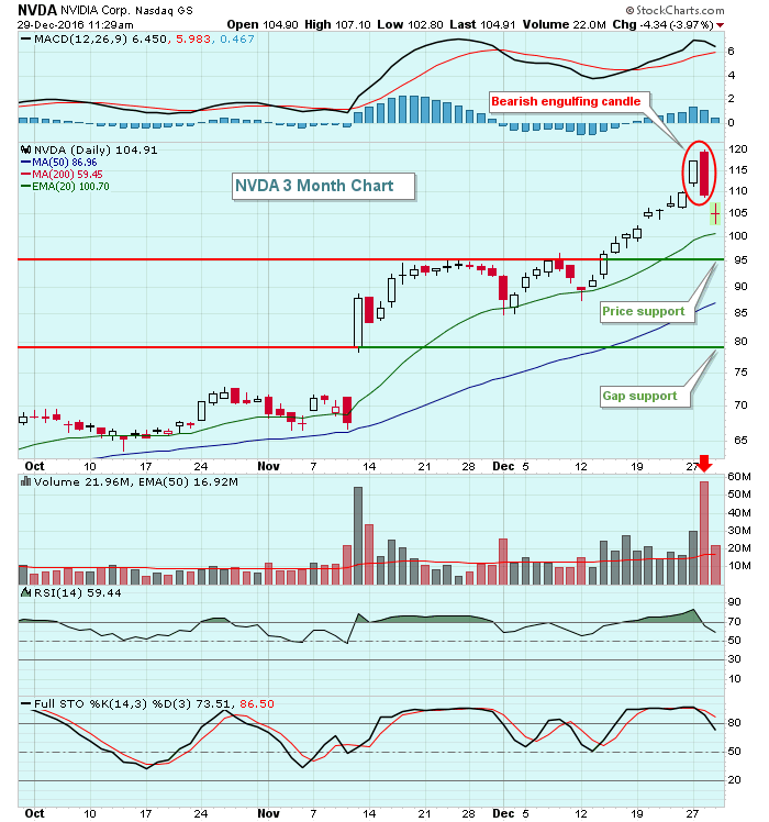
NVIDIA Corp (NVDA) has been one of the best performers of 2016, nearly quadrupling during the year. Its long-term chart has been phenomenal, but its weekly RSI and stochastic have been overbought since early May... Read More
Don't Ignore This Chart! December 28, 2016 at 04:37 AM
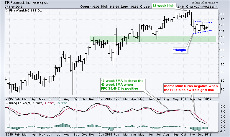
The Nasdaq 100 ETF and S&P 500 SPDR hit new highs in mid December, but Facebook (FB) did not partake in these new highs and remains stuck in a consolidation... Read More
Don't Ignore This Chart! December 27, 2016 at 08:32 PM
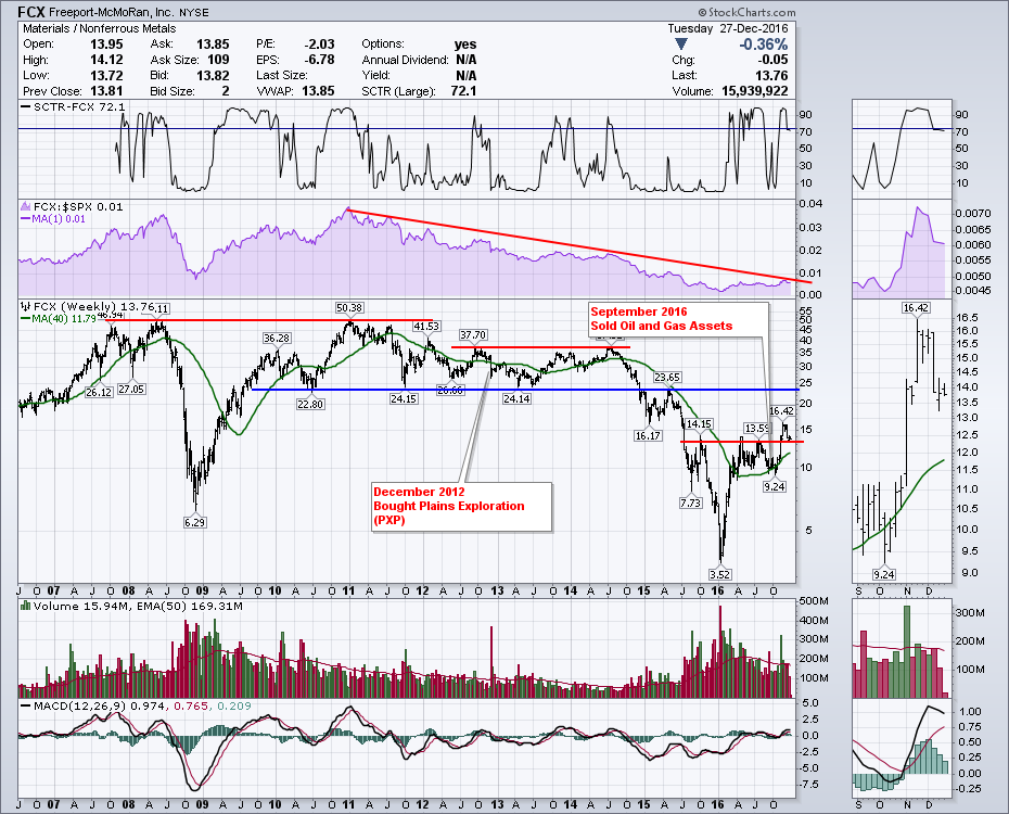
Freeport McMoran (FCX) is a worthy of a novel related to Technical Analysis of price action alone. Critical parts of the chart outline some interesting times for FCX. First, classic resistance at old highs is a theme... Read More
Don't Ignore This Chart! December 24, 2016 at 09:05 AM
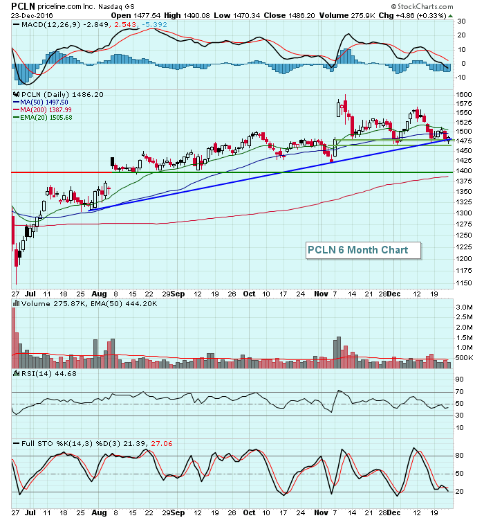
I ran a scan of NASDAQ 100 stocks with RSIs between 40-45 and it returned eight stocks - ATVI, BIDU, FB, JD, PCLN, QVCA, VIAB, VOD. I ran this scan because RSI 40-45 many times offers up great support to an uptrending stock... Read More
Don't Ignore This Chart! December 23, 2016 at 07:10 PM
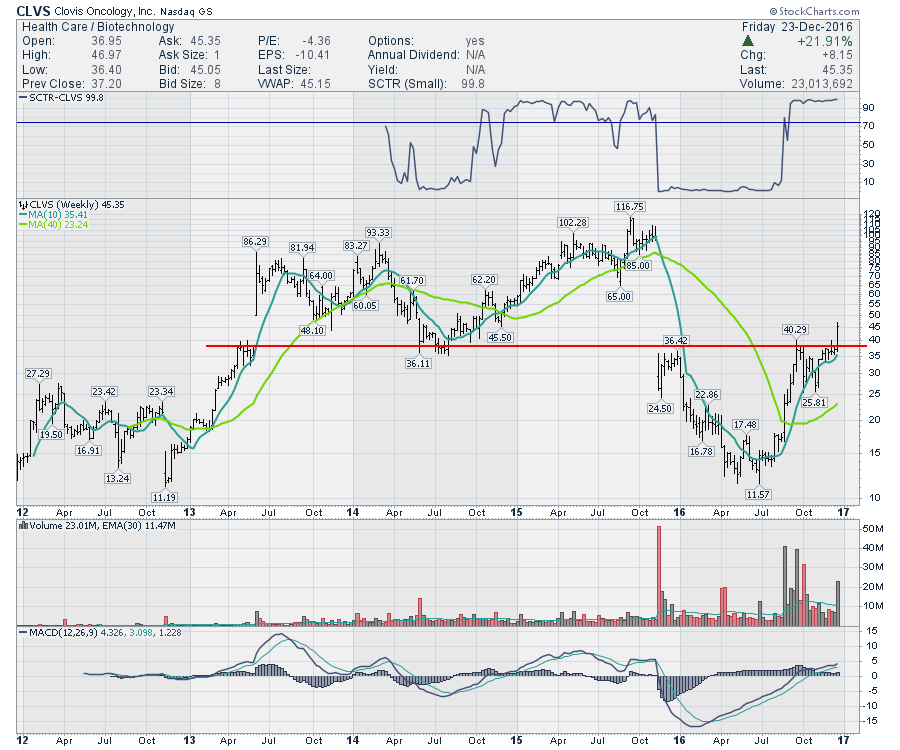
Clovis Oncology (CLVS) had a big week as a Christmas present for investors. But the chart tells us another story. Back in 2013, the stock gapped above $40 and went on a run to $86. After a tumultous pullback to $35, the stock went on another run to $116... Read More
Don't Ignore This Chart! December 22, 2016 at 07:13 PM
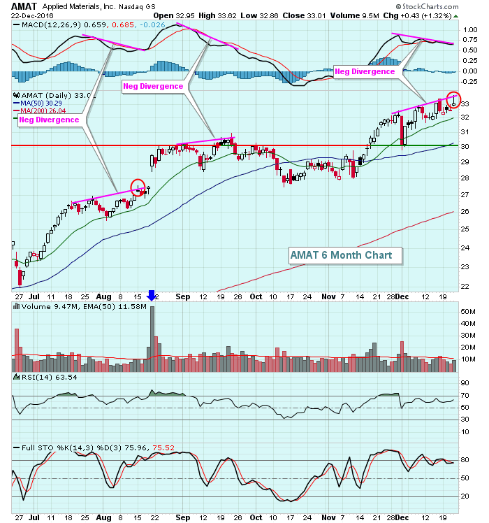
Applied Materials (AMAT) printed a shooting star candlestick on Thursday, with a long-term negative divergence in play on both its daily and weekly charts, signs of slowing momentum to the upside from both an intermediate- and long-term perspective... Read More
Don't Ignore This Chart! December 21, 2016 at 09:01 AM
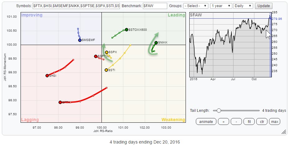
The Relative Rotation Graph above holds a number of (world) equity indices compared to the FTSE all world index as the benchmark, using daily data. For those of you who are following my regular RRG blog, this means a shorter-term view than you are used to from me... Read More
Don't Ignore This Chart! December 20, 2016 at 05:35 PM
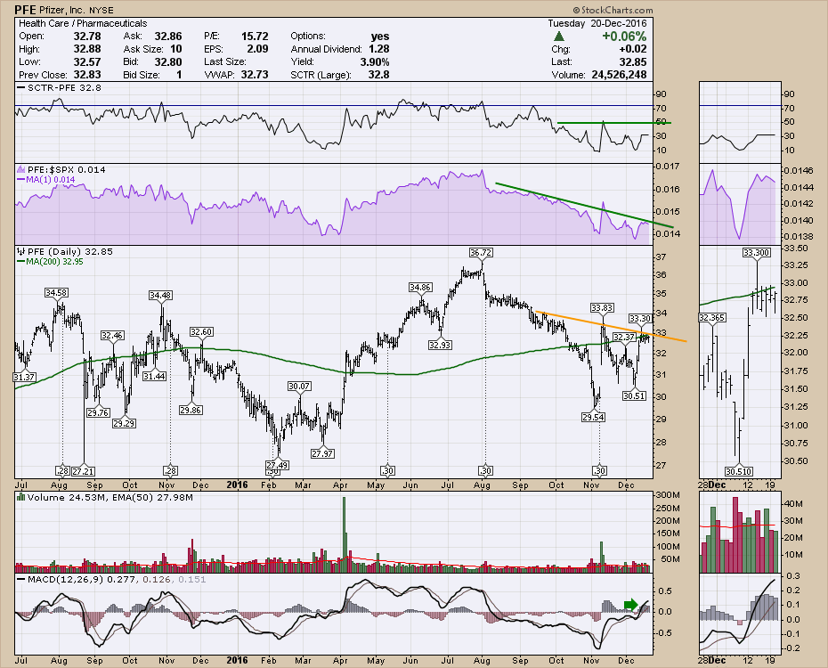
Pfizer (PFE) has been working lower since the summer. The end of July has been an inflection point for quite a few of the defensive stocks. Pfizer stands out as a mega cap paying about a 4% yield with daily volume averaging around 28 million shares a day... Read More
Don't Ignore This Chart! December 19, 2016 at 10:31 AM
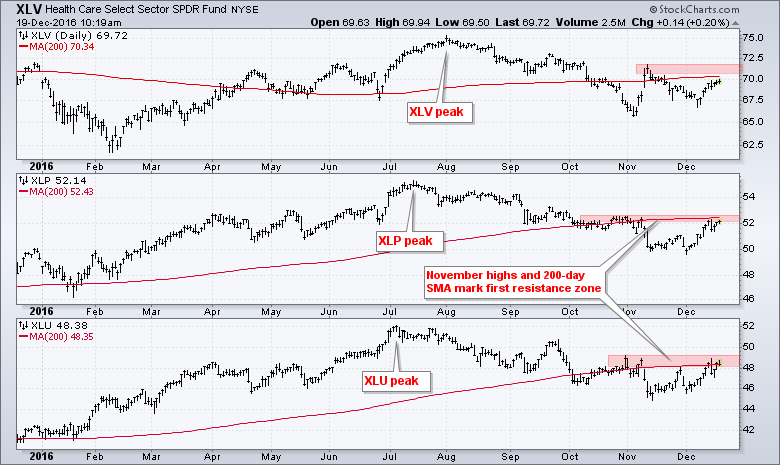
The HealthCare SPDR (XLV), Consumer Staples SPDR (XLP) and Utilities SPDR (XLU) are lagging the broader market in 2016, but they are now challenging their 200-day moving averages with bounces this month... Read More
Don't Ignore This Chart! December 18, 2016 at 01:15 PM
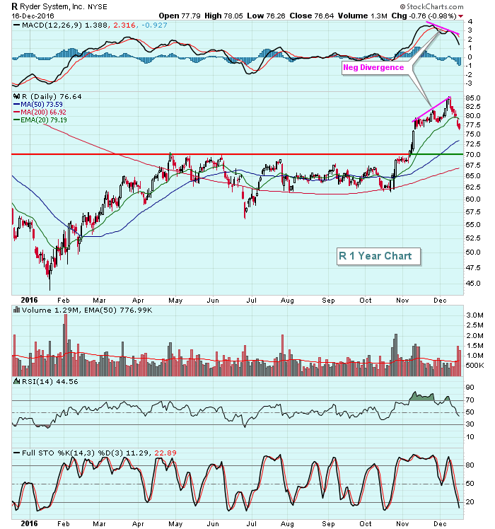
Ryder System (R) was having a huge 2016 until the past several days. Profit taking has kicked in and R has dropped 10% in that brief span. The obvious question from a trader's perspective is.....when does it make sense to jump in on the long side... Read More
Don't Ignore This Chart! December 16, 2016 at 05:57 PM

Progressive (PGR) is making a new high to close out the week. Flo looks happy about it! Photo:Courtesy of Progressive.com When the chart starts popping, it's time to pay attention. This chart has a beautiful 5-year up trend going on... Read More
Don't Ignore This Chart! December 15, 2016 at 04:08 PM
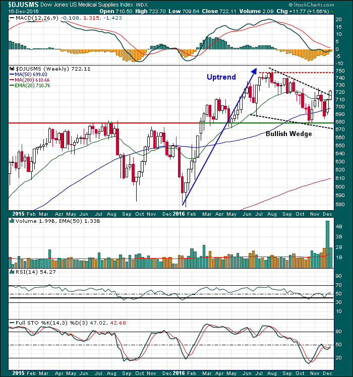
Healthcare stocks (XLV) have been underperforming the benchmark S&P 500 for the past 4-5 months, but they're beginning to show some life as the XLV has been the best performing sector ETF over the last week... Read More
Don't Ignore This Chart! December 14, 2016 at 03:26 PM
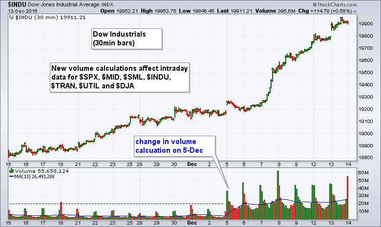
There has been a big change to intraday data for S&P Dow Jones Indices and chartists using volume indicators should take this into consideration. Basically, S&P Dow Jones started using data from the "Consolidated Tape of all recognized U.S. exchanges"... Read More
Don't Ignore This Chart! December 13, 2016 at 04:28 PM
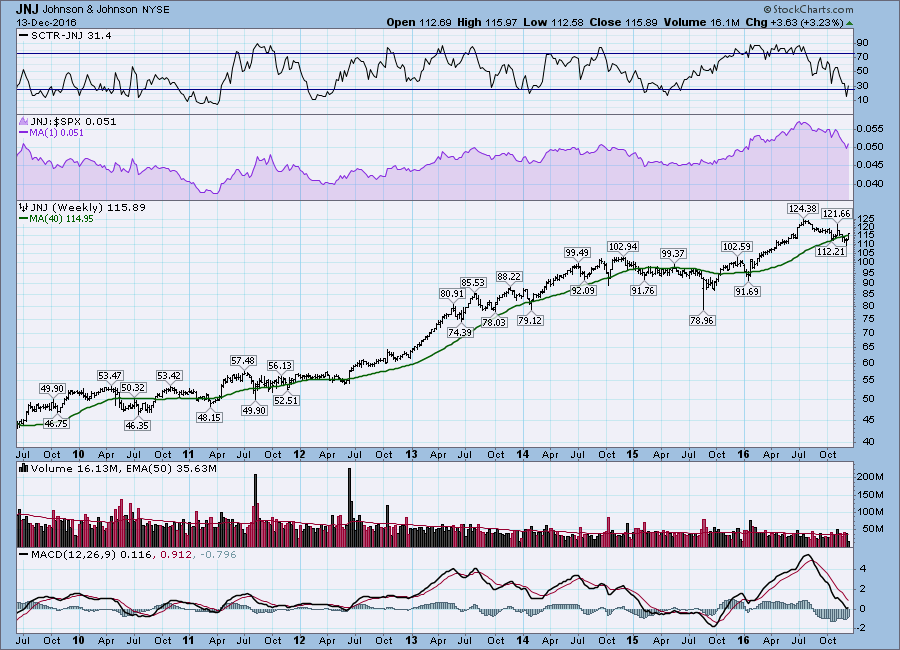
JNJ is one behemoth of a Healthcare company. It dominates in so many areas. Recently are the big cap healthcare companies have been out of favor. Usually, I like to look for strong stocks getting stronger... Read More
Don't Ignore This Chart! December 12, 2016 at 12:16 PM
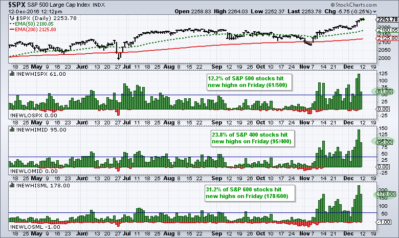
As a percentage of total issues, small-caps are churning out more new highs than large-caps and leading the market. The chart below shows new highs (green) and new lows (red) for the S&P 500, S&P MidCap 400 and S&P Small-Cap 600 over the last eight months... Read More
Don't Ignore This Chart! December 11, 2016 at 10:38 AM
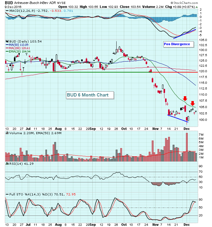
The U.S. stock market has been flying high over the past month, but shares of Anheuser-Busch InBev (BUD) have fallen close to 30% since reaching an all-time high in late September. Technically, there's hope that BUD is at or approaching a very significant bottom, however... Read More
Don't Ignore This Chart! December 09, 2016 at 12:49 PM
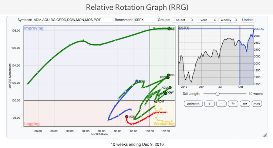
I put up CF Industries on an RRG Chart and saw it just soaring. Here is a link to the live chart. That CF chart also looks beautiful in a StockCharts SharpChart. The stock is still half price to what it was a year ago, suggesting there is more room to run... Read More
Don't Ignore This Chart! December 08, 2016 at 05:26 PM
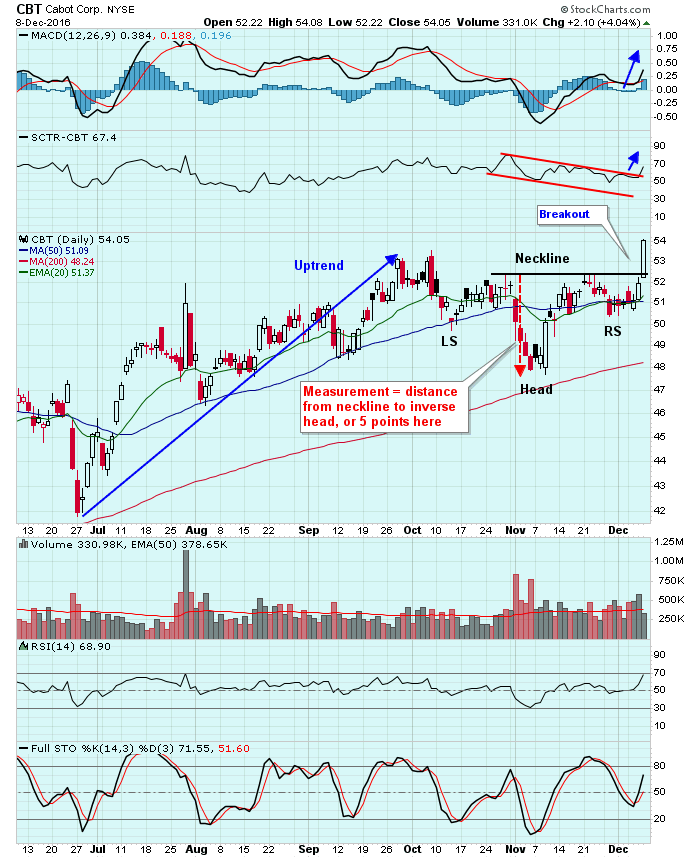
It took two months of consolidation, but Cabot Corp (CBT) finally pulled it off. It cleared neckline resistance in its inverse head & shoulders pattern at the 52.50 level. One of the keys of any continuation pattern is that it requires a prior trend in place to continue... Read More
Don't Ignore This Chart! December 07, 2016 at 09:11 AM
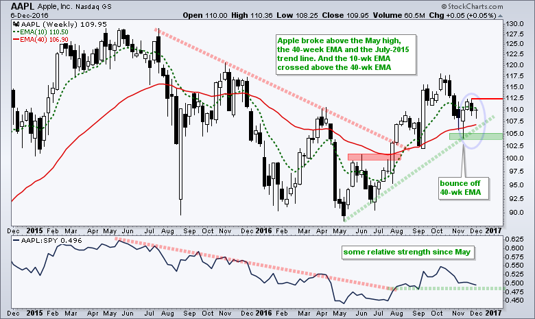
Apple (AAPL) reversed its long-term downtrend with a series of breakouts this summer and the stock is currently trading over 20% above its May low. Notice how the stock broke the early June high, the red trend line and the 40-week EMA with a surge in July-August... Read More
Don't Ignore This Chart! December 06, 2016 at 10:59 PM
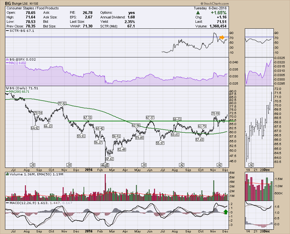
There have been some Agriculture related stocks pushing to new 52 week highs recently. I wrote about Agrium (AGU.TO, AGU) recently. Today, Bunge (BD) jumped up to a 52-week high. This $10 Billion market cap company has just completed a one-year base and looks set to move higher... Read More
Don't Ignore This Chart! December 05, 2016 at 09:45 AM
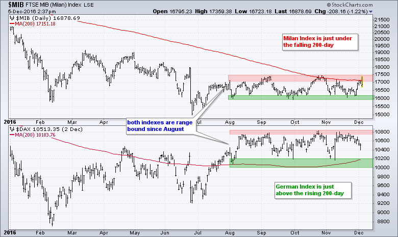
The chart below shows year-to-date price action for the Milan Index ($MIB) and German DAX Index ($DAX). Note that the MIB is down around 22% year-to-date and the DAX is down around 2% since January. In contrast, the S&P 500 is up around 6% so far this year... Read More
Don't Ignore This Chart! December 04, 2016 at 09:32 PM
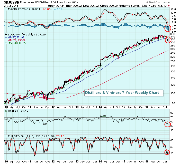
I pulled up one month returns for all industry groups and there were several groups that have performed quite poorly over this period, despite the overall market strength. Toys ($DJUSTY) are down 6... Read More
Don't Ignore This Chart! December 02, 2016 at 04:29 PM
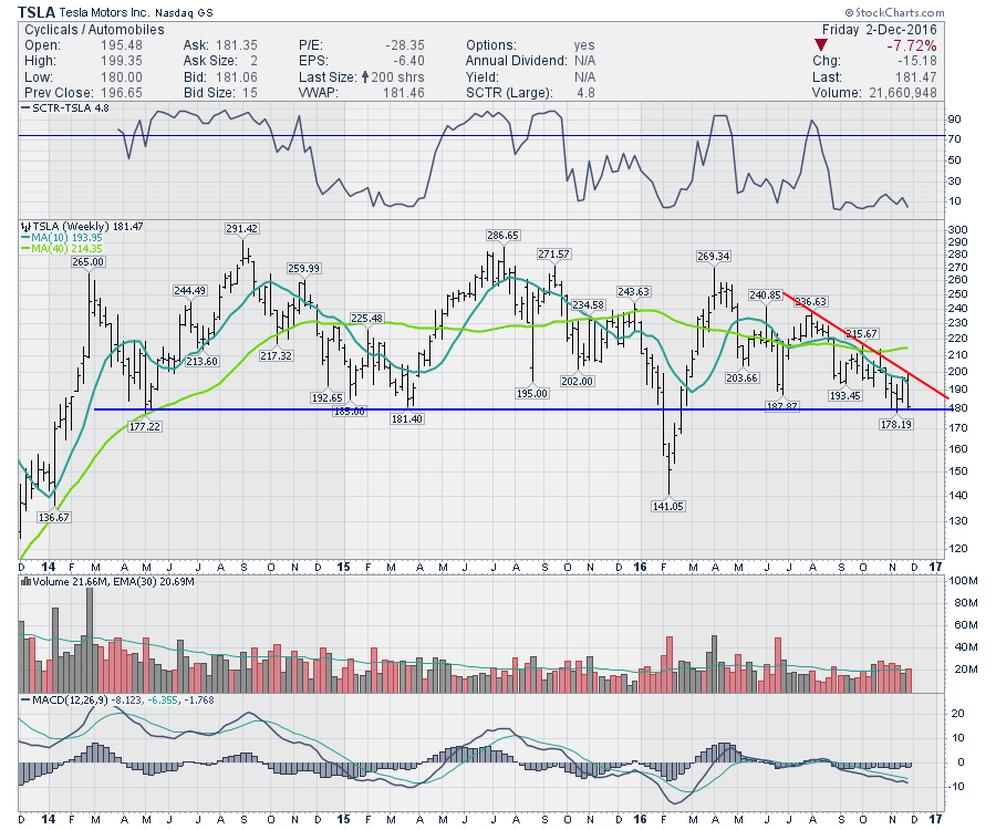
On a week where GM and Ford had nice positive pushes, Tesla (TSLA) fell almost 8%. So how do we handle Tesla from here? It looks to me that Tesla is testing this major support area after breaking it back in January. How investors treat the stock is critical at this juncture... Read More
Don't Ignore This Chart! December 01, 2016 at 05:24 PM
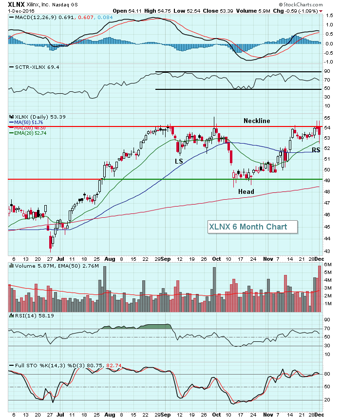
Xilinx (XLNX) is a $13.5 billion semiconductor company and it nearly broke out of a very bullish inverse head & shoulders pattern on heavy volume today. But it didn't. Instead, it reversed lower along with most semiconductor stocks and tested its rising 20 day EMA... Read More