With the exception of Brazil and India, the monthly charts are broken worldwide - and the speed of the drop since the break has been alarming. Come 2019, the charts will need to do a lot of work to rebuild a constructive shape. What are we looking for?
Let's start at the top. In a bull market, the full stochastic indicator usually stays above 50. With Friday and Monday left to improve the final reading, the chart looks perilous. Note that big bear markets start with a break below and can last one or two years. A move back above 50 on the full stochastic may be slow, but it will be a better place to be long for those looking for smoother markets.
On the price panel, we can see the dotted line forming a divergence on the chart, with the PPO momentum indicator at most of the major highs. The 2011 top occurred without a divergence. While this monthly chart makes the year-long divergence look small, we are comparing the January top to the September top. The month-end close is used to finalize the PPO reading for the month.
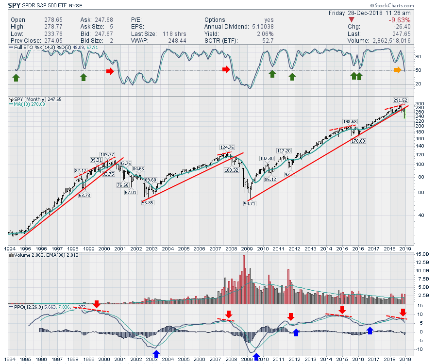 We have also clearly broken the uptrend lines on the price panel. We could add a dotted line using the 2010, 2011 and 2016 lows. The current low in price would line up on that trend line. That would be the flattest trend line (lowest slope) on the chart - with the other indicators like the full stochastic entering bear market indicator levels, it seems late and I don't think it is helpful. The monthly trend is broken.
Regarding a second half final high:
- The SPY retested the March 2000 high but did not make a higher high in September 2000 (-1.17% lower).
- In 2007, the October high was just slightly higher (1.5%) than the July 2007 high.
- In 2018, the September high was 3.5% higher than the January 2018 high.
All that to suggest that this fourth quarter topping structure is not a new experience.
On the PPO, do we look closer to the top or the bottom? The blue arrows mark where the PPO crosses above the signal line. We don't seem to be set up for a blue arrow at this point.
None of these chart settings are modified from the default setting, but the chart is a log scale due to the wide-ranging price levels. The chart has a lot of technical damage. It is important to notice the trading range after the 2008 trend line break. The SPY traded sideways in a 10-15% swing range for 5 months in 2008 before breaking down further.
Our current oversold readings are just that: very oversold. We can bounce from here, but the market will need time to fix the change in momentum. Many investors will want to sell the rally just to get their money back.
In past instances when the market traded below the 10-month moving average, we've seen that:
- 14 of the 15 biggest up days have occurred below the 10-month moving average
- Many of the big 4% up days were during the 2000-2002 and 2008 market sell offs
- Most of the big rallies occurred after huge selloffs
- If you missed the sell offs, you didn't need to be in for the rally
- Most lows are tested on a daily or weekly chart, but may be inside the same month
Are we in for a major storm ahead? Currently, the charts are saying yes while every portfolio manager is saying no. The charts are broken worldwide. While the US economy may be doing well, don't get sucked in to believing the market will simply rally back. It is very difficult to successfully swing trade this volatility over weeks or months. The market is forward-looking; by the time the economy bottoms, the stock market will be well on its way. Fundamental analysis can help in a bull market, but when institutions are broadly selling, even the great stocks get pommelled.
Try to protect your capital until some of these momentum indicators like the full stochastic and the PPO turn up. That might be the best advice I can offer for 2019 as it looks like choppy trading for a while.
Lots more from last weekend's market wrap:
On The Final Bar, I mentioned a lot of negative sentiment indicators. If you are not familiar with sentiment indicators, you may find this video helpful. There are some other charts to take note of as well.
The Canadian Market Review goes through the significant breakdowns on the charts and what to look for.
For those of you looking to use more charts, you might want to learn more about the basics of charting. If so, you'll love Stock Charts for Dummies. The first section of the book walks through all the chart settings to get the charts you want, the second section explores why you might use charts for investing and the third section is about putting it all together.
Click here to buy your copy of Stock Charts For Dummies today!
If you are missing intermarket signals in the market, follow me on Twitter and check out my Vimeo Channel. Bookmark it for easy access!
Good trading,
Greg Schnell, CMT, MFTA
Senior Technical Analyst, StockCharts.com
Author, Stock Charts for Dummies
Hey, have you followed me on Twitter? Click the bird in the box below!
Want to read more from Greg? Be sure to follow his StockCharts blog:
The Canadian Technician