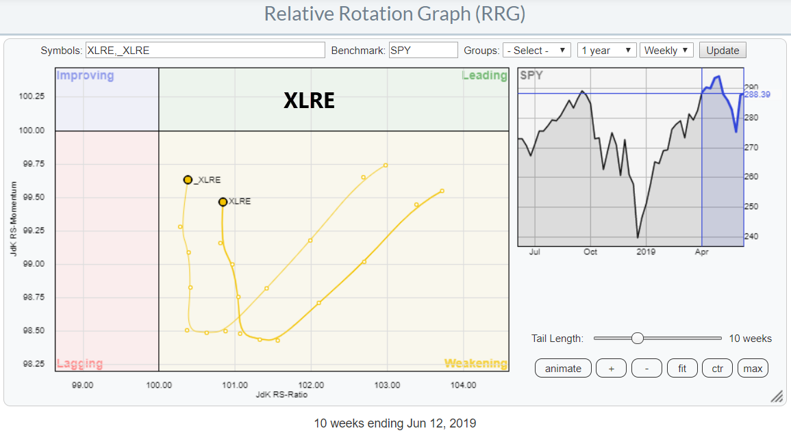
 The Relative Rotation Graph for US sectors shows the sector Real Estate (XLRE) inside the weakening quadrant, but that sector moving upward (almost vertically) on the JdK RS-Momentum scale. This type of rotation usually indicates that a second (or third, etc.) leg of a relative uptrend is about to get underway.
Inspection of the unadjusted* price chart of _XLRE below shows that this sector cleared an important overhead resistance area in March and broke out of a three-year range. Following a re-test of the breakout level, Real Estate is now pushing to new all-time highs.
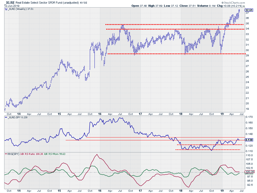 The accompanying relative strength against the S&P 500 Index was in a pronounced downtrend during 2016/2017, but started to level off in 2018. Towards the end of 2018, RS managed to get above the first intermediate resistance level and settle itself above that former range.
At the moment, relative strength is underway for a test of a major horizontal resistance level that connects a few of the important lows since 2015. For further improvement, we do need to see a break above that major level, as that will free the path for further upside movement. The fact that the recent relative lows are coming in higher than the ones in the first half of 2018 is encouraging for such a break.
The RRG-Lines picked up on the turnaround and made a final push above the 100-level at the end of 2018, sending XLRE into the leading quadrant. The sideways move following the upward break caused relative momentum to fade for a few weeks and rotate through the weakening quadrant, but momentum is now coming back and causing the tail for XLRE to curl upward again.
All in all, the signs are lining up for a new period of outperformance for Real Estate, as price is pushing to new highs after breaking out of a three-year range and relative strength is getting back in shape through a rotation towards the leading quadrant while closing in on a break of overhead resistance.
* I have used the unadjusted price for this sector as it is heavily influenced by dividends. In such cases, I prefer the unadjusted chart for marking support and resistance levels as these are the levels that people remember from the past.
My regular blog is the RRG Charts blog. If you would like to receive a notification when a new article is published there, simply "Subscribe" with your email address.
Julius de Kempenaer
Senior Technical Analyst, StockCharts.com
Creator, Relative Rotation Graphs
Founder, RRG Research
Want to stay up to date with the latest market insights from Julius?
– Follow @RRGResearch on Twitter
– Like RRG Research on Facebook
– Follow RRG Research on LinkedIn
– Subscribe to the RRG Charts blog on StockCharts
Feedback, comments or questions are welcome at Juliusdk@stockcharts.com. I cannot promise to respond to each and every message, but I will certainly read them and, where reasonably possible, use the feedback and comments or answer questions.
To discuss RRG with me on S.C.A.N., tag me using the handle Julius_RRG.
RRG, Relative Rotation Graphs, JdK RS-Ratio, and JdK RS-Momentum are registered trademarks of RRG Research.