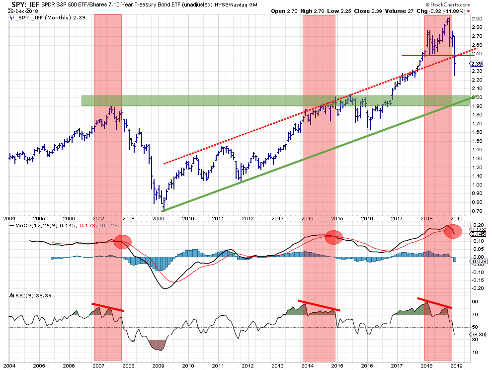
 The above chart shows the stocks/bonds ratio using monthly bars since 2004. IMHO this is one of the most useful charts to decide on an important portion of the asset allocation in your portfolio. Should you invest in stocks or in bonds. In other words, "Risk ON" or "Risk OFF".
It is a basic relative strength chart but now using bars instead of a line chart. this is to show that during a month the relative strength (ratio) can move wildly. A bar chart will give a better, more detailed, view of how, trends in, RS moved when using long-term (monthly) charts like this.
A benefit of plotting the ratio as the main chart is that we can apply, any, classical technical analysis indicator to get a better understanding of the underlying developments.
Let's work our way through the picture above.
From the basic ratio chart
Starting at the top chart we can see that the _SPY:_IEF ratio has been on the rise since early 2009. Until late 2017 the series of higher highs and higher lows was contained within the boundaries of a parallel channel. In September 2017 this ratio broke out of that channel to the upside and started accelerating and even set another higher low (Feb 2018) and another higher high (Oct 2018).
From that latest high the ratio dropped sharply and came back within the boundaries of the channel. Very often such a move back into a channel results in a test of the lower boundary of that channel. In this case, that means the up-sloping green support line which is currently running around 1.90
This 1.90 level also coincides with an important horizontal level where highs were formed back in 2007 but more importantly a whole cluster of highs back in 2014-2015. This area between 1.90 and 2.00 should start to act as support when the _SPY:_IEF ratio is moving further down.
As this horizontal level and the rising support line are coming together around the same level in the same time frame, lets' say the first quarter of 2019 this is now a double support level.
The RSI and the MACD
Plotting the monthly RSI (9-period) of this ratio shows three instances where a clear negative divergence, above 70, between ratio and RSI occurred. In 2007, in 2014 and in 2018.
Divergences are fantastic early warning signals but they are very difficult to use in pin-pointing action moments as they can drag on for a long time or even resolve themselves without any meaningful subsequent price-, or in this case ratio-, action following the divergence.
Plotting a MACD indicator can become helpful here as the crossover of the MACD line with its trigger line can act as a "signal" to confirm the divergence that has been built up in the RSI.
The three occasions where this happened in the chart above are October 2007, December 2014, and November 2018. The 2007 occasion was the prelude of the 2008 crisis as we all know. The 2014 occasion led to a two-year pause and the recent crossover is playing out at the moment and pretty much has only just started.
Based on the observations above it's pretty safe to say that the start of 2019 will be pretty difficult for stocks.
Reverse Relative Strength
Back in 2016, I experimented a bit with, what I called, "Reverse Relative Strength" and used it in a few articles. After a while, I put it aside again as I could not get my head around a useful and replicable way of implementing this thought process. But the idea never left me.
When I was researching and preparing my charts for this article I had to think of this Reverse Relative Strength concept again, especially as the support for the _SPY:_IEF ratio is so well defined at the moment.
The "problem" with this approach is that there are two moving targets. In other words, when you have established a target for a ratio, that target can be reached via multiple routes. The easiest way is if one of the two securities remains stationary you can calculate at what level the other security needs get to in order to reach the established target for the ratio.
So assuming that IEF does not move we can calculate where SPY needs to go and also when we assume that SPY remains the same we can calculate where IEF needs to go. Unfortunately, it is very unlikely that either of these two (or any security for that matter) will remain at the same level for a few months (in this long-term example).
However, I am still intrigued by the question:
"If the _SPY:_IEF ratio goes to the 1.90-2.00 area, what levels do we need to think of for both components?"
Tabulating
Normally we have the values for both components and we can calculate the ratio. in this case, we have a target-value for the ratio but we want to know which values for both components would lead to that target-value.
In order to do that I decided to use a tabular format where we can see the change in both SPY and IEF and the table holds the accompanying ratio values.
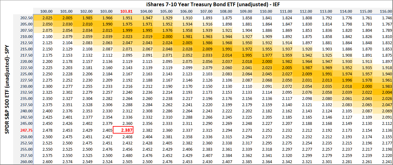 In the table above I have listed a range of possible values for IEF (unadjusted) across the top and a range of possible SPY (unadjusted) values along the side of the table. The cells in the table then hold the _SPY:_IEF ratios for each possible combination.
Finally, I formatted the table to put an orange shade on the values around 2 (from 1.9 to 2.1) as that is my potential target zone for the ratio.
This way of looking at things provides a handle on where the two components need to be or need to go in order to reach that 1.9-2.0 area for the ratio.
The current SPY and IEF and the resulting ratio values are highlighted in red.
Establishing targets for SPY and IEF
To zoom in on potential target areas for both components we need to look at their individual charts.
Please note that I am using unadjusted pricing for both SPY and IEF in this article as it reflects the prices that are in peoples heads and which are likely to serve as support and resistance levels. Especially for IEF, this gives significantly different levels to watch.
SPY
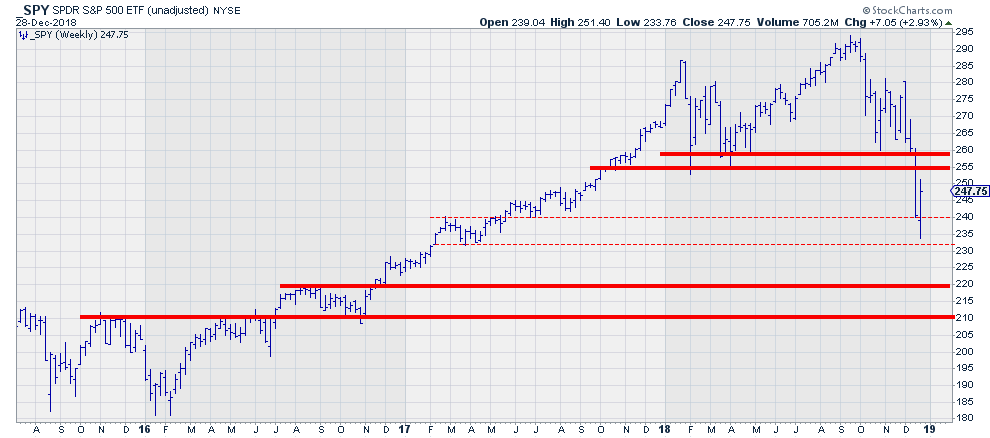 For SPY I am watching the area between 255-260 as overhead resistance which I think will be difficult to break in the next few weeks/months. Then on the downside, there is a solid support level between 210-220. There is a, slight, possibility that SPY has already found support in the area between 230-240 which corresponds with a consolidation area in early 2017 but I consider that an alternative scenario.
Hence 210-220 on the downside and 255-260 on the upside.
IEF
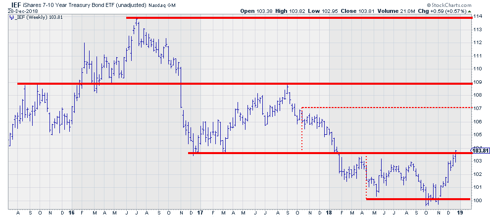 For IEF, it looks like we are breaking overhead resistance at the moment which will open up the way for a further rise towards 109. I have penciled in 107 as that is a target that can be pegged based on the height of the range from March to November.
If the break manages to hold we will see 103.50 to start acting as support, if not then 100 has to be seen as a good support level.
If we put these levels in the table we can see in which direction IEF and SPY have to move in order to get there.
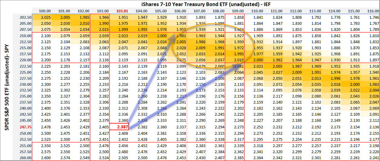 With the path of least resistance for equities being lower and for bonds higher, the most likely path for the ratio is indicated by the two arrows on the table. For the ratio to reach its target area IEF should move to levels between 106-109 and SPY at the same time to 210-220.
If either of these two components decides to move less fast or in another direction the level for the other component will get adjusted as well. If IEF, for example, would rally all the way to its previous high near 114 it can be seen that the damage for stocks could remain limited to levels around 230, whereas if IEF does not manage to hold the current break, stocks will need to come down a lot more in order for the ratio to reach its target area.
Clearly, there is no guarantee whatsoever that any of these events will actually happen but I think that looking at the relative moves of stocks vs bonds from this perspective will help you get a handle on what levels we actually need to see for a (Relative Strength) ratio to reach a certain level.
RRG confirms the preference for Bonds over Stocks
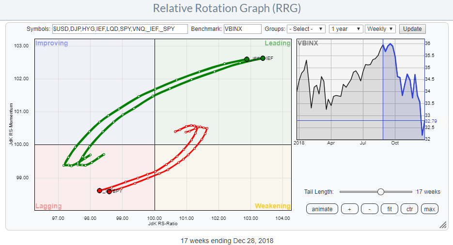 The RRG above shows the rotation for stocks and bonds around the Vanguard Balanced Index Fund (VBINX). The rotation in favor of bonds over equities is clearly visible for a few months already and neither of these tails seems ready to curl up or roll over yet.
I have plotted both the adjusted and unadjusted data for both SPY and IEF and as you can see they rotate fairly similar. Not super-surprising but always nice to see it confirmed.
And, as this is my last blog for 2018, please enjoy your New Year's eve, the markets will still be there and waiting for us in 2019. HAPPY NEW YEAR!
Let me know what you think of this usage of RRG in the comments below. If you would like to receive a notification when a new RRG blog article is published, simply "Subscribe" with your email address using the form below.
Julius de Kempenaer | RRG Research
RRG, Relative Rotation Graphs, JdK RS-Ratio, and JdK RS-Momentum are registered TradeMarks ®; of RRG Research
Follow RRG Research on social media:
If you want to discuss RRG with me on SCAN, please use my handle Julius_RRG so that I will get a notification.