 In my last DITC contribution, I wrote about the Real Estate sector, which is crossing over into the leading quadrant at the same time as the seasonality chart for that sector indicates that, over the last 20 years, XLRE closed the month of July higher 71% of the time, with an average gain of 1.9%.
(The average gain, by the way, is calculated over all years, not just the years in which Real Estate outperformed the S&P 500.)
In this article, I am going to take a look at the seasonality of all sectors, in combination with the Relative Rotation Graph.
It's All About Piecing Things Together
An investment process or a trading strategy is a very personal thing. What works for one person may not work for another, and vice versa. Developing one is often a (long) process of trial and error. That process is called "research."
For me, research is all about piecing things together, grabbing and using what you like and what fits your style while discarding what you don't like or what doesn't fit your style.
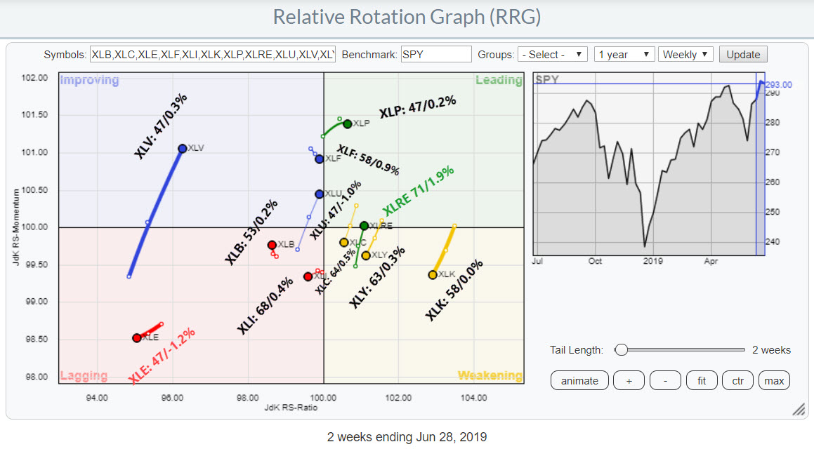
Building on the DITC article, I have created the RRG at the top of this article, which shows the relative rotation for the US sectors. I have shortened the tails to two weeks in order to create a bit more space for the labels that I wanted to attach and show you.
These labels show the symbol of the sector, followed by a colon and the percentage of months over the last 20 years (if available) in which that sector outperformed the S&P 500. This is then followed by a slash and, after the slash, the average percentage of outperformance (relative performance vs S&P 500) over the 20-year period.
For example, the Health Care sector is inside the improving quadrant and moving higher. The label says "XLV: 47 / 0.3%", which means that XLV outperformed the S&P 500 47% of the time over the last 20 years, with an average outperformance of 0.3%.
Real Estate
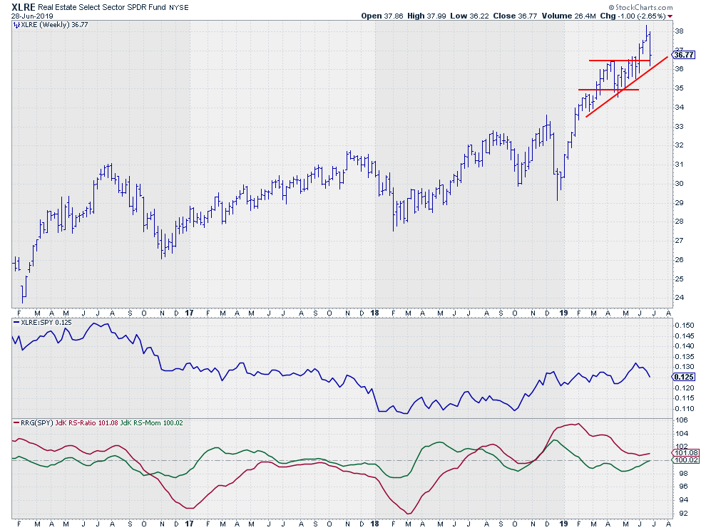 Here is the chart of XLRE, one of the stronger sectors on the Relative Rotation Graph and the strongest sector in terms of seasonality.
On the RRG, you can see that XLRE just rotated back into the leading quadrant after coming from weakening. This is usually a strong sign, as it suggests a continuation of the previously established relative uptrend. On the seasonality chart, XLRE is showing the highest percentage, outperforming the S&P 500 in July at 71%.
The price chart shows an uptrend for XLRE, with a regular rhythm of higher highs and higher lows establishing after the initial surge at the start of 2019. At the moment, the price is resting at or testing the up-sloping support line at a level that more or less coincides with the level of a previous high a few months ago, so some demand/support may be expected to kick in anytime soon.
The stabilization after the initial rise caused the relative strength for XLRE to flatten out as well, which took the RS-Ratio off its highs. The good news is that it looks as if this drop in relative trend has now stopped and started to reverse above the 100-level, with RS-Momentum crossing over above 100 again. This completes a rotation at the right hand side of the RRG and starts a new leg of the relative uptrend.
All in all, things for Real Estate are looking good in coming weeks.
The price is resting at a solid double support level, while the tail on the RRG has crossed back into the leading quadrant. Seasonality suggests an outperformance for July at around 1.9%.
Energy
 Knowing which parts of the market to avoid is maybe even more important than focussing on what to buy. Most of us, if not all, will have to admit that at the end of the year (when they review their performance) that it could have been so much better if they had only been able to avoid one or two of those big bleeders that are dragging our performance.
Relative Rotation Graphs in and of themselves are already a great tool to pinpoint potential bleeders that need to be avoided. The combination with seasonality seems to take this to another level.
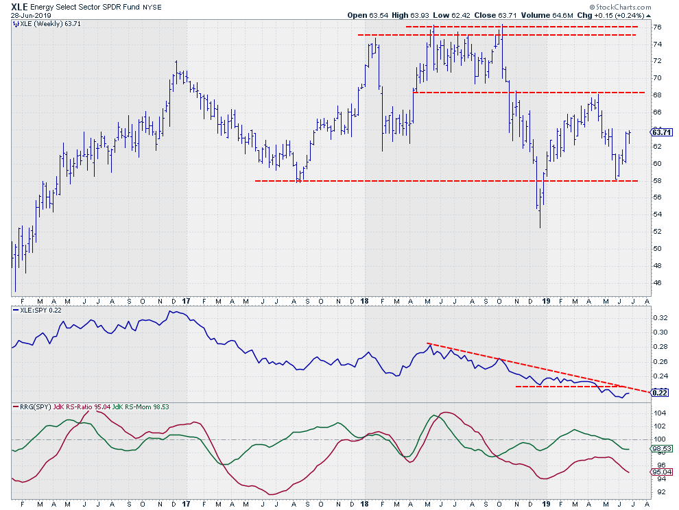
Scanning over the RRG at the top of this article, the tail for the Energy sector (XLE) attracts attention as it is deep inside the lagging quadrant and traveling lower on both axes, causing a negative RRG-Heading.
Seasonality data are indicating that this sector underperforms the S&P 500 53 percent of the time* in July. The average underperformance is -1.2% over 20 years.
*Outperforming the S&P 500 47% of the time as indicated on the seasonality chart (obviously) means that the sector underperforms 100%-47% of the time (a.k.a. 53%).
On the price chart, XLE doesn't look too bad, as the sector is in the middle of a broad range without any clear directional trend in place. The bad news is coming from the relative picture. The RS-Line broke below its previous lows in April and is working its way lower below the falling resistance line.
The JdK RS-Ratio line already dropped below 100, pushing Energy into the lagging quadrant in September of last year. The flat relative line in the first few months of 2019 has caused the rotation through improving, but this ended with the break of RS below support, pushing the sector back into the lagging quadrant at the end of May.
With the price going nowhere, a rotation back into lagging from improving on the RRG, seasonality suggesting a -1.2% performance below the S&P 500 and an actual underperformance slightly over 50% during the last 20 years, Energy seems to be a sector to avoid in coming weeks.
Let me know what you think of this usage of RRG in the comments below. If you would like to receive a notification when a new RRG Charts blog article is published, simply subscribe with your email address using the form below.
Julius de Kempenaer
Senior Technical Analyst, StockCharts.com
Creator, Relative Rotation Graphs
Founder, RRG Research
Want to stay up to date with the latest market insights from Julius?
– Follow @RRGResearch on Twitter
– Like RRG Research on Facebook
– Follow RRG Research on LinkedIn
– Subscribe to the RRG Charts blog on StockCharts
Feedback, comments or questions are welcome at Juliusdk@stockcharts.com. I cannot promise to respond to each and every message, but I will certainly read them and, where reasonably possible, use the feedback and comments or answer questions.
To discuss RRG with me on S.C.A.N., tag me using the handle Julius_RRG.
RRG, Relative Rotation Graphs, JdK RS-Ratio, and JdK RS-Momentum are registered trademarks of RRG Research.