Hello Fellow ChartWatchers!
This week I thought we'd look at something different - the charts that matter the most to me personally. Now, brace yourself... these charts are not financial charts. Nope. These are the charts that tell us at an instant how well the StockCharts.com website is performing. If there is trouble with the site, these charts frequently help us find and fix the problem. In addition, whenever we add or reconfigure our servers, these charts can tell us if the improvements we expect to see actually occur.

This first chart shows the memory utilization of just one of our 17 charting servers - the computers that actually create the chart images you see. See the even "sawtooth" pattern? That's a good thing. It means that the server is able to keep up with it's charting duties easily. One of the first signs that a server is overloaded is a change is that pattern.

The chart above shows the results of a server stress test. This server was pounded with just over 4,000 chart requests from 40 simulated users in a very short span of time. The little black dots on the chart show the time (in milliseconds) it took for each chart request to be completed. The blue line shows the running average of all those times. In this case, the server was able to create each chart in around 274 milliseconds (on average). Everytime we get new servers or make changes to our system, we rerun these stress tests to make sure our average chart generation time doesn't slip. In fact, since we've started adding our new 4-CPU servers from Sun Microsystems, the average chart generation time has decreased by about 25% - something we are very excited about.
If all of our users were located in our offices, they would get their charts in about the same time it takes the servers to create them - i.e. ~1/3rd of a second. Unfortunately, that isn't the case. There's another factor in site performance that we monitor closely - the speed of the Internet itself. Many people take their Internet connection for granted - we don't. Here's one of the key charts we use to see if everything about our site is working well

This chart was created for us by a company called Keynote Systems. They have computers located all over the world that are programmed to download selected pages from our website and measure how long it takes for those pages to arrive. Each one of the green dots on that chart represents one timing test from one of Keynote's 45 different computers. As you can see, at the time this chart was created, we were able to push complete pages out to those computers in anywhere from 2 to 6 seconds.
Much of the variation in those times have to do with each server's physical distance from our offices - but some of the times are obviously affected by other factors. See the green dots that are near the top of the chart? It turns out that most of those were coming from just one of Keynotes computers - specifically, the server in Pittsburgh, PA on the Savvis.net ISP connection. That means that - at the time this graph was created - some of the people in the Pittsburgh area might have been experiencing slowness because of problems at Savvis.net.
While such problems are not uncommon, they are frustrating to track down because the problems can appear and disappear in a heartbeat. Typically these kind of problems get corrected within 24 hours. If we get reports from our users about slowness that persists for several days, we try to help them report the problem to their ISP because they have the best chance of fixing the problem. Another thing we do is to run more detailed tests from the Keynote server with the problem. In this case, here's what those results look like:

This chart shows the time it took for all of the parts of our homepage to show up in Pittsburgh. In this case, everything worked great. We were actually able to get all of our parts shipped out in around 4.5 seconds. The final 2 seconds were due to the time it took for the banner ad to come down from our advertising partner (something we don't have control over). Since things worked fine this time, we suspect that the problem at Savvis.net has been fixed (or will be soon).
While these charts don't really tell you anything about the market, they help us keep StockCharts.com up and working as quickly as possible. Hopefully you enjoyed this "peek behind the curtain" at some of the charts that we stare at every day.
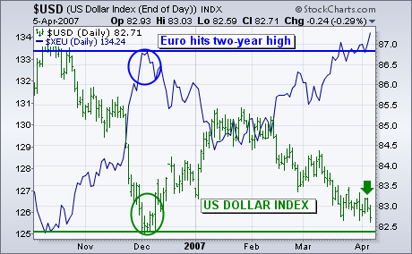
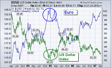
The U.S. Dollar Index fell during the week and is drawing dangerously close to last December's low (green circle). The foreign currency with the biggest influence on the USD is the Euro. Expectation for continuing economic strength in Europe ? and the likelihood for further ECB rate hikes ? pushed the Euro (blue line) to a new two-year high against the dollar. The weekly bars in Chart 2 show the Euro (blue line) moving up to challenge its late 2004 peak near 136. A close above that chart barrier would increase the odds for the USD to threaten its corresponding low near 80. That would be a very important test for the U.S. currency.
The Nasdaq rally continued into its fourth week with a gap up on Tuesday and move into the late February gap zone. This late February gap started a sharp decline to the March lows and the recovery back above 2460 is quite impressive. Even though volume is not so impressive, the current swing is clearly up and we should at least respect this up swing until it is proven otherwise.
Just what would it take to reverse the current upswing? I am watching three items: Tuesday's gap, the late March lows and RSI. The Nasdaq gapped higher on Tuesday morning, closed strong on Tuesday and continued higher the next two days. This follow through is bullish and the gap is bullish as long as it holds. The index established support around 2400 with three indecisive candlesticks (blue oval). A move below Tuesday's gap and below the late March low would reverse the current upswing. Until these are broken, the bulls have a clear edge and we should expect higher prices.
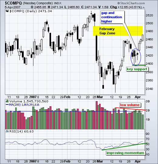
RSI is trending higher and above 50. RSI turned oversold in early March and moved above 50 over the last few weeks. I drew a trendline extending up from the March low and RSI is also trending higher. Momentum continues to improve and this is also bullish. A break below this trendline and a move below 45 in RSI would reverse the uptrend in momentum. The bulls also have the momentum edge and we should not bet on lower prices until a bearish signal.
Our Thrust/Trend Model (T/TM) is so-named because it treats bottoms and tops differently ? tops tend to be rounded trend changes, and bottoms tend to be formed by sharp changes in direction accompanied by internal up thrusts. At price tops, T/TM changes from a buy to neutral (or sell) based upon a downside crossover of the 50-EMA in relation to the 200-EMA, evidence that a change in trend from up to down has occurred. (The T/TM for the S&P 500 is currently in neutral.) At bottoms the model uses a double screen ? the PMO (Price Momentum Oscillator) crossing up through its 10-EMA, and the Percent Buy Index (PBI) crossing up through its 32-EMA.
While PMO crossovers alone are useful for short-term work, there are a lot of whipsaws, so we use the additional screen of the PBI crossover to slow the model down, making it more suitable for medium-term work. On the chart below we display all the components of the T/TM. Of particular interest now are the two thrust components ? the PMO and PBI. Note that the PMO upside crossover has already occurred (on the day of the giant one-day rally); however, while the PBI still remains below its 32-EMA, it has closed the gap. If the PBI does cross to the upside, the T/TM for the S&P 500 will switch to a buy signal, but my advice would be to not anticipate. Wait for it to happen.
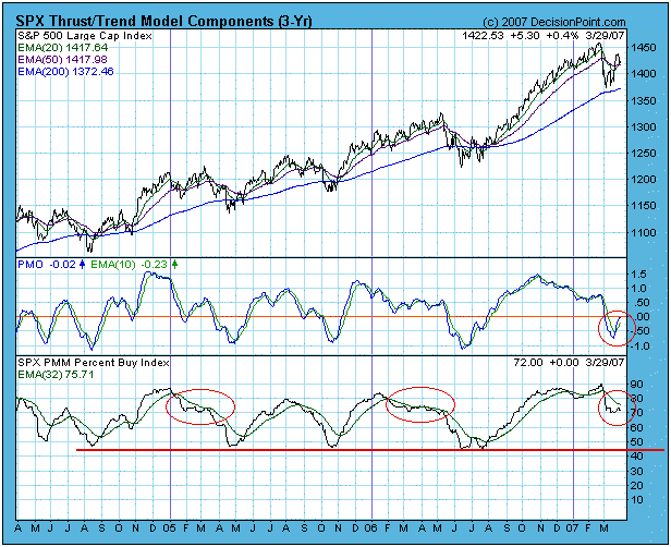
Besides the normal need to maintain model discipline, one of the reasons for caution is that the PBI has still not dropped to the level of previous corrections. It is not absolutely necessary that it do this, but it would be a desirable sign that the correction had run a normal course and that a price bottom would not be suspect. I have drawn ellipses on the PBI in 2005 and 2006 to show the kind of PBI action we might expect.
Another concern is that the PMO looks as if it is trying to turn down below the zero line. If this were to happen, it is extremely negative for the short-term, possibly longer.
Bottom Line: We have had a number of positive events over the last few weeks, and the T/TM is close to generating a buy signal; however, there is reason to believe that the correction still has at least a few more weeks to go.
The put call ratio ("PC") is quite simply the total number of put options divided by the total number of call options. These options include both individual equity options and index options. Every day you can monitor the relationship between put options and call options at www.cboe.com. Once in the site, click on "Data", then "Intra Day Volume". Every half hour, the information is updated. This article is not the appropriate forum to discuss options strategies and definitions, but in its most basic form, put option buyers are expecting the market to decline and call option buyers are expecting the market to advance. The PC gives you a quick, concise picture of the relationship between the put buyers (bears) and call buyers (bulls). The beauty of the PC is that it's a contrarian indicator. When the put call ratio spikes above 1.0, it indicates the market is becoming oversold short-term so expect a rally. When the PC drops below 0.6, the market is becoming overbought short-term so expect a decline. I like to use the 5 day and 21 day moving averages of the PC. Any time the 21 day moving average of the PC approaches 1.0, start looking for a bottom in the market. Historical PC data is available at CBOE beginning in 1995. Let's take a look at how this reading of investor sentiment could have been used to identify recent bottoms in the S&P 500 chart.
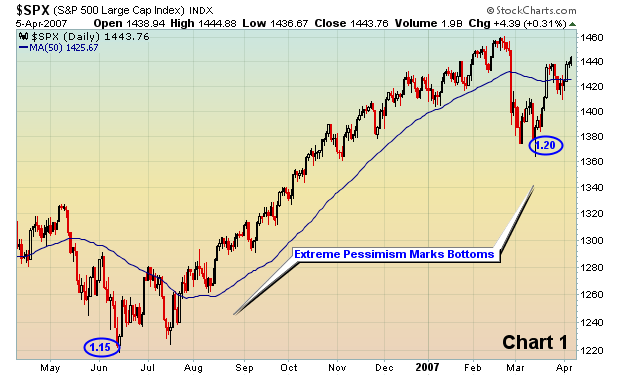
Notice that both bottoms formed when the PC was at extreme readings. The PC at the recent March lows was the lowest 21 day moving average reading since the data was compiled. That reading is indicative of a long-term bottom, not a long-term top. Major tops are formed when the market is euphoric. The recent extreme pessimism suggests that this bull market still has legs - strong legs. We remain very bullish on equities for the balance of 2007 and into 2008.
For the past couple of weeks, the markets have focused in upon crude oil prices and their attendant rise given the Iran hostage situation. The prevailing thought was that "geopolitical premium" was on the order of $4-to-$5 a barrel of the $67/barrel price; and that once the situation was concluded successfully - the premium would be lost rather quickly. Of course the situation was concluded last week, but the price of crude oil didn't "plunge" as expected. In fact, only not been the case as crude oil has lost only -$2.50 off its highs, with the decline quite orderly indeed. We cannot think of a more bullish respone than what was seen; obviously there are other mitigating factors extant in the price of crude oil that haven't allowed it to decline. Therefore, we think the current rally has "legs", with the recent weakness nothing more than a good old bit of profit-taking before an assault on the all-time highs. Technically, we can make the tentative "bullish case" given major support levels have held. Major trendline support has held; and the 200-week moving average has held; and minor trendline resistance was broken above. If the 60-week moving avearge just overhead can be cleared with a bit of authority, then our bullish confidence level will be raised materially.
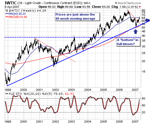
Conversely, we can make the tentative "bearish case" that perhaps crude oil prices can "fail" at the 60-week moving average has it has done so for the past several days. Certainly this was the case in 2001 case where the flattening 60-week moving average turned prices lower by -33%. If this were to occur, then a 2001-like decline would target major support near $40. We think this is a remote probability, but a probablity nonetheless. Therefore, our current stance is quite simple: we are bullish of crude oil, energy stocks in general, and oil service shares in particular [Transocean (RIG) noted on Friday that demand for services was high and rising and likley to do so far into the future]. However, we understand the "risk" to the bullish trade, and can manage our risk easiliy using tight position stops.


