Hello Fellow ChartWatchers!
Last month I had the pleasure of sitting in on several local Technical Analaysis User Groups and seeing how they used many different tools to do group stock analysis. It was a very educational experience for me and I strongly recommend that everyone reading this newsletter join your local technical analysis user group. (If there isn't one in your area, why not start one?) Doing technical analysis with other people is probably the best way to improve your investing success - period.
But as I was sitting in the back of one of the classes, I watched them fall into one of the more insidious "traps" in technical analysis these days. See if you can spot it as I tell the tale:
The group was looking at an ETF for one of the more interesting market sectors these days. The person running the meeting pulled up a chart of the ETF on the screen for everyone to see (I was happy it was a StockCharts.com chart!). Someone in the group commented that the chart had a possible "double top" pattern and they were right - it certainly looked like a double-top. Someone else chimed in that the volume bars appeared to confirm that double-top hypothesis (I thought to myself "Yea! They are using volume to confirm chart patterns!") The group leader then suggested that they add some indicators to the chart to see what they showed - so they added a MACD and a Chaiken Money Flow plot to the chart. The MACD looked weak, but the CMF looked bullish. This caused the group to pause and check out a couple of other CMF plots with different parameters. Hmmmmm. Most of the CMF's were bullish. Eventually, the group decided to ignore the CMF data and move on.
Anyone spot the problem yet?
First off, the problem was NOT that the group ignored conflicting information from the CMF plot - it is very common that some indicators will be bullish while other ones are bearish. You need to think about which indicators you trust more and why. In this case, the group discussed it and decided that they trusted the MACD signals and the double-top chart pattern more than the CMF and that was a good decision.
The problem comes from the nature of ETFs. ETF stands for "Exchange Traded Funds" and they are all the rage right now. These are financial vehicles that are designed to track some index very closely and can be traded just like a stock. They are very useful to investors and the number of ETFs has increased dramatically in the past couple of years.
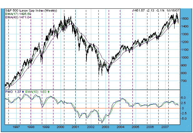
A typical example of an ETF is SPY which tracks the S&P 500 ($SPX). If the S&P 500 index goes up, SPY goes up. If $SPX goes down, SPY goes down. You can buy and sell SPY much easier than you can buy and sell the 500 stocks that make up $SPX and so SPY is a very useful tool in many investors' arsenals.
Have you spotted the trap yet?
Before I reveal the problem, let's look at two charts. Here is a chart of $SPX and one of SPY. See if you can spot the key difference:


Look at the On Balance Volume indicator line. Notice the difference in the direction of those lines? I've added a moving average line to each plot to help you see that the OBV for $SPX is going up while the OBV for SPY is going sideways/down.
Have you spotted the trap yet?
The price plots for $SPX and SPY look extremely similar - just as they should. When $SPX goes up, SPY goes up and vice-versa. But now look at the volume bars. They don't look identical do they? First off, the volume scales are very different - $SPX ranges from 2 Billion to 6 Billion while SPY's volume ranges from 200 Million to 600 Million. But the bigger problem is that the "shape" of the volume bars aren't exactly the same. They are similar - but there are subtle differences in the position and magnitudes of the taller volume bars. Those differences are what caused the OBV plots to be different. But why would the volume plots for $SPX and SPY be different? Could this be the trap? Will Chip ever get to the point!? 
ETFs are different from stocks because of this fact: While the price of an ETF closely tracks the underlying index's value, the volume of an ETF only reflects the popularity of the ETF itself - NOT THE SUPPLY OR DEMAND FOR THE THING THE ETF TRACKS.
Consider the following hypothetical example: Let's say that for some reason an amazingly rich Jillionaire decides that they wants to invest in the market - so they buy 1 Billion shares of SPY in a single day. What would SPY's chart look like?
Despite all of this new demand for SPY, SPY's price chart would continue to mimic the value of the S&P 500 index. It would go up and down in the exact same way as before, just like $SPX does. Of course SPY's volume would have a HUGE spike in it, but that volume spike would have no impact on the price of SPY.
Now consider what would have happened if our hypothetical Jillionaire had invested in a real stock instead of an ETF. In addition to a huge spike on the volume chart, there would also be a huge jump in the price of the stock since the price of a stock is directly related to the demand for that stock's shares.
The key point here is that many kinds of technical analysis make an assumption that is not always true for ETFs. Any form of T/A that relies on studying both price and volume - including chart pattern analysis and price/volume indicators like the CMF - assumes that volume and price are directly related. Since there is no direct relationship between price and volume for an ETF, those analysis techniques should be used very carefully when looking at ETFs.
(Note: The volume for popular ETFs like SPY actually do a pretty good job of mimicking the demand for the underlying index, but that is due to indirect factors. As shown in the charts above, sensitive indicators can be thrown off by those differences. In the case of less popular ETFs, the differences are even greater.)
As I sat in the back of the class observing the give and take around their study of the ETF, I thought about speaking up. Unfortunately the class was almost over and I was late to my next appointment. Fortunately for you, I made a note to myself to write about it in the next newsletter.
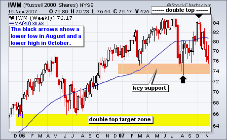
The Russell 2000 ETF (IWM) shows the beginnings of long-term downtrend. In stark contrast to QQQQ, IWM forged a lower low in August and a lower high in October. The inability to move above the summer highs showed relative weakness on the way up. The ETF is already testing support from the 2007 lows and relative weakness continues. The pattern at work looks like a large double top with a ton of support around 74-76. A break below the 2007 lows would confirm the pattern and the downside target would be to the support zone around 64-66.
Two weeks ago I stated that market strength was mixed, and that I thought that the correction had several more weeks to go before it was over. Since then further breakdowns of support have occurred, most notably on the Nasdaq 100 Index chart, which experienced a major break of its rising trend line, eliminating the one area of strength that supported a "mixed" assessment for the overall market.
Currently, a correction is in progress that is affecting all major indexes, and my opinion is that it is likely to continue into mid-December. One of the reasons I believe this is that, while the market is approaching oversold levels, it is not as oversold as it needs to be, and more technical work is needed before we can have confidence that a solid bottom has been made.
On the first chart below we can see that the three primary indicators of price, breadth, and volume are well below the zero line, but they have not yet hit the bottom of their normal ranges. Even after they hit bottom, a lot of work is needed to put in a solid bottom. I have put a box around previous bottoming actions. Note how several weeks and more than one indicator bottom is normally required to get the work done.
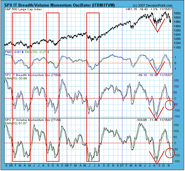
Also note how the August bottom differs from the others. It is what we call a "V" bottom, and there was no retest to make the bottom more solid. From a technical viewpoint, I believe that is why the rally ultimately failed.
Another reason for my assessment is that the 9-Month Cycle is projected to make a trough around mid-December. As you can see by the cycle chart below, cycle projections are somewhat subjective, and cycle lows don't always appear where we think they should, but current market action and technical factors as described above make me believe we have a good chance of being right about the current cycle projection.
Bottom Line: While the market is becoming oversold, I believe that it will take several weeks before the decline is over and a solid bottom is in place. This belief is supported by what we can observe as historical norms for corrections, and by our 9-Month Cycle projection. Any rally that emerges before the proper amount of work is done is likely to fail.
There has been clear technical damage on the major indices as a result of concerted selling. The NASDAQ 100, which has led the market higher for most of 2007, has been treated rather rudely over these past few weeks and that's never good. The reason? During periods of economic expansion, the higher growth technology stocks tend to outperform because of their ability to grow earnings more rapidly. The stock market, for the first time in a long time, is sending a message that the economy is much worse off than was originally forecast. The good news is that inflation is dormant per the tame PPI and CPI numbers released last week. A sudden increase in inflation would put the Fed in a box, but since inflation remains contained, the Fed has ammunition to continue lowering rates. That should, in turn, lead to a strengthening economy in 2008.
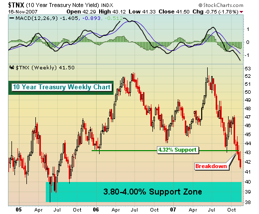
The bond market is already pricing in the next interest rate cut and as you can see from the chart below on the 10 year treasury bond we appear to be heading to the 3.80-4.00% area. That should keep downward pressure on the dollar and produce continuing gains for the gold sector.