| |
|
|
|
|
| |

|
ChartWatchers
the StockCharts.com Newsletter
|
|
|
|
|
|
|
|
Hello Fellow ChartWatchers,
Recently we've gotten several questions about how someone can display more than one stock on a single chart. I thought I'd take time this week to go over the steps you can take to do that with our SharpCharts Workbench. Let's get started.
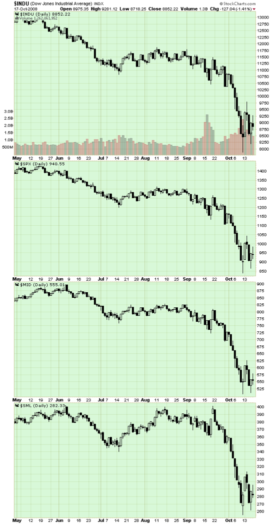
In this example, we'll create a chart of the Dow with the S&P Large Caps, Mid Caps, and Small Caps below it.
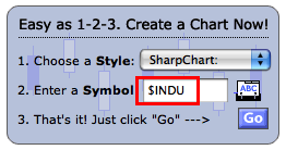
Create a chart of your "first" stock
There are several ways to create a new SharpChart. The easiest is to just go to our homepage and enter "$INDU" into box for step #2, then press "Go".
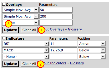
Remove any existing Indicators and Overlays
To make things easier, let's remove any Indicators and Overlays on your default chart. The quickest way to do that is to click the "Clear All" buttons in the "Overlays" area (#1) and "Indicators" area (#2). Be sure to click the "OK" button to confirm each removal. Finally, click the "Update" button (#3) to display your clean chart.
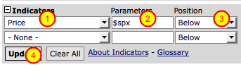
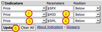
Add the "second" stock as a "Price" indicator
So here's the magic: You can use the "Price" indicator to add additional ticker symbols to your chart. Simply select "Price" from one of the empty indicator dropdowns (#1) and then enter the ticker symbol you want to chart in the "Paramaters" box (#2). In our case, we want to use "$spx" (which is, coincidently, what is automatically added). Finally, we want the $SPX plot to appear underneath our current Dow chart, so we need to make sure that the "Position" dropdown is set to "Below" (#3). Finally, as always, let's click the "Update" button (#4) to see what we get.
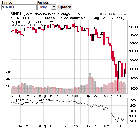
Checking our progress so far
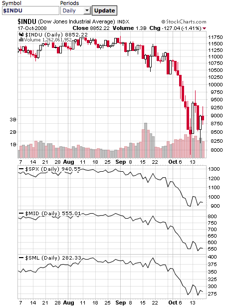
At this point, you should have a chart that looks similar to the one above. (Note: Members that have changed their Default chart settings will probably see some differences in any areas that they changed.) Note that $SPX now appears below the chart of $INDU.
Add the other two ticker symbols
Let's add the other two indices by repeating the process we just learned. Don't forget to change the value in the "Parameters" boxes (#2 and #4) to $MID and $SML. When you're done, click the "Update" button (#5) to see the results.
Checking the results
You should see something very similar to the chart above. This is about as good as a Free User of StockCharts.com can get. StockCharts.com members however have some very powerful additional capabilities that I want to look at next.
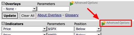
Opening the Advanced Options area
Members who are logged in should see the green "Advanced Options" triangle located just to the right of the "Indicators" area. (Don't confuse it with the one next to the "Overlays" section.) If the Advanced Options area isn't already on your screen, click that green triangle to make it appear.
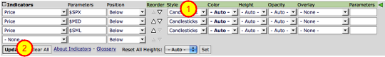
Change to an "All Candlestick" chart
Let's display the other indices as candlesticks instead of line plots. Find the "Style" dropdowns (#1) and change all of them from "- Auto -" to "Candlestick", then click "Update" (#2). You should see 4 candlestick plots on your new chart. Terrific! But wait... The three indices' plots are not as tall as the $INDU plot. Let's fix that.
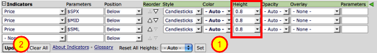
Increase the height of the Price plots
For this example, we want the indices' to be 80% as tall as the Dow chart. The quickest way to do that is to use the "Reset All Heights" dropdown (#1). Select "0.8" from that dropdown, then click the "Set" button. As soon as you do that, all of the "Height" dropdowns (red box) are changed from "- Auto -" to "0.8". You can then click the "Update" button (#2) to see the results.
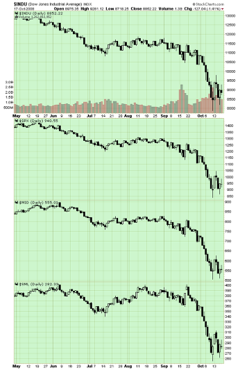
Checking our progress
You should see something similar to the chart above (which has been scrunched down to save screen space). Four candlestick plots of different ticker symbols in one chart - pretty cool! There's still one more thing I want to add however - time scales for the $SPX and $MID plots.
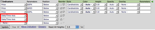
Adding more time scales
Back down in the "Indicators" area, select "Date/Time Axis" in the empty indicator dropdown. Then do it again so that you have two of them (red box).
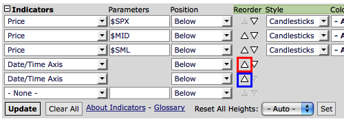
Move the time scales into position
Find the "Up" triangle in the "Reorder" column that's next to the first "Date/Time Axis" (Red Box). Click on that triangle twice to move that "Date/Time Axis" line directly under the "Price" indicator for $SPX. Next, find the "Up" triangle for the second "Date/Time Axis" (Blue Box) and click on it once to move it under the "Price" indicator for $MID. Finally, click "Update" to see our finished masterpiece!
Click here to see a live version of this chart.
As with all forms of power, this one does come with some limitations. Free users and Basic members can only add up to 3 additional ticker symbols to any chart. Extra members can add up to 6.
Sorry for the length of this article, but I wanted to be absolutely sure that everyone knows how to use this important capability. Hopefully you can take the lessons from this demonstration and improve your charts as a result.
- Chip
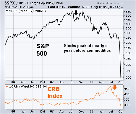
COMMODITES ARE LAST ASSET TO PEAKby John Murphy | The Market Message A number of readers have asked if I thought the U.S. was in a recession or heading into one. Others have asked if I thought this recession would be worse than most. Although I'm not an economist, it is possible to make some judgements about the direction of the economy by looking at various financial markets. Two of them are stocks and commodities. On July 18, I wrote an article suggesting that commodities were peaking based on a number of technical indicators. That article also contained a headline that read: "Commodities Peak During Bear Markets". Here is an excerpt from that earlier message: "At the end of an economic expansion, stocks usually peak before commodities. If stocks enter a bear market (and a recession starts), commodities usually enter a downside correction as well. During the stagflation years of the 1970's, serious downturns in stocks caused profit-taking in commodities. The commodity rally resumed after the stock market and the economy turned back up again." Stocks lost half of their value during 1973 and 1974 which led to a recession the second year. Commodities also dropped during that recessionary year. Historical studies show that stocks peak anywhere from six to nine months before the economy. From October 2007, that would put the outer target for an economic peak in July 2008 which is when commodities peaked.
DIA RETURNS TO THE GAPby Arthur Hill | Art's Charts
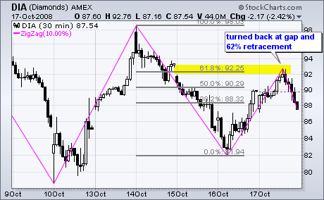
In a volatile week with huge swings, the Dow Industrials ETF (DIA) returned to Wednesday's gap with another 10% move. The magenta lines on the 30-minute chart show the zigzag indicator, which measures movements that are 10% or more. As you can see, there was an advance greater than 10% on 12-13 October, a decline greater than 10% on 14-16 October and an advance greater than 10% on 16-17 October. Wow, what a week for day traders. There was a day when these swings would look impressive on a weekly chart. Obviously, this is not your father's Dow.
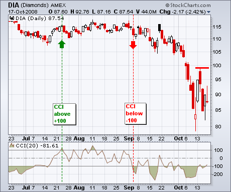
With these big swings, the Dow Industrials ETF (DIA) remains stuck in a volatile range and short of a breakout on the daily chart. I am watching two items to signal a trend changing breakout. First, the pullback on Tuesday-Wednesday established key resistance around 99. Mondays' surge was impressive and Thursday's recovery affirms support, but we have yet to see follow through and a resistance breakout. Second, the Commodity Channel Index (CCI) moved below -100 in early September and momentum remains bearish overall. At the very least, CCI needs to break into positive territory. However, I would like to see a surge above +100 to show some real strength and turn momentum bullish. Be sure to check out the corresponding video for more details.
There is also a video version of the this analysis available at TDTrader.com - Click Here. VERY OVERSOLD MARKETby Carl Swenlin | DecisionPoint.com
To say that the market is very oversold is not exactly breaking news because it has been oversold for at least a few weeks; however, the oversold condition has been steadily getting worse over that time, and we have perhaps reached the limit of how oversold the indicators will get without the market taking some time to clear the condition. Keep in mind that the condition can be cleared if the market merely drifts sideways while indicators drift higher toward neutral territory, but, considering the kind of volatility we have been experiencing, it seems that a rally is more likely.
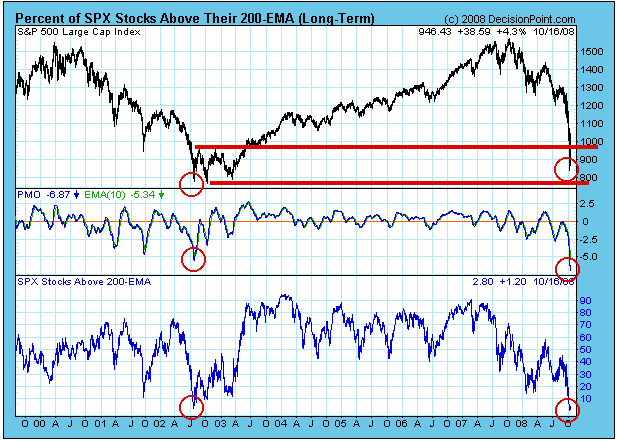
Let's look at the chart below, which has some major points of interest. First, the PMO (Price Momentum Oscillator) and the Percentage of Stocks Above Their 200-EMA have reached their lowest points since the July 2002, which was the beginning of the end of the 2000-2002 Bear Market. Note that it took nearly nine months for this bottoming process to take place in the form of a triple bottom. Also, current prices have dropped into the support zone provided by that previous bear market bottom.
This all looks like a pretty good setup for at least a bear market rally of some substance. The first thing that has to happen is a rally the lasts more than two days, and we need to see if the bottom will be a "V" spike or a double bottom with at least several weeks between each bottom. The latter would be preferable because, the more work put into the bottom, the longer the rally is likely to last. A "V" bottom would beg for a retest.
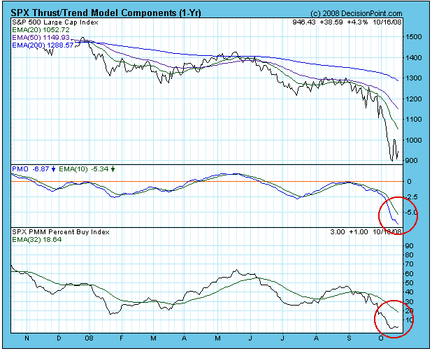
Any rally that begins now should be viewed and played as a short-term event, because we have seen how quickly they have been running out of steam. The first indication that a rally may develop into something longer term will be if the Thrust/Trend Model generates a buy signal. On the chart below I have highlighted the two components of the T/TM that we need to watch -- the PMO (Price Momentum Oscillator) and the Percent Buy Index (PBI). When both these indicators have passed up through their moving averages, a new buy signal will be generated. Even though this is a medium-term signal, it should also be worked as a short-term event, because of the whipsaw we have experienced during this bear market. (The rally last long enough to trigger a buy signal, then fails.)
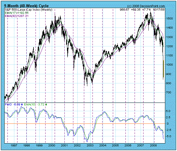
Finally, I am compelled to show you a chart of the 9-Month Cycles. My current projection for the next cycle low is October 22. As you can see, it is highly likely that the cycle low is already in as of last week, although we can never be sure except in hindsight. Nevertheless, the cycle chart is one more piece of evidence that we could be getting a sustainable rally at any time.
Bottom Line: The market is extremely oversold, and we have plenty of evidence that a rally is due. I do not for one minute believe the bear market is over, but it does not seem reasonable that the vertical descent will continue unabated. Reasonable? Perhaps that is not the best word to use in these circumstances. Let's just say that the technicals are screaming for a good sized bounce. Having said that, I will leave you with a reminder that we are playing by bear market rules. Oversold conditions are extremely dangerous and do not always present opportunities on the long side. Be careful! IS THIS THE BUFFETT-BOTTOM?by Tom Bowley | InvestEd Central Warren Buffett said he was buying stocks this past week. Should you? Well, it depends. If you buy stocks on a regular basis as part of a disciplined strategy - say in your 401(k) plan - then keep buying. The idea of buying stocks over the long haul is not only to buy when the market is soaring, but more importantly, to also buy when the market is falling. The key element is your time horizon. If you don't need the money for the next 5-10 years, then you stay invested and keep buying.
Here's the problem. Fewer and fewer of Americans buy and hold. We've seen many of our strongest companies buckle. Most financial companies have been brought to their knees during this financial crisis and the crisis is threatening to take many other sectors with it. American International Group (AIG) was thought to be a darling among Wall Street analysts. We don't need to detail the woes of AIG, just suffice it to say that no company is immune to failure. So if you're of the buy-and-hold mentality, remain diversified.
I am not of the buy-and-hold mentality and never will be. Technical analysis is where it's at. When the first signs of technical weakness appear, beware. Let sectors regain relative strength before committing back into the group. This very simple strategy avoids major carnage and it's the major carnage that wrecks portfolios, not the minor losses from timing a trade incorrectly.
Charts 1 and 2 below highlight, in hindsight, two major sector breakdowns in our market over the last few years. Both are heavily responsible for the technical damage the entire market is suffering right now.
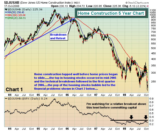
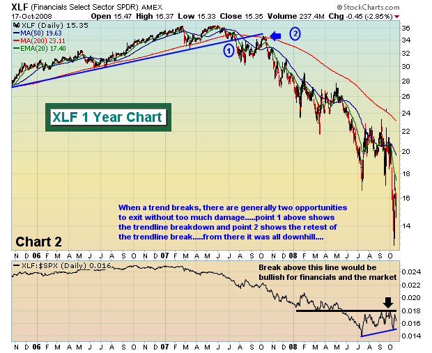
We need housing to begin to show signs of improvement before the major indices are likely to recover.
While I have tremendous respect for Warren Buffett as an investor, he will admittedly tell everyone that he can't time market bottoms. I will wait for more technical signs before becoming aggressive.
Over the course of the last 3-4 weeks, the only trades that Invested Central has considered have been ETFs and they've been few and far between. Options expiration and max pain provided some super opportunities last week as the number of net in-the-money puts was 3 to 4 times the amount we had ever seen before. Coincidentally (sarcasm intended), the market soared on Monday and gapped up on Tuesday and we headed for the exits. We are 100% in cash at the moment and plan to stay that way in the near-term as the gyrations in the market are nauseating.
During markets like this, capital preservation is Job #1 for traders.
Happy trading!
Join Tom and the Invested Central team at www.investedcentral.com. Invested Central provides daily market guidance, intraday stock alerts, annotated stock setups, LIVE member chat sessions, and much, much more. "JUMP OFF POINT" FOR CRUDE OIL?by Richard Rhodes | The Rhodes Report Quite simply, the trend is sharply lower. The massive de-leveraging taking place in the capital markets has not spared crude oil at all; however, this shouldn't be a surprise given the "bell ringing" at the top was none other than a "key reversal month" that has led to mean reversion back into the 50-month moving average. The question is whether this level now crossing at $73.43 can be regained in the days ahead and be used as a "jump off point" to further gains. Unfortunately, we think not. A number of fundamental and technical factors at play will not allow for this to occur, with the probability of an even sharper decline than what we have seen YTD if prices
continue to extend lower below this level.
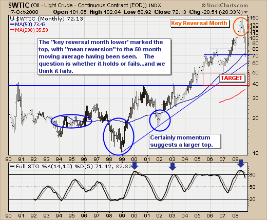
One only need look at the 14-month stochastic that it has just rolled over and exited overbought territory. Hence, it remains quite some distance from levels that in the past have provided for rallies. If the stochastic must move to oversold levels, then it could very well be one year or more before we see a larger and more tradable bottom, this obviously begs the question as to what level crude would obtain before this larger rally could unfold. Our current target is $40,which will come into closer purview if the rising trendline at $60 is violated.
Given this, one would obviously not want to be in the oil stock complex to be sure; with the integrated oil players such as Exxon-Mobil (XOM), Conoco-Phillips (COP). Chevron (CVX) and Marathon Oil (MRO) likely to outperform the Oil Service stocks as they did during the last crude oil downturn. If we are have a favorite, it would be Chevron (CVX) given it sports a 4.10% dividend
Good luck and good trading! |
|
|
|
|
|
|
|
|
|
|
|
|
|
|