This is the third part of a series of articles about Technical
Analysis from a new course we're developing. If you are new to
charting, these articles will give you the "big picture" behind the
charts on our site. if you are an "old hand", these articles will help
ensure you haven't "strayed too far" from the basics. Enjoy!
(Click here to see the beginning of this series.)
Chart Construction
Charts are created from data - Price data and Index data. After discussing the various types of data used, weâll look at how charts are constructed.
Price Data
Exchanges record the price and number of shares for each stock transaction. These individual transactions are called tick data. Tick data is compiled over different periods of time to construct price bar data. Price bars show the beginning, highest, lowest and ending prices for a chosen time period. Individual price bar time periods can range from one minute to one year. Daily, weekly and 60-minute price bars are other common examples.
Price bars less than a day long are known as intraday price bars. Intraday price bars range from one minute to one hour and are typically used in technical analysis by day traders who hold positions for a matter of minutes or hours.
A daily price bar is constructed of all the transactions during a full day of trading. Daily price bars are most often used in technical analysis by investors who hold positions from days to years.
The number of shares traded in each transaction is called volume. Volume is recorded as tick data just like price. Volume tick data is added together to construct volume bars and are then charted with their corresponding price bars for technical analysis.
Index Data
Data for hundreds of indices, published by financial service companies and the major exchanges, are provided to StockCharts.com through third party data providers. Indices are not tradable financial instruments. Indices represent domestic and foreign market averages, industries, commodities, currencies, bonds and many other price, volume and breadth measurements of market activity. Examples of market indices include the Dow Jones Industrial Average ($INDU), NYSE Healthcare Index ($NYP) and the New Zealand Dollar ($NZD). The financial service companies are responsible for the accuracy of the indices they publish.
Breadth indices measure how many issues move within a particular market index. Breadth indices give analysts insight into investor sentiment. Examples of breadth indices include NASDAQ Advance-Decline Issues ($NAAD), NYSE Advance-Decline Volume ($NYUD) and AMEX Issues Unchanged ($AMADU).
Price Chart
A price chart is a graph which shows how price and volume changes with time. Price charts on StockCharts.com are called SharpCharts. (Time-independent charting methods like Point & Figure charting will be discussed in detail later.)
The diagram above illustrates the layout of a typical SharpChart. Price data, volume data and technical indicators are displayed on a SharpChart. A technical indicator is a mathematical expression of price and/or volume which can provide insight into future price movements. We will talk more about technical indicators later.
Price data and overlays are plotted in the Price Plot Area. Overlays are technical indicators that are normally expressed in terms of price. Non-price values of overlays are displayed on the left axis as shown above.
Technical indicators that cannot be expressed in terms of price are normally plotted in the Indicator Panels. Although only a single Indicator Panel is shown above, SharpCharts can be created with multiple Indicator Panels displayed above and below the Price Plot Area. Additional date/time axes can be added between the Indicator Panels if needed. The legend for both the Price Plot Area and Indicator Panel contain the information used to create the SharpChart.
Next time, we'll get into the specifics of Line charts, OHLC Bar charts, and Candlestick charts.
At the start of the 20th century, Charles Dow invented the Dow Theory.
It was a simple idea. He created two stock indexes -- one for
industrial stocks and one for the transports (which were exclusively
rails). His reasoning was that both indexes should rise together in a
healthy economy. While industrial companies made the goods, the rails
transported those goods to market. One couldn't function without the
other. Although he was applying that idea to the economy, his Dow
Theory became a basic part of traditional technical analysis. When both
indexes are rising together, a bull market exists. When they fall
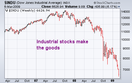
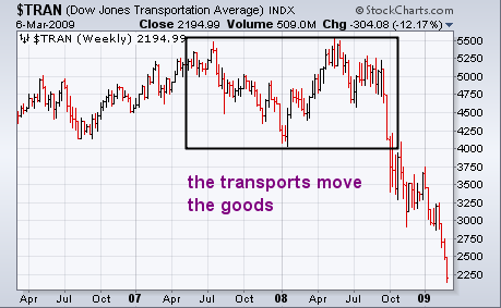
together, a bear market is present. Charts 1 and 2 compare the Dow Industrials and Dow Transports
over the last three years. Both are in major downtrends which is bad
for stocks and the economy. Although the transports turned down first
in the second half of 2007, they retested their old highs in the spring
of 2008 before finally peaking. The transports fell sharply during the
second half of 2008 and are now trading at the lowest level since 2003
(the industrials have already broken that low). Since most attention is
given to industrial stocks, I'd like to examine some driving forces
behind the transportation plunge.
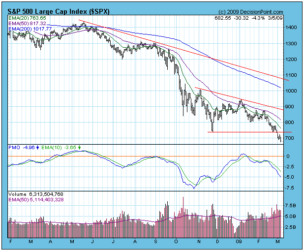
At the end of last week the S&P 500 had declined to and had settled
on the support created by the November lows. It was poised to either
rally and lock in a double bottom, or break down. On Monday prices
broke down through support, and by Thursday's close it could be said
that the breakdown was "decisive". When a breakdown is classified as
decisive (greater than 3%), it means that chances are very high that
the market will not be able to gather enough strength to rally back
above the recently violated support. Reaction rallies back toward the
support are possible, but not guaranteed.
The monthly-based chart below provides a better perspective of the
seriousness of the breakdown, and we can also see the location of
future support levels. The next support is at 600, at the low of the
medium-term correction in 1996. I do not consider this an important
support level. The first important support I see is the line drawn
across the 1994 consolidation lows -- around 450 on the S&P 500.
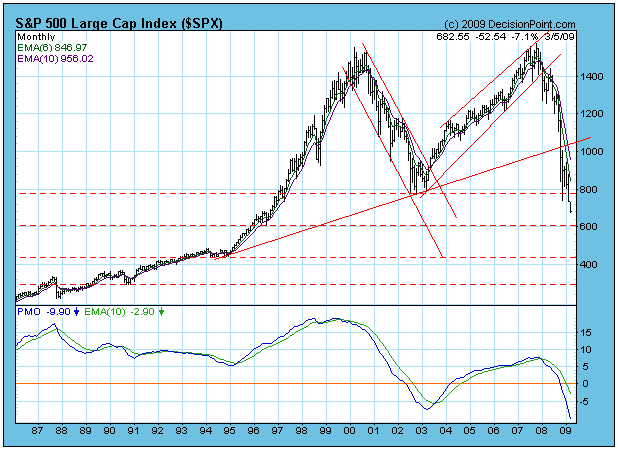
The market is now very oversold in the medium-term and long-term, but
in a secular bear market this is not a cause for rejoicing. Bear
markets can crash out of oversold conditions.
Bottom Line: The S&P 500 has decisively violated important
support, and the most likely consequence is that prices will continue
to decline, with 600 on the S&P being the most obvious level for us
to see a bounce of any significance. While we could see a bounce before
then, I think we should be more concerned that the decline will
accelerate into a crash. There are still investors who have endured the
decline from the bull market top and who were hoping that the 2002 bear
market lows would mark the end of the current bear market. Now that
long-term support has been clearly broken, another round of panic
selling could be just around the corner.
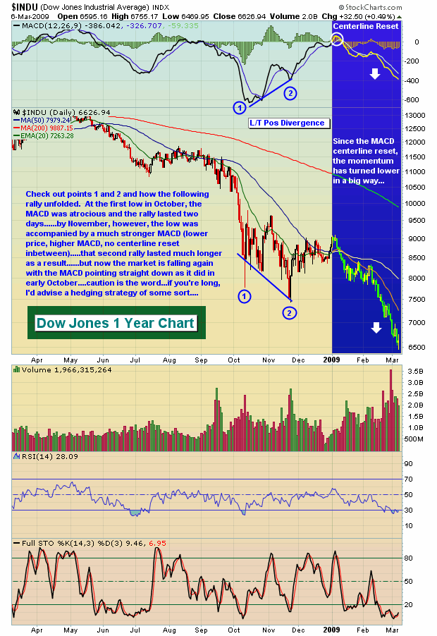
Significant market bottoms generally share many key characteristics. I like to see a spike in volume to get that last wave of selling in place. During this "panicked" phase, it's also important to see pessimism rise to a relative level where we can be fairly confident that a rally can last more than an hour or two. Obviously, oversold momentum oscillators like stochastics and RSI are in play at a bottom. My favorite momentum oscillator - the MACD - can provide clues as to the duration of any potential rally.
On the Dow Jones chart below, notice that the MACD is pointing straight down on the daily chart. It's unusual to see a long-term bottom form when momentum is so negative. So at this point, if the pessimism ramps up to a point where a bottom forms, I'd only be looking for a short-term rally to follow. In order to see a more sustainable rally ensue, I need to see this momentum slow and begin to reverse. That's where long-term positive divergences come into play. The market showed much more stability after the November lows and the positive divergence formed on the daily chart. Check out the Dow Jones chart below:
While I acknowledge that market bottoms can be carved out without extreme pessimism, this type of pessimism usually does form during emotional markets. I would certainly be much more confident about trading a rebound in the market if the pessimism reaches an extreme level first. On the S&P 500 chart below, I've highlighted recent market bottoms, the 5 day moving average of the equity only put call ratio at that time, and the subsequent gains realized off of the panic bottom. It's important to note that the average equity only put call ratio reading since the CBOE began providing the data in 2003 is .67. The average since September 1, 2008 is .79, much higher due to the increased fear overall. From these numbers, you can see that any move of the 5 day moving average above .90 should be respected. Here's the chart:
For free educational videos of the put call ratio and how to successfully incorporate them in your trading strategy, go to www.investedcentral.com/putcall.html.
Happy trading!
This year has seen the S&P decline by -24.3%; with the building crescendo of "fear" likely to provide for a bottom that can be traded sooner rather than later. We're looking towards sector rotation to play a large part in our trading strategy; and we're quite interested in the fundamentals as well as the technicals regarding a "long Industrials/short Healthcare (XLI:XLV)" pairs position. Quite simply, the Industrials have underperformed the S&P by -10.2% YTD, while Healthcare has outperformed by +7.5% YTD - this notes the obvious safety factor inherent in the Healthcare sector given its "less volatile" nature. However, the Obama Administration's tackling of the US healthcare system has sent XLV prices lower in the past two weeks. Moreover, there will likely be pressure upon XLV for the foreseeable future as Healthcare "safety" becomes a source of funds for those stocks - such as the Industrials - that have been beaten down. This is the fundamental argument.
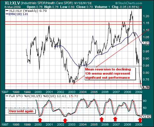
Technically speaking, the XLI:XLV ratio has fallen rather precipitously in the past year from above 1.20 to a new low at 0.70; but it is precisely this "plunge" that has put the distance below the 130-week exponential moving average at historic proportions, with the 30-week stochastic falling below the oversold 20-level. We are mean reversionists at heart; and given this distance and the prior instances of the 30-week stochastic turning higher - then we are very interested in putting on this trade as the risk-reward is in our favor. Now, it hasn't turned higher yet; but once a catalyst appears...we'll be doing so.
Good luck and good trading,
Richard