Hello Fellow ChartWatchers!
Talk about your "Wall of Worry"! These days there are tons of things to worry about. So are the bulls going to be able to keep climbing?
Whenever I want to get a solid, high-level view of the overall market I turn to our trusty Bullish Percent Indexes. Specifically the Bullish Percent Indexes for the nine S&P Market Sectors.
Remember, a Bullish Percent Index (BPI) takes a group of stocks and records the percentage of those stocks that have a "P&F Buy" signal on their Point and Figure charts. So BPI's are market indicators that range between 0 and 100 and give you a great sense of how bullish or bearish that group of stocks is.
We currently have BPIs for 19 different groups. Here's the complete list. Note that our BPI's always have ticker symbols that start with "$BP".
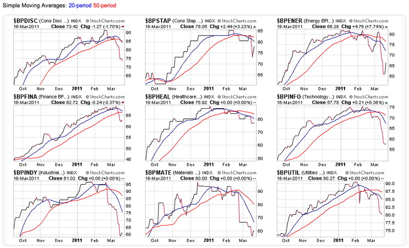
The nine S&P Sector BPI's are created from the members of the nine S&P Sector ETFs. They provide a broad view of the market as a whole and can help spot sector rotation effects. In the case of their BPI's, our CandleGlance tool is perfect to seeing how these BPI's are doing:
(Click above to see live versions of these charts.)
In a phrase, things are doing "Not good" if you are a bull. All but one of the BPI's have recently had their 20-day MA cross under their 50-day MA and most are continuing to move lower. A strong rally will be needed very soon to prevent most of them from moving below 50 for the first time in quite a while.
- Chip
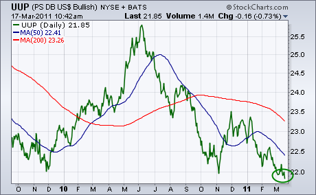
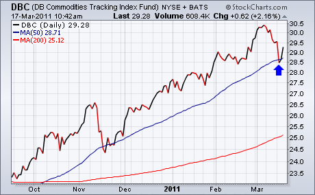
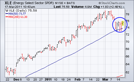
Traders continue to sell the U.S. Dollar. In yesterday's trading, the dollar fell to a 20-year low against the Japanese yen. Today, it's falling against everything else. More importantly, the greenback is breaking important support levels. Chart 1 shows the PS Bullish Dollar Index (UUP) falling to the lowest level in three years. One of the side-effects of a falling dollar is stronger commodities and shares tied to them. Right on cue, both are bouncing. Chart 2 shows the DB Commodities Tracking Index Fund (DBC) bouncing off its 50-day moving average (blue line) and gaining 2%. Virtually all individual commodities are bouncing today. As are shares related to them. Chart 3 shows the Energy Sector SPDR (XLE) bouncing off its 50-day line. Precious metal shares are also rebounding.
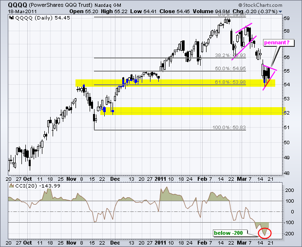
With big declines on Wednesday, the Nasdaq 100 ETF (QQQQ) and the Russell 2000 ETF (IWM) both became oversold and hit potential support zones. The first chart shows QQQQ hitting support around 54 after an 8+ percent decline the last few weeks. This decline pushed the Commodity Channel Index (CCI) below -200 for the first time since early May, seen of the infamous flash-crash. Broken resistance, the December consolidation and the 62% retracement combine to mark support here. The ETF consolidated the last three days with a small pennant taking shape. A break, up or down, from this consolidation will provide the next short-term directional clue.
Click this image for a live chart
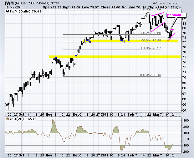
The next chart shows IWM hitting support just above 77. This support zone stems from the January lows and the 50% retracement mark. Notice that IWM held up much better than QQQQ over the last few weeks. CCI moved well below -100, but did not exceed its January momentum low and did not exceed -200. A small pennant also formed the last three days. A move above 80 would put the bulls back in play, but a break below 78 would argue for a continuation lower with the next support target around 74.
Click this image for a live chart
(This is an excerpt from Friday's blog for Decision Point subscribers.)
My wife is something of an insomniac, so she listens to a lot of nighttime talk shows -- not the best cure for insomnia, I'll bet. Recently she told me about the comments of some guest on some talk show -- sorry, but that's as good as I can do for attribution -- who had an analogy for the U.S. financial woes. He said we are like a person who makes $50,000 a year, spends $75,000 a year, and has $375,000 in credit card debt. Hopeless is what it is.
From Mauldin and Tepper's Endgame: The End of the Debt Supercycle: There is a limit to how much debt you can pile on. As the work of Reinhart and Rogoff points out in This Time It's Different (2009), there is not a fixed [emphasis mine] limit for debt or some certain percentage of GDP where it all breaks down. Rather, the limit is all about confidence. Everything goes along well, and then "bang!" it doesn't.
"Confidence" has always been the keyword in financial markets. We get a daily diet of economic news with a determined spin about how the economy is gradually improving, but in the background the Fed and the politicians keep digging a deeper hole of debt. And the story is the same around the globe -- governments trying to exacerbate the threat of horrible levels of debt by piling on even more debt.
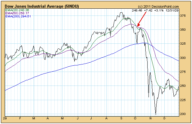
The real question is if the collapse really will be a "bang!" moment, of whether there will be some kind of advance warning upon which we can act. As a technical analyst I believe there will most likely be a gradual deterioration ahead of the "bang!", and we must assume that the deterioration has gone too far when the 20-EMA crosses down through the 50-EMA. To illustrate this point, let's look at two of the most catastrophic financial events in the last 100 years -- the 1929 Crash and the 1987 Crash.
The first chart is of the Dow Industrials in 1929. Note that the 20-EMA crossed down through the 50-EMA about two weeks ahead of the Crash. Some will complain about the two whipsaw signals earlier in the year, but this kind of activity characteristically precedes major tops and part of the cost of doing business if you want to avoid major declines. To mitigate the damage of these whipsaws, our timing model only generates a NEUTRAL signal (instead of a SELL) when the crossovers occur above the 200-EMA.
Next is the 1987 Crash. It is hard to see, but the 20/50-EMA crossover occurred four days ahead of the crash. Again, there was a short whipsaw earlier in the year.
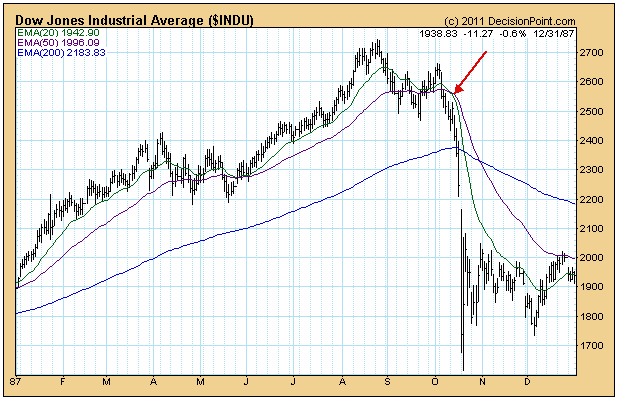
Bottom Line: Catastrophic market events are usually a big surprise to most people, but they rarely take place without giving some advance technical warning signs. The moving average crossover has been a reliable, though by no means perfect, signal for impending trend changes. It is certainly one way we can attempt to be prepared ahead of the "bang!".
For the first time since August 2010, the bears are in control of the short-term action. I haven't lost sight of the intermediate- and long-term uptrends that are in place (which remain bullish), but I also am not going to ignore the clear breakdowns of the past few weeks on heavy volume.
Perhaps the most bearish indication has been the impulsive nature of the selling. Below is a chart of the NASDAQ 100:
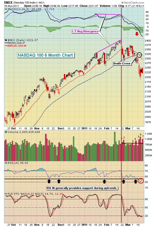
There are a few things to point out here. First, this is a 6 month chart showing that the near-term technicals have eroded. Longer-term weekly charts remain quite bullish. Long-term charts cannot breakdown without the shorter-term charts breaking down first. With that in mind, let's take a look at a few of the issues the bulls will need to address in the very near-term.
The combination of price/volume is the most significant piece of technical evidence in my opinion. It trumps EVERYTHING else. It's very difficult to take a bullish view on the price/volume combo since mid-February. I've drawn a vertical red line to separate what was solid price/volume trends from the more bearish trend we've seen over the past month. Since the downtrend began, the 7 highest volume days on the NDX have all been down days. 5 of those 7 days have had closes more than 1% below opens. This demonstrates that there's plenty of distribution taking place throughout the trading day. It's not simply a gap down and the weakness is over. Those big red candlesticks tell a scary story.
The weakness was preceded by a long-term negative divergence on the MACD. That was a warning sign that momentum was beginning to slow. The subsequent MACD centerline cross was followed by a death cross (black circle in chart above). These are unmistakable signs that the bears are now in control. It was hard to dispute the fact that the bulls were in control for 6 months. Well, now it's the bears' turn.
Another red flag raised last week was the RSI falling beneath the 40 support level. While 30 marks oversold conditions, 40 has proven to be a fairly reliable RSI support level during uptrends if you study history. This just adds to the bearish short-term argument.
Determining whether market weakness simply represents a pullback or whether it is the start of a bear market is the subject of this month's Online Traders Series event. CLICK HERE for details.
I am very pleased to announce the launch of our Traders Boot Camp series, which is a FREE learning series on a wide range of topics associated with trading stocks. To register, CLICK HERE.
Happy trading!
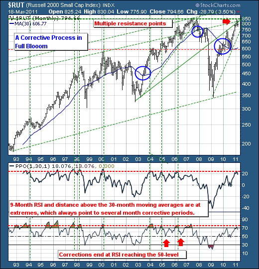
Over the past several weeks, we've seen the market leader Russell 2000 Small Cap Index ($RUT) falter modestly given Middle East/North Africa and Japanese concerns. Commonsensically speaking, this would have been expected, but certainly on a longer-term basis RUT was ready to decline from a technical perspective due to a number of reasons. They are:
1. RUT has rallied sharply off its low in a very short amount of time and back into the 2007 highs; long-term previous high resistance almost also proves difficult for a few months.
2. As resistance was tested, the 9-month RSI moved above the 70-level, which in the past has roughly marked a very overbought condition that has ultimately led to a corrective process that carries the RSI back towards a more neutral 50-level.
3. The distance above the 30-month moving average hit the 20% level; this is shown as a function of PPO. When this occurs, the the probabilities favor a multi-month corrective process.
Therefore, while world events hit the headlines, the Russell 2000 was certainly ripe for a correction anyway; and while many pundits will speak that the market is oversold on various short-term measures - it is not on longer-term measures. So this simple means we are sellers of rallies as they develop, with several more months before a bottom is to be found.
