| |
|
|
|
|
| |

|
ChartWatchers
the StockCharts.com Newsletter
|
|
|
|
|
|
|
|
Hello Fellow ChartWatchers!
Overlaid charts are a very powerful feature of StockCharts.com. Most people are familiar with using the "Price" Indicator with the "Behind Price" Position setting to create an overlaid chart. (If you aren't, be sure to read this article for more.) But overlaid charts can also be tricky to interpret if you are not careful. Consider the following chart:
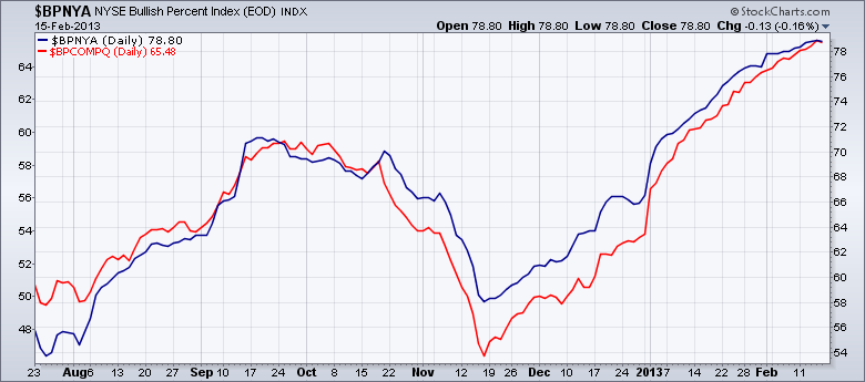
Which of these two Bullish Percent Indexes has the higher value? Looking at the chart, you'd say that both of them are currently about equal since both lines meet in the upper right corner, correct?
That would be an inaccurate interpretation however. Notice that this overlaid chart has two different vertical scales - the one on the right (54-78) is for the main ticker symbol ($BPNYA in this case) and the one on the left (48-64) is for the first overlaid symbol ($BPCOMPQ).
Here's the important part: For standard overlaid charts like this, our system automatically expands the vertical scale for all overlaid symbols so that the smallest value is very close to the bottom of the chart and the largest value is very close to the top.
When you are comparing two very different things - like two different stocks or a stock with an index - then that automatic expansion works well. However, when you are overlaying things (usually indexes) that share a common data range (e.g., Bullish Percent Indexes, Bond yields, etc.), you can easily create confusing charts.
In those cases, instead of using the "Price" indicator, you need to use the "Price (same scale)" overlay.
Compare the chart below with the chart above:
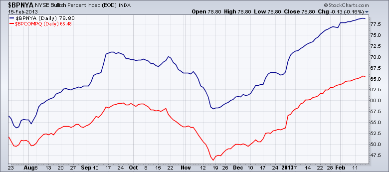
This is the correct chart to use when comparing the values (and thus the "strength") of these two indexes directly. It clearly shows that the NYSE BPI has been consistently higher than the Nasdaq BPI for months.
Again, I created this second chart by using the "Price (same scale)" overlay with $BPCOMPQ as its parameter. By understanding when to use the "Price" indicator" and when to use the "Price (same scale)" overlay, you will be able to create even better, more powerful charts.
- Chip
Quick Site Notes:
- We've create a new version of PerfCharts that we need help testing.
- Our Orlando SCU Seminar is next Saturday. Wednesday is the last day to register.
- We've announced new SCU seminars for Long Beach, Seattle, and New York.
- The Seattle SCU Seminar event will be the first time we offer "SCU 102 - Customizing and Configuring Your Account"
- The next ChartCon conference will be held in 2014. We want to ensure that ChartCon is always a high-quality event.
- Our online, educational videos area continues to grow.
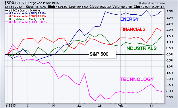
SECTOR LEADERS YEAR TO DATE...
Chart 1 plots relative strength ratios of the energy, financial, and
industrial sectors versus the S&P 500 (the black zero line).
Those three sectors have been the top performers year to date.
Technology has been the weakest (on a relative basis). Let's start by
taking a closer look at the two top sectors -- energy and financials.
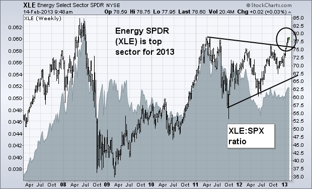
ENERY ETFS ARE BREAKING OUT TO THE UPSIDE...
The weekly bars in Chart 2 show the Energy Sector SPDR (XLE)
breaking out of a bullish "symmetrical triangle" (see circle). [A
symmetrical triangle is defined by two converging trendlines. Since
it's a "continuation" pattern (and the prior trend was up), it's a
bullish pattern]. The XLE is now challenging its early 2011 high. A
rise above that barrier (which appears likely) would pave the way for
an eventual rise to its 2008 peak. Its relative strength ratio (gray
area) has also turned up during 2013 for the first time in two years.
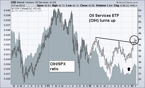
The weekly bars in Chart 3 show the Market Vectors Oil Services ETF (OIH) rising above a "neckline" drawn over its 2012 peaks (circle). Its relative strength line (gray area) has also turned up.
FINANCIALS REACH FOUR-YEAR HIGH...
It's usually a good sign for the stock market when financial stocks are
in a leadership role and in an uptrend. That's certainly the case on
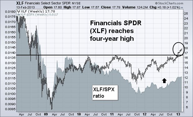
both points. Chart 4 shows the Financials Sector SPDR (XLF)
having risen above its 2011 peak to reach the highest level since 2008
(see circle). That represents a major bullish breakout and suggests
that the bottoming pattern that started in 2009 has been completed.
Its relative strength ratio (gray area) has also been rising and and is
now at the highest level in nearly two years. The XLF includes a wide
range of financial stocks that include banks, brokers, insurance,
financial service companies, and REITS.
The Nasdaq 100 ETF (QQQ) just canât seem to find its mojo this year, but the 2013 trend is still up and the bulls still have the edge, albeit a slight edge. First, note that QQQ has been trending higher since mid November. A three month uptrend means the medium-term trend is up, which establishes the path of least resistance. Second, QQQ stalled the first six weeks of the year and the Bollinger Bands narrowed significantly in early February. A Bollinger Band squeeze signals a volatility contraction that can lead to a volatility expansion.
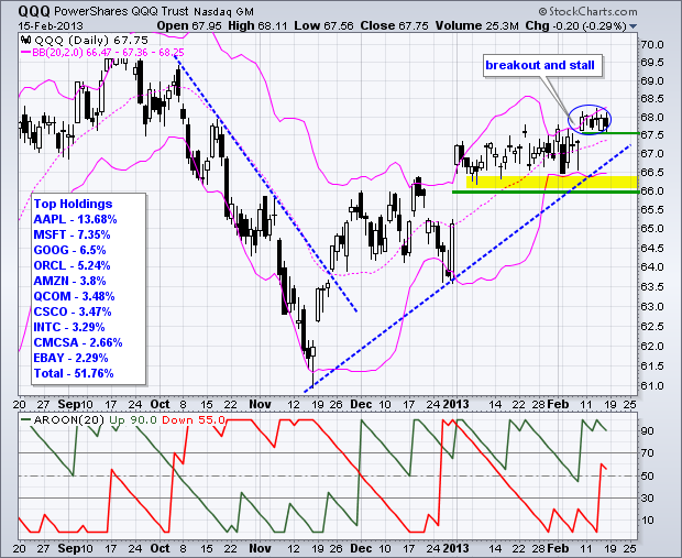 Click this image for a live chart It looked like the bulls were taking control when QQQ gapped up and broke resistance six days ago, but the ETF went right back into stall mode after this breakout. Looks like the volatility expansion has been put on hold. Technically, the breakout is holding because the gap has yet to be filled. After holding 67.50 for six days, a close below this level would provide the first sign of trouble. Medium-term, the January-February lows mark key support in the 66-66.50 area. Also notice that Aroon Up (green) remains above Aroon Down (red), although Aroon Down moved above 50 this week. A bearish Aroon cross would put another straw on the bullâs back. You can read more about the Bollinger Band Squeeze and Aroon indicators in our ChartSchool. Enjoy the long weekend! Arthur Hill CMT This weekend, I want to talk about the technology sector. Some of the major tops of the market have been spotted on the $NDX before the market breaks down.
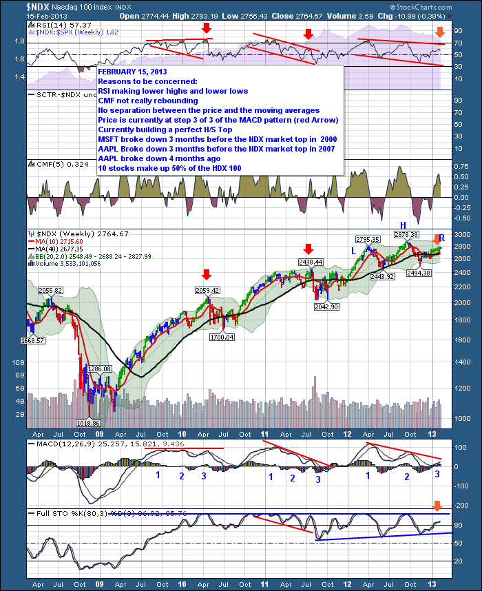
Here's the chart. It has a lot of data on it. I would encourage you to click on this link $NDX to see a larger version.
Let's start at the top.
- Lower Valleys on the RSI seem to be one of the consistent themes among the recent tops.
Well, we clearly are seeing that here. 3 months after the RSI has put major lows in, we are trending up, but I think everyone could agree begrudgingly. The tech market has not exactly exploded higher. If you look at the shaded area behind the RSI, that is the $NDX compared to the $SPX. It has been under performing for a while now.
- Looking at the CMF, the surface area of the recent pullbacks below zero are large, like the 2007/2008 top.
- The major fund managers aren't as supportive.
- After 3 months off the November low it hasn't been an overwhelming bull surge in. The price action is barely above the moving averages where usually the $NDX surges away from the moving averages. Maybe its just early and I am too optimistic in this charts power to outperform.
- The Head/Shoulders pattern is remarkably clear and the MACD is mimicking a perfect trend for a head/shoulders top. Highest peak on the first one, progressively lower after that. You will also notice the red arrows I placed on the 2 previous market peaks. They both happened at the 3rd peak of the MACD pattern. Again, the lower lows on the MACD is a better indicator than the lower highs but even the slightly lower highs were present in 2010. Specifically on the MACD, we would be very concerned if the market rolled over at this level. The MACD at such a low level, rolling over near zero would confirm a bigger decline coming in my view.
- To confirm all of this, The Full Sto's are above 80 so you are in overbought territory or a strong bull market depending on your view. I don't find the full Sto's that valuable an indicator currently, but if it breaks through the bottom of the current trendline (not immediately), we could find ourselves in a big bear market. Currently, the Full Sto's are half way between. Still bullish based on any interpretation.
- Lastly, I want to point out that MSFT was the market leader and it fell fast and hard in 2000. Then AAPL was a big market leader and it fell fast and hard from Dec 2007. And then recently, AAPL was the market leader but it has recently fallen fast and hard with slight slowing of growth. After a 40% pullback, we are all expecting it to rise here. In both previous cases, the pullback was 70%.
Too bearish a prediction? I don't know. I just know that all the traits and patterns are lining up. As the experienced technician likes to say....I know, it's different this time.
I will blog about the tech stocks this week. You can follow my blog at this address - The Canadian Technician.
Good Trading,
Greg Schnell, CMT Downward
pressure in gold prices continued as very large funds liquidated
substantial portions of their positions in the gold ETF (GLD). (See article.) Naturally, we need to look at the charts to give this story some context. (Charts were made before the close.)
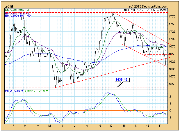
The
daily chart shows that price has reached the bottom of the declining
trend channel, the top of which is drawn from the October high. This was
something we thought likely because price failed to reach the top of
the channel before it started down again. Another important event that
happened today was that the 50-EMA crossed down through the 200-EMA,
signalling nominally that gold is in a long-term bear market. The same
type of EMA crossover occurred back in May 2012, so, obviously, the
"long-term" nature of the signal is not carved in stone, but it does set
the tone for the gold market.
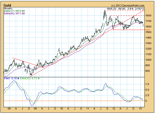
To
more accurately assess the long-term picture we need to zoom back to
the weekly chart. Here we see the +170% advance from the 2008 low. After
the top in 2011, prices have been moving in a horizontal range between
1540 and 1800, in what we would call a high-level consolidation. This is
also known as a continuation pattern, which implies that prices will
eventually break out of the consolidation and continue higher. That is a
nice scenario for gold bulls, but first it appears that prices will
have to retest the support at 1540 at least one more time. Obviously,
that is a critical support level.
The
most striking aspect of gold's behavior since the 2011 top, is that it
is not following "the script", which is that the Fed printing press will
drive gold prices higher. With the Fed printing money at unprecedented
rates, why, we must ask, have gold prices stalled for almost a
year-and-a-half? When our assumptions are not confirmed by actual price
movement, we must reassess our assumptions. A possible alternative would
be that the Fed's actions are not causing inflation, but deflation, at
least in that part of the economy that affects gold prices. To better
understand how this could be true, I recommend that you read the Quarterly Review and Outlook, Fourth Quarter 2012, by Dr. Lacy Hunt of Hoisington Investment Management.
Conclusion:
Gold could be in the process of consolidating a massive up move, and it
is currently headed toward a retest of the bottom of the consolidation
range at 1540. Failure of that support level would suggest that
assumptions about the Fed causing inflation (and an increase in gold
prices) should be questioned.
I remain bullish for 2013 and believe we could see 1700-1800 on the S&P 500 before the year is over. But I can't deny the short-term warning signs that are showing up everywhere. Let's take the issues one at a time.
1. Historical Tailwinds Have Ended
Since 1950, the months of November, December and January have been the three best consecutive months for the S&P 500 and have accounted for roughly 50% of all of this benchmark index's gains during this period. That period just ended. Unfortunately, February has carried an annualized return of -1.27% over the past 63 years on the S&P 500, making it the 2nd worst calendar month of the year. Making matters worse, February has an annualized return of 5.02% from the 1st through the 15th, but has an annualized return of -11.47% in February AFTER the 15th. Friday was February 15th.
2. Momentum Has Slowed
We only have long-term momentum issues on a few indices that include biotechs and homebuilders. But shorter-term negative divergences are popping up everywhere. On Friday, I ran a StockCharts scan of POSITIVE divergence candidates and there were 30. I then ran a scan looking for potential NEGATIVE divergences and my scan returned nearly 200. Obviously, momentum is becoming an issue.
Over the past three months, financials (XLF) and industrials (XLI) have been the relative leaders with gains of 17.73% and 16.77%, respectively. But slowing momentum is already very obvious on both of these daily charts. Check them out:
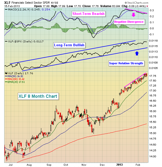
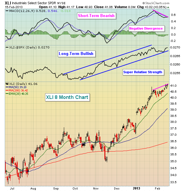
The move higher has been great. 17% returns in 3 months - it's tough to beat that. Yet both of these leaders are looking like they need a rest. Higher prices with lower MACDs don't guarantee us that a correction is coming, at least not as far as I'm concerned. What they DO tell me, though, is that risks are elevated and that is what technical analysis is all about. Instead of shallow pullbacks to test rising 20 day EMAs, I'm beginning to think we're ready for 50 day SMA tests.
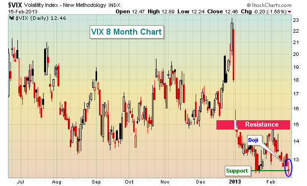
3. The Volatility Index ($VIX) Bottoming?
On Friday, the VIX not only tested the January low, signaling perhaps a double bottom, but it also printed a doji candlestick. Dojis are considered reversing candlesticks and it would make sense for the VIX to reverse at the current level. If it does reverse and move higher, it'll likely come at the expense of a declining stock market. You can check out the potential VIX bottom here:
4. The Dollar Rising
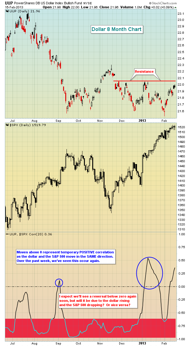
There has been a strong inverse correlation in place for several years between the direction of the U.S. dollar and the direction of the S&P 500. Lately, however, the S&P 500 has attempted to move higher while the dollar also moves up to test resistance. Something has to give here. A breakout in the dollar likely would increase the selling pressure on equities, so as we begin a new trading week, I'd keep an eye on how the dollar trades. Look at the recent POSITIVE correlation:
5. Major Price Resistance
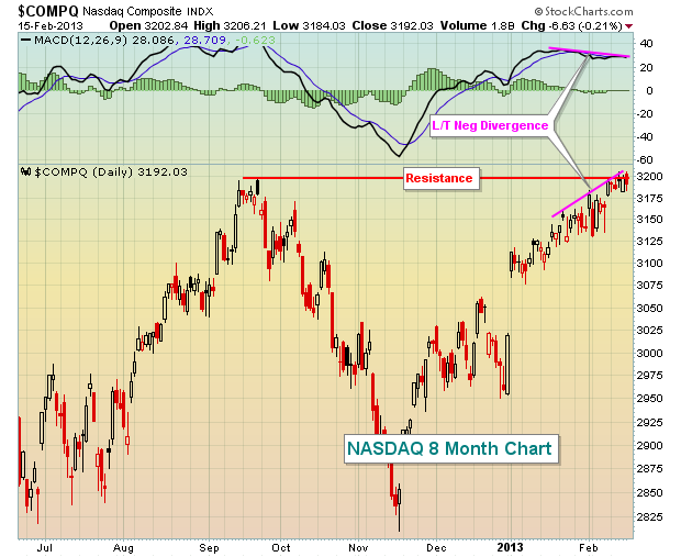
The Dow Jones has been battling the 14000 level for two solid weeks without much success. Just above that psychological price level is the Dow's all-time closing high on October 9th, 2007, of 14164.53. In addition, more recent price resistance resides at 3194.86, which represented the opening price on September 21, 2012 on the NASDAQ. While the NASDAQ was able to clear this level late last week, it's hard to call what it did a "breakout". Check it out:
So, in addition to all of the issues above, throw in significant resistance on two of our major indices.
6. Weak Friday Finish
I realize it's just one day, but our major indices have tended to finish much stronger than they did on Friday. I understand the Dow Jones turned green at the close, but note how both the NASDAQ and Russell 2000 lagged and finished well off earlier intraday highs. In addition, the three top performing sectors on Friday were all the defensive groups. It seems to be that the market is prepping for a pullback sooner rather than later.
Given all the warning signs, I'd avoid most stocks as we head into a holiday-shortened trading week. In particular, there are 5 S&P 500 stocks that look particularly vulnerable to selling this week. CLICK HERE or more details on these stocks.
Happy trading! |
|
|
|
|
|
|
|
|
|
|
|
|
|
|