Hello Fellow ChartWatchers!
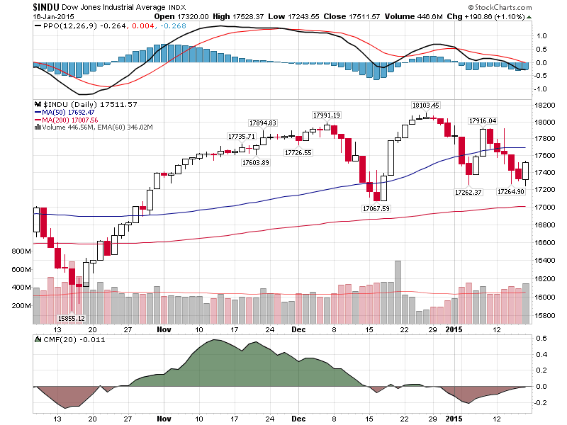
TGIF! Today's big turnaround saved us from an otherwise dreadful week as the Dow bounced off of support around 17260, the low at the beginning of the year. Our standard chart of the Dow shows the situation the best I think:
(Click the chart for a live version)
Take a second, look at that chart and see if you can spot any significant technical signals. Once you are done, read on to see what I spotted and then see if you agree.
In the near term, the Dow just tested the 17262 low from the start of the month. If it falls below that level, then the 17067 low from mid-December would be the next test. Clearly volatility has increased significantly since the snore-fest that was November. The most interesting thing to me about that chart however is the divergence between the MACD indicator on the top (measuring momentum) and the CMF indicator on the bottom (measuring money flow). In general, the MACD has been moving lower since peaking in mid-November. The CMF peaked at the same time and moved lower more-or-less together with the MACD until... the 17262 low at the start of the month. Since that low, the two indicators have moved in opposite directions. Will today's retest of that low change things going forward?
So who do you think will win out - momentum or money flow? Monday should be very interesting indeed... But until then, let's talk about webinars!
How to Attend a Live StockCharts.com Webinar
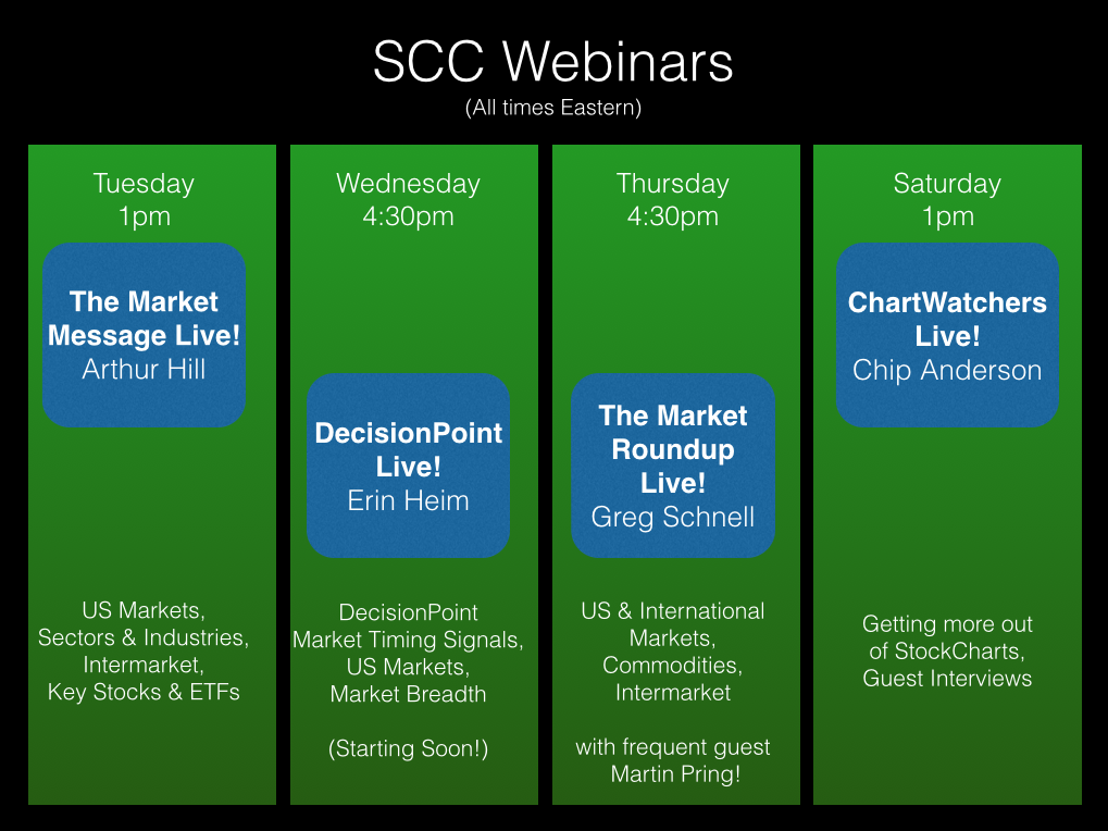
First off, did you know we now produce 3 (soon to be 4) different webinars each week? Hopefully that's not a complete shock. You can think of our webinars as similar to local radio / television shows. They are live events where one or two presenters spend about an hour doing various combinations of the following activities:
- Telling you what they think about the market
- Backing up those opinions with live charts
- Explaining how to use a feature on StockCharts.com
- Talking about their background and current projects
- Engaging in witty banter
- Answering questions from audience members
- Reminding you that the webinar videos are indeed archived on the site for later review
- Apologizing for running out of time... again!
- Conducting live audience polls
- ...and much, much more!
The feedback we've gotten on our webinars so far has been truly remarkable - unbelievably positive. Because of that, we are working on increasing the amount of webinar sessions. So which webinar(s) should you try to attend? Here's our current schedule:
So next question: Do you need to attend all of them? I can hear it now: "Chip, that's too many! My schedule's full enough as it is and now I have to attend all these webinars too?!?!? Aggggggghhhh!!!!"
Fear not good reader. I am here to explain how we see webinars fitting into things and what your priorities should be going forward.
First off, we see webinars are additional, optional content that supplements the various written articles that we have on the website. Most if not all of the information conveyed in our webinars is also presented in written format in our blogs are help articles. If tuning into live events just isn't your thing, then just ignore the webinars and keep using the website just like before.
Second, webinars are "live" - meaning that they are ad hoc and can contain mistakes and technical glitches. Presenters do spend a little time preparing for their webinars, but we can't go back and do a "second take" if things don't go well on the first try. In general, this is what makes webinars more interesting I think - but it does require a different level of tolerance from the audience than, for instance, a blog article does.
Third, webinars are archived. We put them up on the Internet for you to review (or re-review) at any point in the future. Here's the link: http://stockcharts.com/webinars/archives
Finally, webinars do have other limitations. For instance, you'll need to have the special GotoWebinar software installed on your computer/device in order to participate in the live webinar. Also, limited time combined with lots of viewers means we cannot answer every question that is sent in. Finally, the charts that are shown in a webinar are not clickable and thus you may not be able to easily re-create a chart that you see - although often those charts will appear in the presenter's blog later.
To sign up for a webinar currently, just watch for the appropriate announcement on our homepage and click the corresponding registration link. Currently, you have to re-register for each webinar. (That will change soon.) After you register, you will get an email with specific information about joining the webinar. If you can, try to join the webinar about 10 minutes early to ensure that your computer can connect properly.
Currently, all of our webinars are free and open to everyone. That will change soon however. Soon, our main market commentary webinars (i.e., Arthur & Greg) will only be available to members.
So, in conclusion: Webinars: great but optional. Join up if you can. Watch the archived version later if you can't. If you are short on time, read our commentary articles.
- Chip
Even though big round numbers should not have any technical significance, it is hard to argue with the magnetic pull of 2000 on the S&P 500. The index first neared 2000 when it broke above 1975 in July. After a pullback to the 1900 area in early August, the index made another run at 2000 and even crossed this level a few times in September. Alas, the index fell back again in October with a deep plunge below 1850, but came roaring back in November and finally got through 2000. Just as it seemed the 2000 area was going to be relegated to the past, the index fell back below 2000 in mid December. Notice how this broken resistance zone turned into support and the index again bounced back to new highs in late December.
So here we are in mid January and the index is once again battling the 2000 level. With Friday's weak open and strong close, the 2000 area is once again acting as support. Notice that the index formed a hammer on Wednesday and a bullish engulfing on Friday. Now let's see if we can get some follow through. A move above the wedge trend line would validate the 2000 area as support once again and suggest that the January correction is ending.
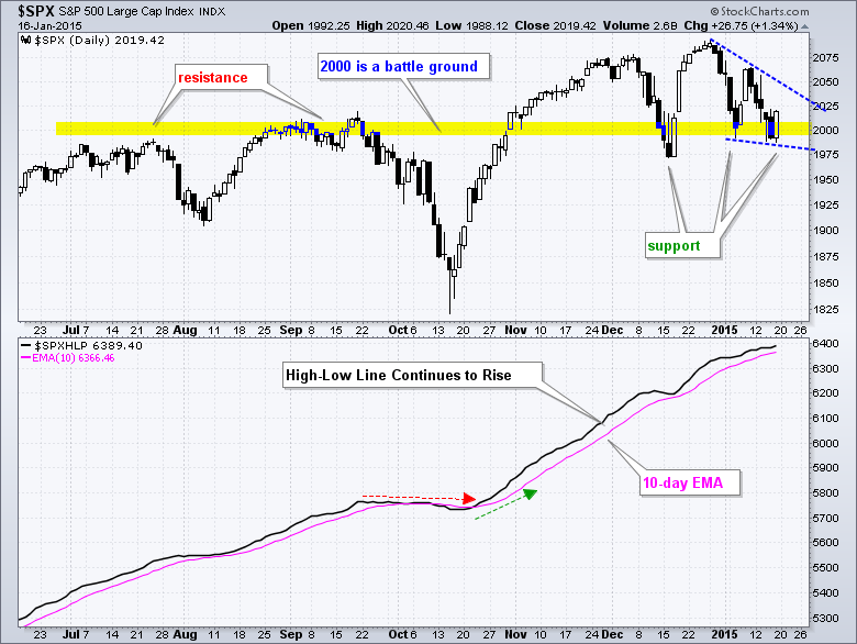
The indicator window shows the S&P 500 High-Low Line, which is a cumulative measure of High-Low Percent ((new highs less new lows) divided by total issues). The line rises when new highs exceed new lows and falls when there are more new lows. This simple indicator gives us an idea of the overall trend. The bulls get the benefit of the doubt as long as new highs exceed new lows, and the line rises. After flattening in late September and turning down in early October, this breadth indicator turned back up in late October and moved above its 10-day EMA. It has been above its 10-day EMA for almost three months now. The S&P 500 has a bullish bias as long as this line is rising (above the 10-day EMA).
Thanks for tuning in and have a great three day weekend!
Arthur Hill CMT
There are big expectations for Mario Draghi this week. He is supposed to announce some form of QE. There are a lot of interesting European charts but lets start with the Euro ($XEU). This week, the Euro took out the 2006 low. One of the major things to notice is that the MACD is at the third lowest momentum level in the history of the Euro. While that by itself does not make the low imminent, history would suggest we are near the lows unless we have a complete financial breakdown like the Global Financial Crisis.
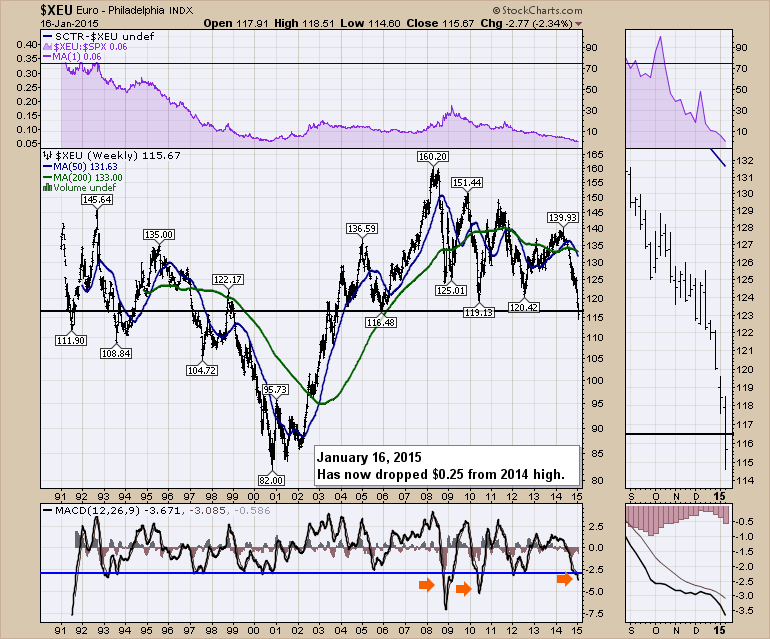
The daily chart of the Euro is interesting. For those who study candles, today was a big hammer candle.
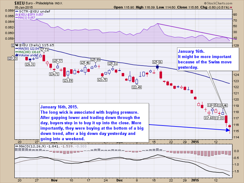
Some like to have the candle close above the open, but the most important part is that it closes near the top of a wide ranging day after a big downtrend. Germany is the strongest country in the Eurozone, but all of the charts shown for Europe seem to be turning up. Spain ($IBEX), France ($CAC), Italy ($MIB) and the UK ($FTSE) have behaved better over the last few weeks. The German Market Index ($DAX) closed at a new all time high today. It also made a new all time high in December. Higher highs and higher lows is the definition of a new uptrend. That started today!
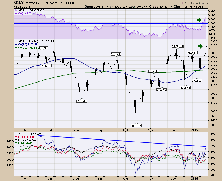
The most interesting part of the $DAX price action is the relative strength is now stronger than it has been since July 2014. Now what we need to see is confirmation. In the bottom panel, almost all the European markets have been building a small (very small) series of rising lows since the beginning of January while the US pushed lower. France ($CAC) shown in blue made one month highs today. If France can break this downward sloping trend line, that has to be considered as bullish and confirmation of the $DAX breakout. This also suggests to me that the European stocks might get a bounce with support from the hammer candle on the Euro. If the Euro and the equities start to run higher, this would encourage fund flows towards Europe. It will be an important week in Europe.
I recently published an article about the long bonds in America which discusses why fund flows may start slowing towards long term American bonds. That fits into this story line as well. That bond article can be reached by clicking here. Time To Start Thinking About A Long Bond Reversal ($USB).
Good trading,
Greg Schnell, CMT
The nearly six year bull market lives on, but the bulls have been taking several body blows of late. Whether this bull market continues could depend on a couple of key industry groups within the technology space.
First, let's take a look at computer hardware ($DJUSCR). This is the place that Apple (AAPL) calls home. This index topped in late November and has been mired in a bullish wedge the past couple months. On Friday, the DJUSCR hit price support at a time when its 60 minute MACD is just beginning to turn higher. Take a look at the daily chart of this influential group:
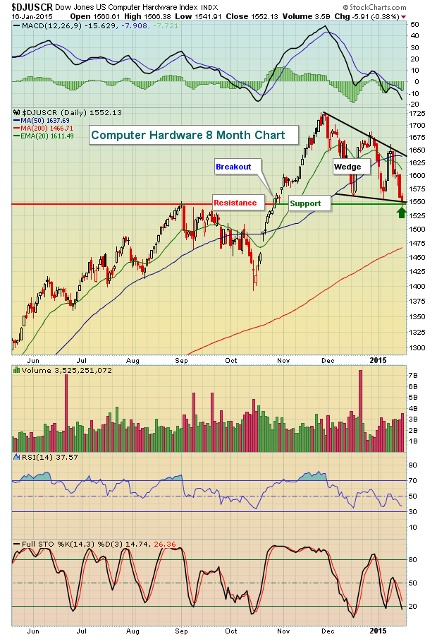
From this chart, you can see that Friday's action left the DJUSCR testing key price support at 1545 while in the midst of a bullish wedge formation. It's also easy to see that over the past several months, RSI readings in the 35-40 area have constituted excellent reward to risk entry points. It's difficult to say whether this level will hold as support, but it certainly offers up a low risk entry opportunity.
Now check out the shorter-term 60 minute chart:
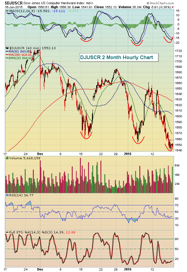
It appears as though this index is beginning to carve out a bottom very similar to the bottoms that formed in early January and mid December. A reversal at this level would not only make sense on the 60 minute chart, but also on the daily chart where that bull wedge has carried price action down very close to key price support.
In addition to computer hardware, semiconductors are holding onto significant price support as well. Check out the recent downward momentum and the test of price support on Friday:
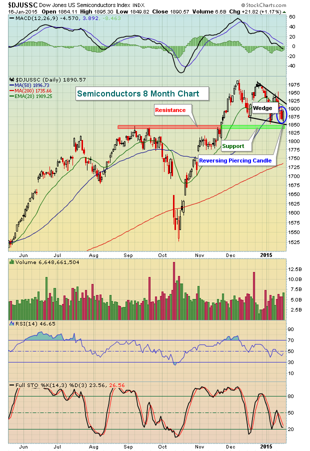
Semiconductors also are in a bullish wedge pattern and on Friday printed a bullish reversing piercing candle at price support and the bottom downtrend line of its wedge pattern. Throw in the RSI reading in the 40s and it appears that semiconductors also sport a very solid reward to risk ratio for traders on the long side.
Technology has been one of the driving forces behind this bull market so watching to see if these two leading industry groups can maintain their uptrends and stave off the bears will likely go a long way in determining how much is left in this bull market.
I'm featuring a key technology company testing major price support as my Chart of the Day for Tuesday, January 20th. You can register for this chart and all future Charts of the Day by CLICKING HERE.
Happy trading!
Tom Bowley
Chief Market Strategist
Invested Central


 From what I've seen of most investors' asset allocations, it's a maze. My personal asset allocation is better described as a labyrinth. Unlike a maze that attempts to make you mentally confused and physically lost, a labyrinth provides a path towards inner calm and mental clarity. My labyrinth allocation is in fact more accurately described as a methodology allocation and is...