A yield curve is a graphical representation of yields on bonds with different maturities. The most common example is the government bond yield curve, but it is very well possible to render a yield curve for other types of bonds, such as corporate bonds, high yield bonds, etc.
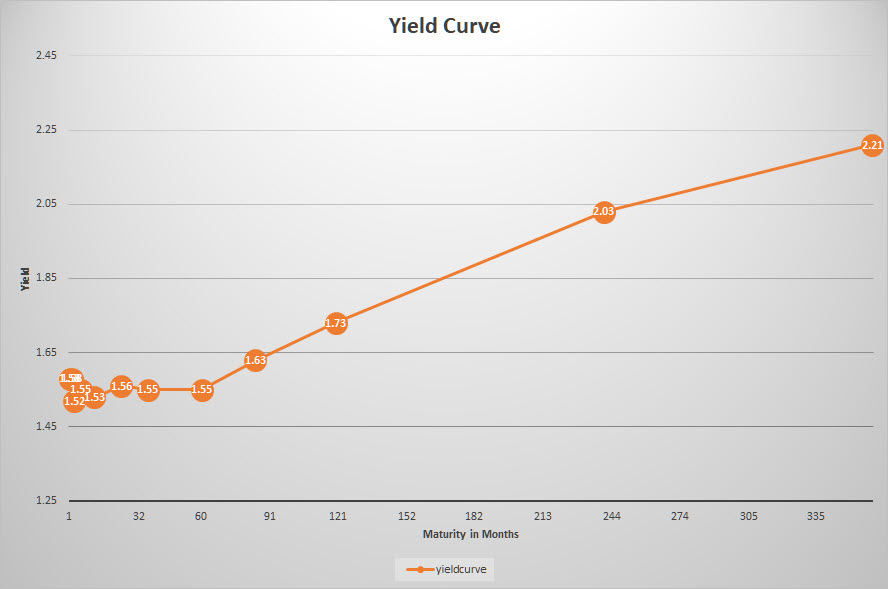
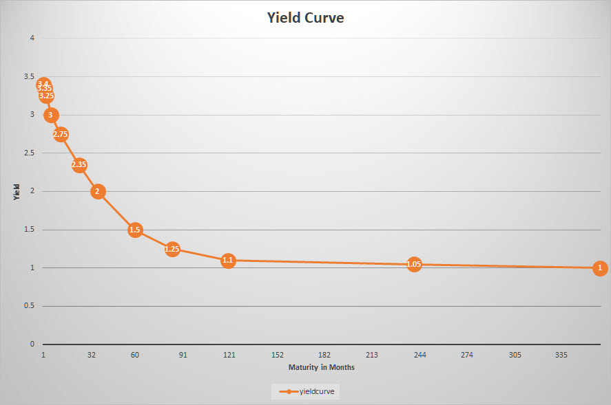
The government bond yield curve is often referred to as the benchmark yield curve; the image above shows this curve for US government bonds on 1 November 2019. Data to draw a yield curve (for US gov bonds) are readily available from various sources. A good source to check yields for various maturities of government bonds is the website of the US Department of the treasury (www.treasury.gov). The image above is rendered using data from that source.
Each day, the yields are reported for the various maturities, ranging from 1 month up to 30 years. Please note that all these yields are annualized; for a bond with a one-month maturity, you will receive 1.58% : 12 = 0.13%
On the horizontal axis the maturity of the bonds is translated to no of months in order to get a proper scaling on the chart. On the vertical axis the yield is shown.
In a normal situation, one would expect to receive a higher compensation (yield) for longer maturities. When you lend money to the government for 20 or 30 years, it intuitively makes sense to receive a higher compensation than when you lend it only for a year or a few months.
As these yields change every day, the shape of the curve will change accordingly. Because financial markets have a tendency of throwing curve balls from time to time, unusual/unintuitive situations can and will happen.
Three Shapes
Essentially, there are three possible shapes that we can see in the yield curve.
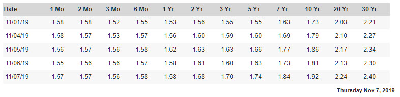
Normal
This is the situation described above, in which the yield on shorter maturities is lower than on higher maturities. The yield curve curves gradually upward, with the increase of yield decreasing towards longer-dated bonds.
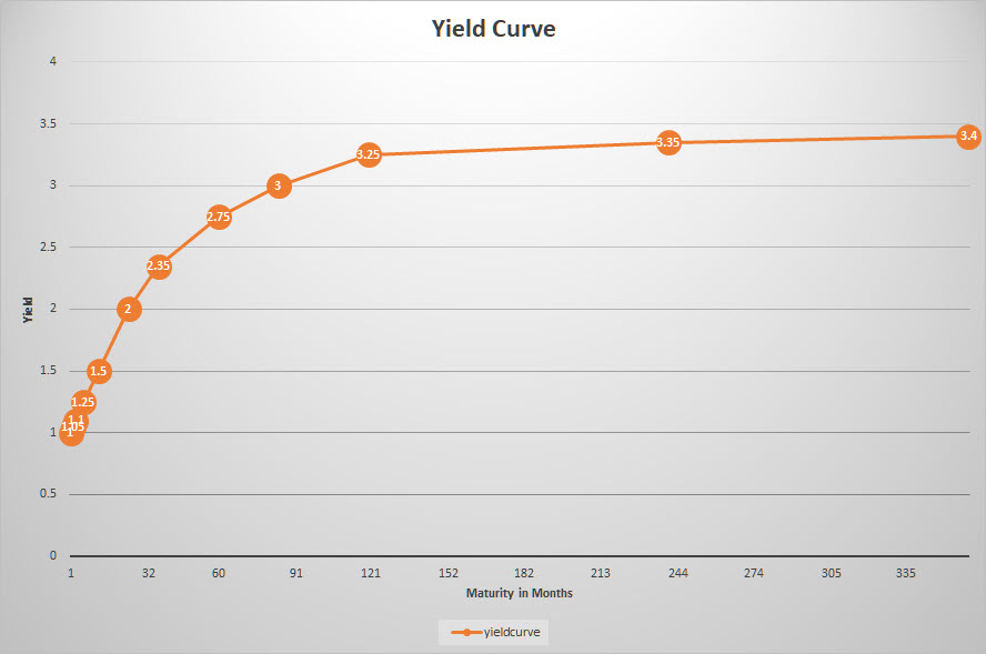
Flat
When the yield curve is "flat," the yields are (more or less) the same across all maturities. This means that you will receive roughly the same compensation for lending your money out for 2 years or 30 years. You are not compensated for the longer-lending (and therefore more risky) period.
Inverted
An inverted yield curve refers to a situation where the shorter-dated bonds offer a higher yield than the longer ones. Clearly an unusual situation, but it happens. When it does, it is a situation that draws a lot of attention.
What can we learn from (changes in) the yield curve?
The image(s) above are obviously "styled" and will usually differ quite significantly from reality. An inverted yield curve does not have to be "completely" inverted as in the image. Sometimes only part(s) of the curve are inverted; this can cause humps or dents in the curve as we would expect it to be shaped.
In general, the yield curve reflects the way investors think about risk. In a normal yield curve situation, the thinking is that the shorter the maturity, the less risk for the investor and, therefore, a lower yield (compensation) than for longer-dated bonds.
A normal-shaped yield curve is usually seen in an economic environment that shows normal growth and little-to-no changes in inflation or available credit.
Changes in the shape of the curve over time can help investors to signal changes in the economic climate. This changing of the curve is often referred to as "steepening" or "flattening." These movements are measured by the slope of the yield curve. When there is a big difference between the short and the long end of the curve, it is called steep. When this difference decreases, long yields come down while short yields go up, which is called a flattening of the curve (the slope is getting less steep).
The opposite situation, when the difference between the two ends of the curves is small but is starting to increase, is called the steepening of the curve. Steep curves are generally seen at the beginning of a growth or expansion period.
An inverted curve is usually seen as a signal that economic growth will soon stabilize or reverse, maybe even signaling the start of a recession. This is caused by investors thinking that the period of economic growth is or will soon be over, making them more likely to accept lower rates before they fall even further. This process can cause (partial) yield curve inversions.
As the economy expands and contracts and the yield curve moves from normal/steep to flat/inverted, the curve has to pass the flat shape in both directions. A flat curve can therefore be seen as a transition period in the economy from one phase to another.
Which tools to use?
It is not so much the current shape of the curve that can help us to solve the financial puzzle, but more the transition and the changing of the shape of the curve that will provide us with clues for the potential future direction of the economy.
As with many graphs/tools/relationships/etc. that we use in our analysis, the yield curve will not provide us with the definitive answer. Like all other tools that we have at our disposal, it is just a piece of the puzzle that we are trying to solve every day.
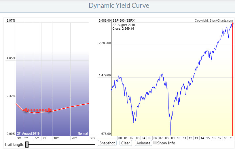
On StockCharts.com, we have the dynamic yield curve tool to help you analyze the yield curve as it changes over time.
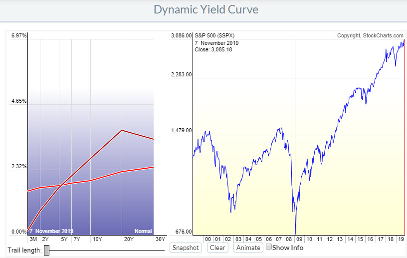
In the image above, you can see the changes the curve has experienced from the low in the S&P 500 in 2009 to today.
In early 2009, the shape of the curve was normal with a small bump on 20y. Today, the curve is much flatter, with short yields much higher than in 2009 and long yields much lower than in 2009. We can therefore see a serious flattening of the curve over this period.
During that period, there have been a few days where the curve was minimally inverted at the end of August.
When people talk about "the yield curve inversion," they usually refer to the 10y-2y segment.
Another way of showing that relationship is by drawing a chart of the difference between these two yields ($UST10y-$UST2y), as shown in the chart below.

When this relationship dips below 0, the 10-2 curve is inverted.
(In a previous post, I wrote about how you can combine the yield curve with the business cycle to get a handle on economic conditions and also throw in some Relative Rotation Graphs for analysis purposes.)
-Julius
My regular blog is the RRG Charts blog. If you would like to receive a notification when a new article is published there, simply "Subscribe" with your email address.
Julius de Kempenaer
Senior Technical Analyst, StockCharts.com
Creator, Relative Rotation Graphs
Founder, RRG Research
Want to stay up to date with the latest market insights from Julius?
– Follow @RRGResearch on Twitter
– Like RRG Research on Facebook
– Follow RRG Research on LinkedIn
– Subscribe to the RRG Charts blog on StockCharts
Feedback, comments or questions are welcome at Juliusdk@stockcharts.com. I cannot promise to respond to each and every message, but I will certainly read them and, where reasonably possible, use the feedback and comments or answer questions.
To discuss RRG with me on S.C.A.N., tag me using the handle Julius_RRG.
RRG, Relative Rotation Graphs, JdK RS-Ratio, and JdK RS-Momentum are registered trademarks of RRG Research.
Julius de Kempenaer
Senior Technical Analyst, StockCharts.com
Creator, Relative Rotation Graphs
Founder, RRG Research
Host of: Sector Spotlight
Please find my handles for social media channels under the Bio below.
Feedback, comments or questions are welcome at Juliusdk@stockcharts.com. I cannot promise to respond to each and every message, but I will certainly read them and, where reasonably possible, use the feedback and comments or answer questions.
To discuss RRG with me on S.C.A.N., tag me using the handle Julius_RRG.
RRG, Relative Rotation Graphs, JdK RS-Ratio, and JdK RS-Momentum are registered trademarks of RRG Research.