One of the benefits of being a stockcharts member is the multiple ways to display data and save it for future looks.
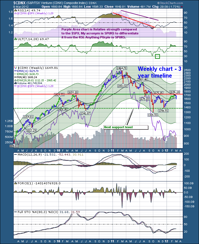
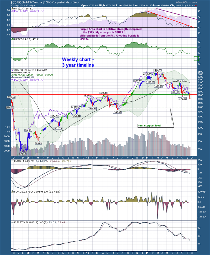
On the weekend I was scanning through my various chartlists. This chart popped up in my "Canadian Technician" chart list. So using the search field on the stockcharts website, I put in CDNX. It shows everything on CDNX that is on a stockcharts blog, chartschool etc. Magically, the first time I posted the CDNX chart was on September 22. 2011.
So without adding any new data, look how important the lines on the chart have been.
This is the link to the original blog. "The Canadian Technician" Here is the original chart view.
I would encourage you to annotate your charts all the time. Each day the charts give you new data. You may be immersed in other data that clouds your view. But just drawing trendlines and adding comments makes the chart come alive and allows you to work off it and refreshes your thoughts. Guy Adami mentions that you have something to shoot against when you identify support and resistance. You put in a buy order as it approaches support with a stop just below if support doesn't hold. In the above chart 1398 was support. Conversely, you may sell as it approaches the resistance above the stock price. In the above case 1700 for round numbers. If it breaks through, you buy it on the other side and put your stop just below the new support.
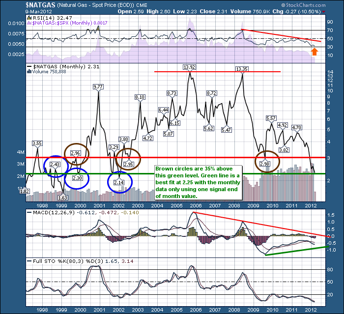
OK, let's take that logic to something we have all given up on. $NATGAS.
This is a very long term chart. Some would say this old data point doesn't matter. It might not. But what happens at this level is that production gets shut in rather than lose money by producing gas at prices below cost. So eventually, there is a low point that the whole thing reverses.
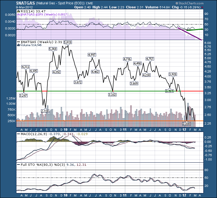
Lets look at a 3 year weekly then a daily.
Now I see absolutely nothing on the weekly chart. It just looks terrible. Other than it is trying to hold the lows recently put in January. However, the chart for the CDNX up top on Sept 22 looked awful too. WIthin a few weeks $CDNX put in the lows after plunging through support. But $CDNX closed above support by the end of the week. OK let's stare down the daily $NATGAS chart.
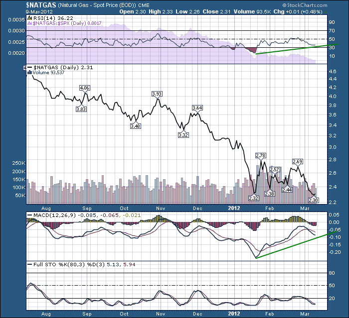
One of the main clues I am looking at on the daily is the 3 previous bounces are right around this level. It is trying to base in my opinion. But I might be wrong. So I'll draw a line at say the 2.20 level. That is my 'exit' if I am wrong. It also looks like $2.70 would be the top. My downside this morning would be 6 cents as it is trading at $2.26 and the upside is $0.44 so the risk reward is starting to look strong. I did not draw the lines on this chart to show how lifeless the chart looks without a trading plan drawn on it. The compelling indicator for me on the daily is the dramatically higher low on the MACD. I love that huge positive divergence. Check out the $COMPQ on Oct 4th, 2011. You'll notice a much higher MACD base that was a good clue higher times were in store. This dramatically higher MACD base at least tells us the selling momentum is stalling.
How would you trade it? Would you just wait for a break above $2.70 to confirm the bottom is in?
Good Trading,
Greg Schnell, CMT

