Note to the reader: This is the thirteenth in a series of articles I'm publishing here taken from my book, "Investing with the Trend." Hopefully, you will find this content useful. Market myths are generally perpetuated by repetition, misleading symbolic connections, and the complete ignorance of facts. The world of finance is full of such tendencies, and here, you'll see some examples. Please keep in mind that not all of these examples are totally misleading -- they are sometimes valid -- but have too many holes in them to be worthwhile as investment concepts. And not all are directly related to investing and finance. Enjoy! - Greg
"Those who cannot remember the past are condemned to repeat it." — George Santayanna
An indicator is defined by Webster as a pointer or directing device, an instrument for measuring or recording. What, then, is a technical indicator? Technical indicators are mathematical manipulations of data so that specific values or levels can reflect the market or security being indicated upon (analyzed). There are other types of market indicators that are commonly used, such as economic time series, interest rates, and so on. Stock market indicators utilize open, high, low, close, volume, and open interest, which are the basic components of stock and futures data.
"He who does not know the supreme certainty of mathematics is wallowing in confusion." — Leonardo da Vinci
I hope that the mention of mathematics doesn't scare anyone. You don't always have to understand mathematics to know that it will work. Most people believe that Leonardo da Vinci was a mathematician, when he was actually far from it. He had a close friendship with Luca Pacioli, who inspired Leonardo. Leonardo did, however, create a number of mathematical instruments and measuring devices, but his knowledge of mathematics was not exceptional; his friendship with one, whose mathematical knowledge was exceptional, was where the confusion may lie. One word of caution here, do not confuse mathematics with numerology.
One of the first, and possibly still best, indicators is the moving average. In the early days of technical analysis, there was only a moving average. It wasn't as specifically defined as it is today by adjectives such as: simple, exponential, weighted, triangular, variable, and so on. Using a columnar pad and a pencil, one could easily calculate a simple (arithmetic) moving average, especially a 10-period simple average. This average smoothed price movements and reduced or eliminated any cyclic action whose period was less than that of the average. In other words, it helped eliminate noise and made the prices easier to follow.
The ability to visually display an indicator made computers the ideal mechanism for significant advances in technical analysis. Today, with most technical analysis software packages, you can manipulate data in their formulary and immediately see the results visually. Incidentally, formulary is a word coined by John Sweeney (Technical Editor, Stocks & Commodities), which refers to the system or technique of building or constructing indicators by using predefined mathematical operations and functions.
Remember: Learn not only the capabilities of your technical tools, but more importantly, learn their limitations.
Indicators come in all types: those that indicate overbought and oversold, those that try to follow a trend, those that indicate reversals of trends, those that indicate excess, and a host of others. You can use an indicator without actually knowing the exact mathematical calculations—honest. Display the indicator with the security you want to analyze, using as much data as you can (the more, the better). Attempt to identify times when the indicator reaches a certain threshold or value and the security responds in the same manner. It will be rare to find an indicator that perfectly correlates with the security, so learn to accept something less than 100 percent. Experiment with small changes in the parameters that make up the indicator to see if the results improve. Once you have it where you like it, try it on another security. Yes, you have just discovered one of the difficulties of over fitting an indicator to specific data.
This is commonly referred to as curve fitting , which works well in the past and rarely so in the future. That is a statistical reference used when performing regression analysis. It works great on the data being used, but is basically worthless with anything else. That is why so many indicators seem to work on some things and fail miserably on others. This is also quite common among those selling systems and "get rich quick" products.
Some Things That Bother Me
Warning! This section is loaded with my personal opinions.
As I have stated earlier, I believe technical analysis is much more art than science; the science part is more related to the process of research than the actual analysis. A lot of esoteric analysis has attached itself to technical analysis, probably because they involve numbers or charts.
Before moving forward with this section, I adamantly want to state that with technical analysis being essentially an art, almost anything goes as long as the user is comfortable with it. The bottom line is that if it works for you, go for it. I guess the engineer in me wants to ensure the methods I use are based on sound and reasonable principles and at most, don't violate any principles of analysis that I believe in. If I hit on something you disagree with, please understand I'm just expressing my personal opinion, which, of course, could be totally wrong. Isaac Asimov was one of my favorite authors, scientists, and researchers. In an article entitled "The Relativity of Wrong", he used the curvature of the Earth to help explain how differences in perceived facts should be held.
"When people thought the Earth was flat, they were wrong. When people thought the Earth was spherical, they were wrong. But if you think that thinking the Earth is spherical is just as wrong as thinking the Earth is flat, then your view is wronger than both of them put together. The basic trouble, you see, is that people think that "right" and "wrong" are absolute; that everything that isn't perfectly and completely right is totally and equally wrong." — Isaac Asimov
In Nate Silver's book, The Signal and the Noise, he shows concern about the honest evaluation of the performance of predictive models. We keep being bombarded by stories of data mining, when the facts show that most statistical models have high rates of error, especially true in modern finance. This does not mean they are not useful, but they have a quantifiable chance to fail. This all goes back to the difference between an art and a science. Technical analysis is an art that can use some scientific processes in its practice. If someone is mathematically inclined such as an engineer or a scientist, then I think the probability of them using technical analysis in its purest form (first order) is more likely than when someone from the arts uses it. While the following comments on various elements of technical analysis (second order) cause me concern, it shouldn't bother you if you disagree on my interpretation of their merits, only the realization that you and I disagree.
"Criticism is always a kind of compliment." — John Maddox
Bold Statements About an Indicator's Value/Worth
An issue that is of concern is when someone makes the statement that an indicator is not good because they have back-tested it. Well, therein is a big problem, because not everyone uses an indicator the same way. You cannot judge an indicator's usefulness for someone else, only yourself. As an example, I use stochastics more as a trend measure and normalization measure, whereas I think the majority uses it as an overbought/oversold indicator. I also always use stops instead of a reversal signal of the indicator that gave the buy signal, while many do not. Therefore, when you hear someone make a bold statement about an indicator's worth, ask them for very specific details on how they tested it.
Fibonacci Numbers
Often, a simple mathematical series of numbers can sometimes be misinterpreted (promoted) to be something magical. My personal favorite sequence is 6, 28, 496, 2,520, 8,128, and 24,601. I'll explain them at the end of this section.
Personally, I see no value in the actual numbers that make up the Fibonacci series, a series developed by an Italian mathematician (Fibonacci) in the thirteenth century to help understand the propagation of rabbits. First I must say that I do value the ratio of the numbers that are expanded in a Fibonacci-like series (0, 1, 1, 2, 3, 5, 8, 13, 21, 34, 55, 89, . . .). That ratio is 0.618 (and its reciprocal is 1.618), often called the golden ratio because of its wide occurrence in nature, usually with a jaundiced eye. Here is a fact: the actual numbers in the Fibonacci series have little to do with the ratio. Any two numbers expanded in the same manner will produce the same golden ratio. Here is a test: Try it with 2 and 19. Add them together, and then add the total to the previous number just like in the Fibonacci series (2 + 19 = 21, 19 + 21 = 40, 21 + 40 = 61, etc.). Expand this until you get to four digit numbers so that the accuracy will be acceptable (2, 19, 21, 40, 61, 101, 162, 263, 425, 688, 1,113, 1,801, 2,914, 4,716, . . .). The last two numbers in this sequence are the two numbers that I will use for this example: 2,914 and 4,716. Now divide the first number by the second number and you will get 0.618. This is exactly the same as with the value obtained using the Fibonacci series of numbers.
So why did I pick 2 and 19 for this example? Hint: The second letter in the alphabet is B. What is the 19th letter? S. BS! And that is what numerology is all about.
I can find no source that explains why the series of Fibonacci numbers begins at zero. If I were tasked with mathematically identifying the propagation of rabbits, I think I would at least have to begin the series at 2. The fact of the matter is that the series can begin anywhere, even negative numbers, as long as the expansion follows the correct formula. It is the ratio that is important, not the actual numbers in the series. So, when you hear someone say they are going to use a 34-day moving average because 34 is a Fibonacci number, you can immediately begin to doubt the rest of their analysis.
Just so you know: the Fibonacci expansion of 1 plus the square root of 5 divided by 2 will work with any two numbers, even negative numbers. Sorry, no magic here, just numerology. As far as Elliott Wave theory goes, there are often so many complications and conditions introduced into using this type of analysis that it is incapable of being proved wrong. Sometimes I think it gets adjusted more often than earnings estimates. However, it is always convincing to align the workings of the market with what appears to be pure mathematics. In the series of numbers introduced at the beginning of this section, 6, 28, 496, and 8,128, are known as perfect numbers; this means the sum of their divisors (other than the number itself) is also equal to the number. For example: 6 = 1 + 2 + 3, and 28 = 1 + 2 + 4 + 7 + 14. I like 2,520 because it is the smallest integer than is divisible by all integers from 1 to 10 inclusive. Finally, I like 24,601 as it is the prisoner number of Jean Valjean from Victor Hugo's Les Misérables. Incidentally, 24,601 has prime factors of 73 and 337. I like these numbers solely for their mathematical uniqueness; and like many number sequences, they have no use in technical market analysis. Possibly Keno!
Retracements
Many use the Fibonacci ratio for percentage retracements. These retracements are generally derivations and powers of the expansion formula 1 plus the square root of 5 divided by 2. They are generated by looking at ratios of the supposed Fibonacci numbers themselves, such as dividing any number by the one that immediately follows it, which yields the popular 0.618. The complement of that is 0.382, which can also be found by dividing any number in the series by the number two places later in the sequence. 0.236 is often used, as it is created by dividing any number by the number that is three places later in the series. I have often wondered where the 0.50 ratio came from; it is just the ratio of the second (1) and third (2) number in the series. I'm not sure that this process could ever end. Add to the Fibonacci retracements, those of Edson Gould, which were 33 percent and 67 percent, and all of a sudden, with some percentage of error involved, you have covered over 50 percent of the entire data being analyzed—a coin toss would be better. I could carry this further by adding the retracement values of others; Gann comes to mind. The bottom line is simply that with enough percentage retracements provided, one of them is bound to be close to a reversal point, however, you won't know which one it is until you invoke hindsight.
Reversal and Continuation Patterns
If I drew a pattern that looked like a head-and-shoulders pattern on a white board, most would be able to identify it. However, if it is a reversal pattern (which the head-and-shoulders pattern is), then shouldn't it be reversing something? It should appear in an uptrend. If not, one is working in isolation and will be often wrong.
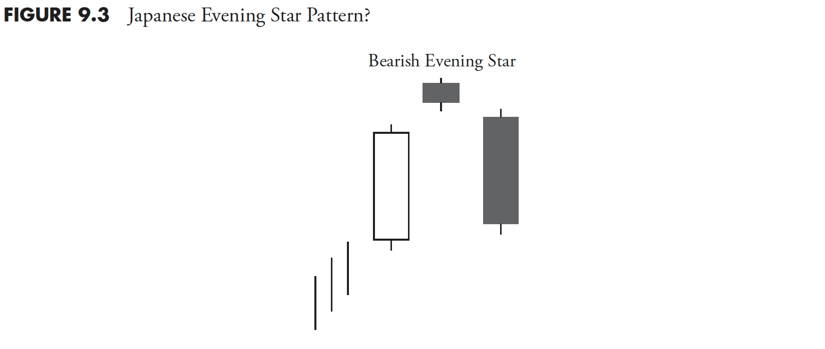
Figure 9.2 is a picture of a classic pattern known as a head-and-shoulders top pattern. However, I challenge this type of labeling because we don't know if it is in an uptrend or not. If the graphic showed an uptrend in prices preceding the pattern with at least as much price movement as the neckline to the head, then I would agree that this is a head-and-shoulders top. There is no difference with Japanese candle patterns, a subject I have written endlessly about in the third edition of my Candlestick Charting Explained, in which I took an engineering approach to validate the patterns and wrote honestly about them. Classic chart patterns or candlestick patterns used in isolation are dangerous. If they are reversal patterns, then they must reverse something, and that is the preceding trend.
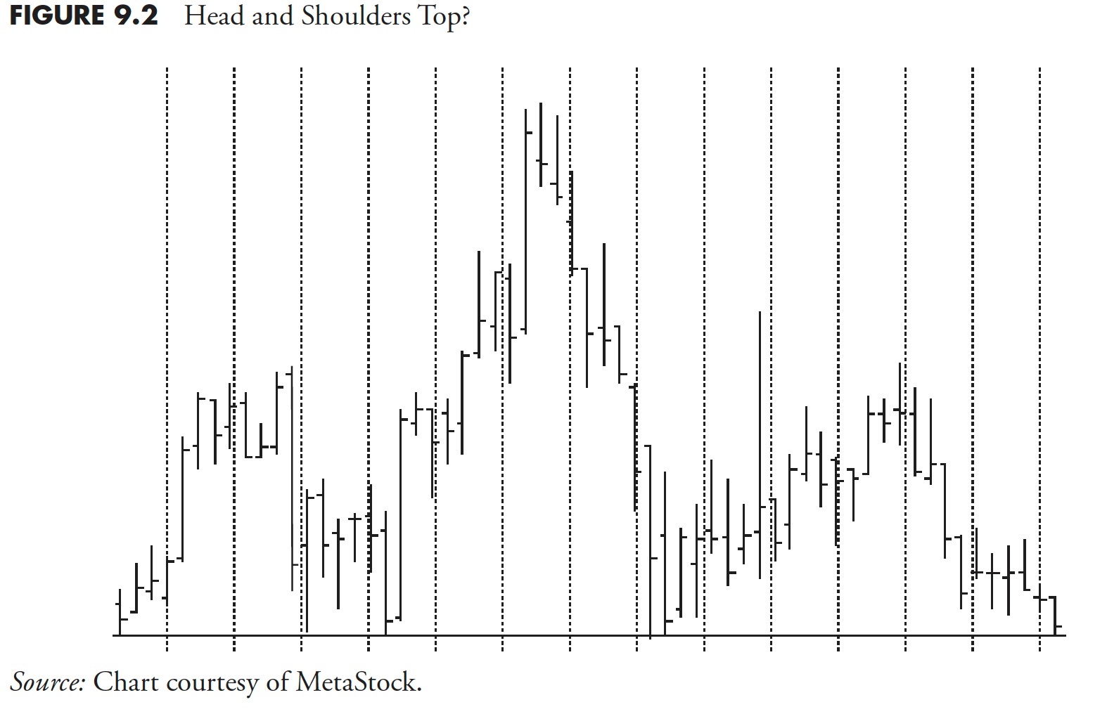
Figure 9.3 is a Japanese candle pattern known as the evening star. It is a bearish reversal pattern because it reverses an uptrend—as shown by the three vertical lines preceding it. If those uptrend lines were not there, I would say that this pattern looks like an evening star, but until we know what trend it is in, we cannot say for sure.
The same exact analysis can be attributed to continuation patterns, both classical and candlestick. If a bullish continuation pattern is identified, please ensure that it is in an uptrend; otherwise, it is not a bullish continuation pattern.
Japanese Candle Patterns
I spent a considerable amount of time in Japan with my friend Takehiro Hikita in the early 1990s. He translated most of the Japanese books on candle patterns and was insistent on me learning exactly how they should be interpreted and used. I cannot tell you how often I see candle patterns being misused, including the previous topic on not identifying a trend first. Why are single-day candle patterns not recommended for trading? Every day, the market sends a message.
Here is what I say about single-day candlesticks: They are not candle patterns in that they allow you to see the evolution of trader psychology through multiple days like you can with more complex candle patterns. I also say single candlesticks still send a message that should neither be traded nor ignored. Can you use candle patterns on intraday or weekly data? Of course you can; however, I don't recommend it. The Japanese were adamant about the period of time between the close of one day and the open of the next day as being critically important to the psychological evolution of traders in developing the pattern. With intraday charts, that time period is just the next data tick, with not a lot of time to develop a thought. Weekly candlesticks truly voids the concept, as the open is Monday's open, the close is Friday's close, the high is the high for the week (could occur on any day), and the low is the low for the week (again, it could occur on any day of the week). In fact, the open, high, and low could all occur on Monday, with the close on Friday. The trading activity for the last four days of the week would not be seen in a weekly candlestick. However, as with any art form, if it works for you, use it.
Analyzing Time Series That Does Not Trade
Can you do technical analysis on a time series that doesn't trade? For example, I see a lot of moving averages, trendlines, and support and resistance lines on charts of economic data like the Baltic Dry Index, the advance decline line, or the Index of Leading Indicators. Does the Baltic Dry Index trade? How about the Index of Leading Indicators? Are investors/traders making investment/trading decisions on the data that makes up that index? How can something that is not traded have support and resistance? It can't, it is just analysis by those who truly don't understand what they are doing. Computer software has caused a lot of this and new (sometimes older) analysts are analyzing every chart they see—most in futility. I think much of it is because they are just playing with their software.
Almost all references on supply and demand are directly tied to price. Th is involves the pricing of goods and services, as well as securities. It seems that some analysts have not understood this concept and draw trendlines all over a chart without any real understanding as to what it is they are trying to accomplish, unless, of course, it is to support (sic) their hypotheses.
Support and Resistance
Can you use support and resistance for oscillators, ratios, and accumulated or summed values like you do with price-based issues? I believe this is carrying the supply and demand analysis a little too far, yet many analysts are doing it. Can an oscillator made up of internal breadth components have a support line or a resistance line? No, but it can reach certain levels on a consistent basis and if that is what is being represented, then so be it, but it is not support or resistance. Similarly, I see some who will draw trendlines across moving average peaks or troughs. This is irrelevant analysis and does not represent any type of support or resistance.
Like most things, there are exceptions to all this. An analyst may point out that the 200-day moving average offers support for the issue being analyzed. This may well hold out to be true, only because of that particular moving average's popularity. It probably would not hold true if an average that is less familiar or a totally random average were picked, say 163 periods.
Also, and in fairness to these analysts, drawing trendlines on some indicators such as the advance decline line is not done to identify support and resistance, but to assist the analyst in identifying divergence with price. This is one reason drawing trendlines on rates of change oscillators is not support and resistance identification.
The message is simple: If it does not trade, don't do technical analysis on it.
Multicollinearity
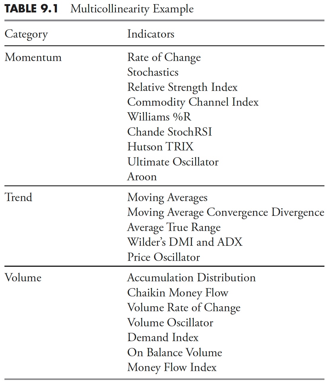
If you find a group of indicators that are essentially telling you the same thing and with consistency, you need to pick one of them to use and then drop the others. If they are all saying the same thing, they are not assisting you in your analysis. This is known as multicollinearity and is a trap you need to avoid. Ensure that you are using indicators that measure the markets differently, and are diversified. While breadth indicators are different than most price-based indicators, there are many price and breadth indicators that are essentially revealing the same thing.
Table 9.1 is from StockCharts.com's ChartSchool, showing the various categories with a few samples of the indicators contained in each category.
Many times, investors think that they are more correct in their analysis if many indicators are telling them the same thing (see the section on behavioral biases and, in particular, confirmation bias). They are supportive of your analysis only if the indicators are not collinear. If they are collinear, then the support the investor feels from having a lot of indications agree is misleading and dangerous. The support for their analysis gives them a false confidence. This occurs in many things, more information is not always better information.
Analysis vs. Reporting
"Are you an investor or a story teller?" — Barry Ritholtz
I see hundreds of charts with analysis on the Internet, newsletters, and many that are sent to me for feedback. More often than not, I see a beautiful example of the analyst unknowingly utilizing the remarkable and always correct technique of hindsight. A beautiful chart with some indicators is presented, and the analysis discusses the signals from the indicator or an obvious divergence between the prices and the indicator, but sadly all that took place a few weeks ago or more. Identification of chart patterns, whether classical or candlestick, usually only occur sometime after they have matured and often too late to act on. Analysis is accomplished at the cold hard right-hand edge of the chart. Reporting is the analysis that is accomplished elsewhere on the chart. Hindsight is great for observable information about how markets and techniques reacted in the past, but it never works for tomorrow. Learn from the past, just don't trade from it.
Analog Charts
My main problem is that they are an example of recency bias. Recency bias was defined in Chapter 6, but is related to thinking one can determine the next color on a roulette wheel from observation. The market is impacted by events each year that affect the decision-making of investors and rarely, if ever, do these types of events reoccur. Often, I have observed analog charts with huge amounts of data where the small arrows used to point out the correlation can be many months in width. Remember, it might rhyme, but it doesn't repeat. In support of analog charts, the fact of which I agree is that investor behavior does repeat and repeat often, and this alone may be the true benefit of analog charts.
Polls and Surveys
With the Internet and 24/7 media, there are polls and surveys for everything imaginable. Rarely are the actual questions presented to the viewer, only the results with an error probability, which I think they just make up to add to the credibility of the poll. If you have ever tracked the polls over time, you know that rarely is there any timely information, and, more than likely, there is never any actionable information. If you see the results that you do not like, change the channel or go to another website. Poll and survey questions can be constructed in a way to generate the answers that the pollster desires. This is called framing and is mentioned elsewhere in this book.
Miscellaneous
There are a number of analysis techniques that have attached themselves to technical analysis that I do not use. I have spent a lot of time in the early days studying them, and decided they were not for me, as they involve entirely too much subjectivity in their process. Although I think some analysts use them beneficially, I think most will never be able to do so. Some have to be restated more often than earnings reports.
Here are some questions for those who believe full moons affect investors: When is the moon not full? If the sky is overcast, is it still a full moon? If it is a full moon in Texas, is it a full moon in India? A full moon is solely based on the relationship of the observer and the light of the sun shining on it. In other words, you must know where you are on Earth in order to know when there will be a full moon. Ironically, the most perfect full moon is when it is in a lunar eclipse, an event in which the Earth blocks the sun from illuminating the moon. Just something to think about! And to correlate market events to full moons is downright scary—a classic case of mistaking correlation with causation.
Cyclical events, those with consistent periodicity such as planets and other orbiting bodies, especially those with human-identified frequency—say, the Moon, which orbits Earth every 28 days (27.322 to be exact)—can cause many examples of apparent correlation, but is woefully short on causation. Just think of all the human-like events that occur once per month! And I'm not even going to address the issue of whether you're viewing the orbit from Earth or elsewhere.
Seasonality is popular among some, but I always want to ask them just one simple question: Would you actually make a trading decision based solely upon seasonality? Most will say they use it to help confirm, and that has merit. Just because February 25 has historically been a good day for the stock market, does not mean it will be a good one this year. An often-touted example is the "sell in May and go away," where there is significant statistical proof that the period from May through October performs worse than the November through April period. I have dealt with using statistics in earlier chapters so you know my opinion on this; seasonality is just statistics. In my opinion, seasonality is a perfect example of observable information; you just can't make a trading decision based on it.
Let's say you tested the "Sell in May" concept by first choosing exactly when to sell and exactly when to buy again in November, and the results over the past 60 years shows it worked 75 percent of the time. I'm not even going to address the issue of how to determine "it worked" but only that it was profitable on an absolute basis. Now, armed with that statistic, would you actually sell in May and buy again next November? I seriously doubt it. It just might be the beginning of a period of time that contributes to the 25 percent of the time it doesn't work—maybe for the next four to five years. Would you stick with it? Of course not, investing decisions based solely on statistical evidence are unsound.
A mechanically inclined person can make a reasonable assumption about how a clock works, even having never seen the inside of one. With the addition of drawings and descriptions about how it works, one can probably get it very close to being correct. However, until one sees the actual workings, one is never really quite certain.
My opinions on these esoteric analysis techniques are directly tied to my use of technical analysis to actually manage money. I do, however, believe those who use technical analysis to make forecasts, find these techniques easy to use and justify.
Finally, no indicator is right all of the time; fortunately, you don't have to be right all of the time. You just need to ensure that you do not hold onto losers and keep your emotions out of the game. Choose some good reliable indicators and stick with them. Learn how they respond during different market environments and master the interpretation of them. And remember, when your favorite indicator fails you, avoid thinking that this time is different, it probably is not.
It is time to move from some of my strong opinions about the market to research into how to determine if a market trends whether it be up, down, or both and then a convincing section on what truly is risk. I strongly believe risk is the loss of capital, and not volatility as the "world of finance" would have you believe.
Thanks for reading this far. I intend to publish one article in this series every week. Can't wait? The book is for sale here.