TAKEAWAYS
- Energy sector is breaking higher on price chart
- XLE's RRG tail is continuing to pick up steam
- The exploration & production industry is leading inside the energy sector
Strong Rotation on the Weekly RRG
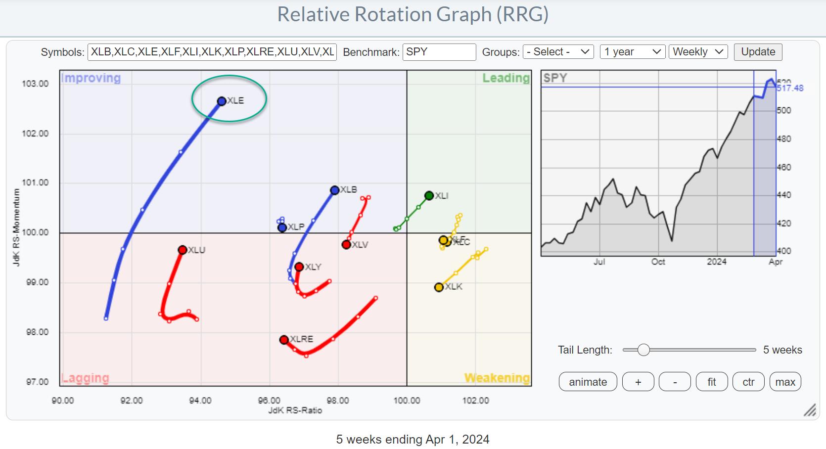
For a few weeks now, the improvement in the energy sector (XLE) is becoming increasingly visible in the lengthening of the XLE tail on the Relative Rotation Graph. The recent rotation from lagging into improving on the weekly RRG is now starting to pick up steam and also move higher on the RS-Ratio scale, indicating a further improvement of relative strength.
Daily Rotation is Confirming Strength
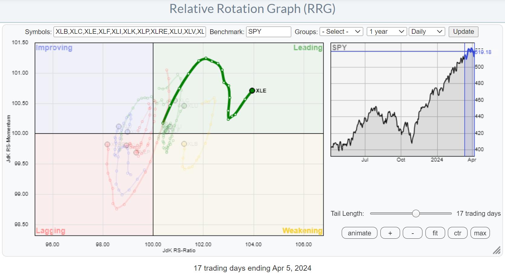
This improvement is further emphasized on the daily RRG, where we find the XLE tail well inside the leading quadrant with a recent "hook" back up, following a dip in relative momentum.
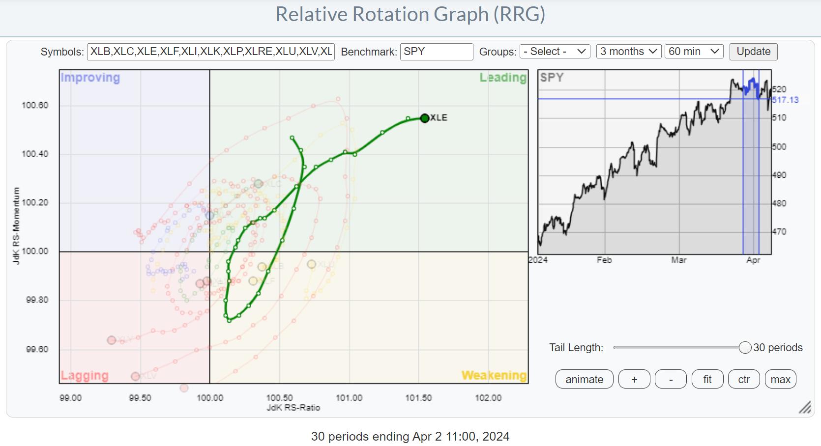
Clockwise vs. Counter-Clockwise
As a side note, this is a good example where a tail "seems" to be making a counter-clockwise rotation. But in reality, under the hood, on a smaller time frame, you can see there is a clockwise rotation visible.
In this case, the pivot on the daily tail was on 4/1 (no joke). When I zoom in on 4/1 and the surrounding days using an hourly RRG, a clear clockwise rotation shows up.
Price Breaking Major Resistance
The energy sector was also mentioned in my previous article as one of the sectors that was close to breaking a major overhead resistance level.
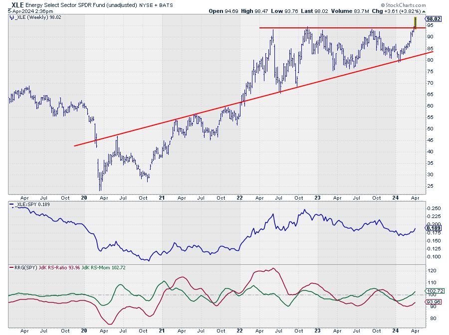
This is now happening. With the excess supply of around $94 now out of the way, new upside potential was unlocked. This will certainly help further improve the relative strength of this sector.
Industries
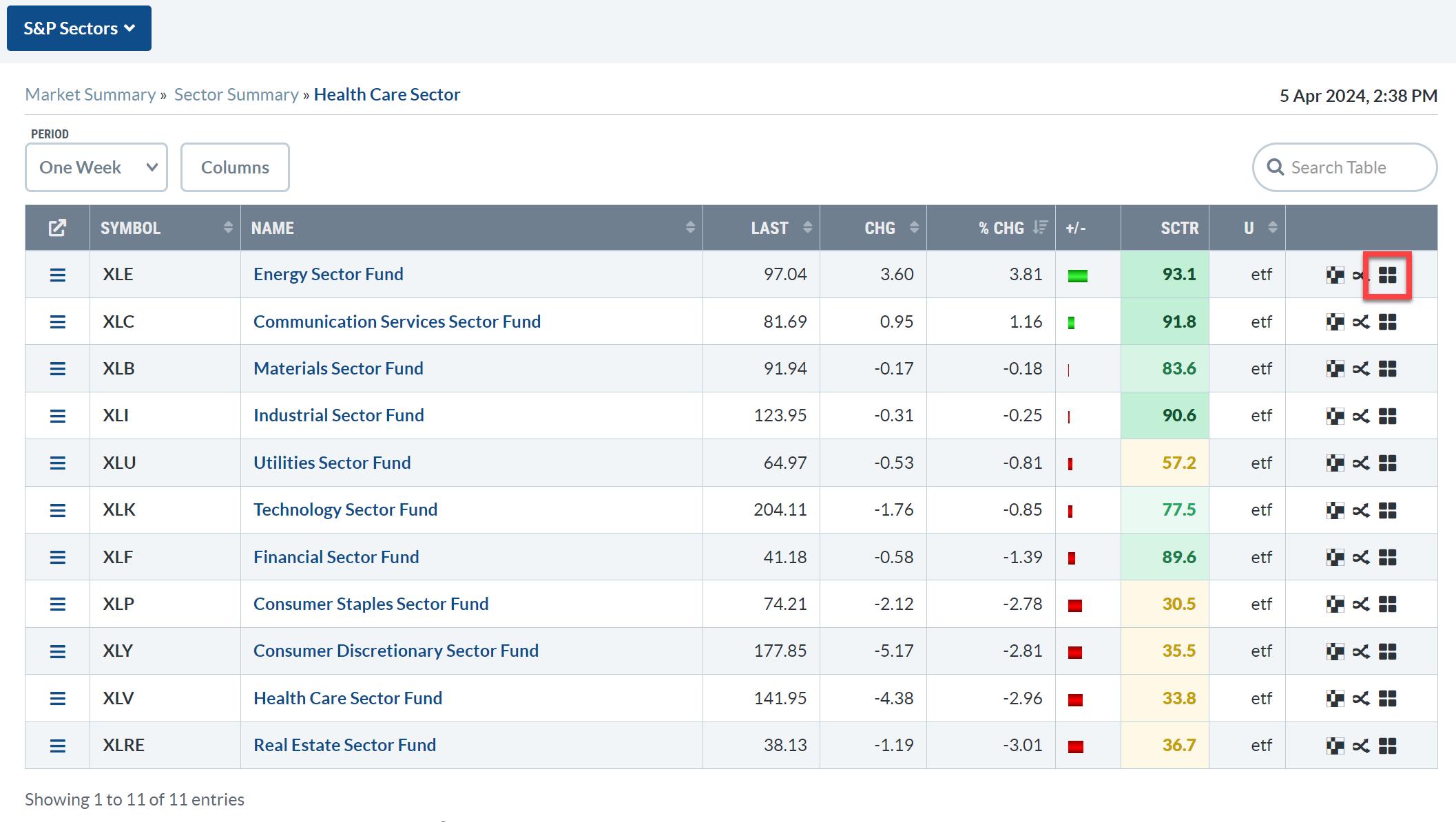
From the Sector Summary page, we can dive deeper into the energy sector by opening up an RRG that shows the rotations for the various industries inside the sector. Just click on the small RRG icon at the end of the line.
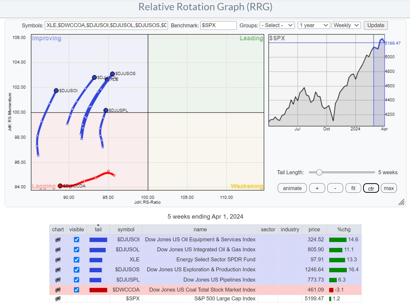
Initially, this RRG will use the $SPX index as the benchmark. The overall strength of the sector is clearly visible in all groups (except Coal), moving inside the improving quadrant at a positive RRG-Heading.
However, things change when we switch the benchmark to XLE, which allows us to see the rotation of these groups within their own universe. We already know that the sector is doing well, but which industries should we focus our attention on?
Exploration & Production Stands Out
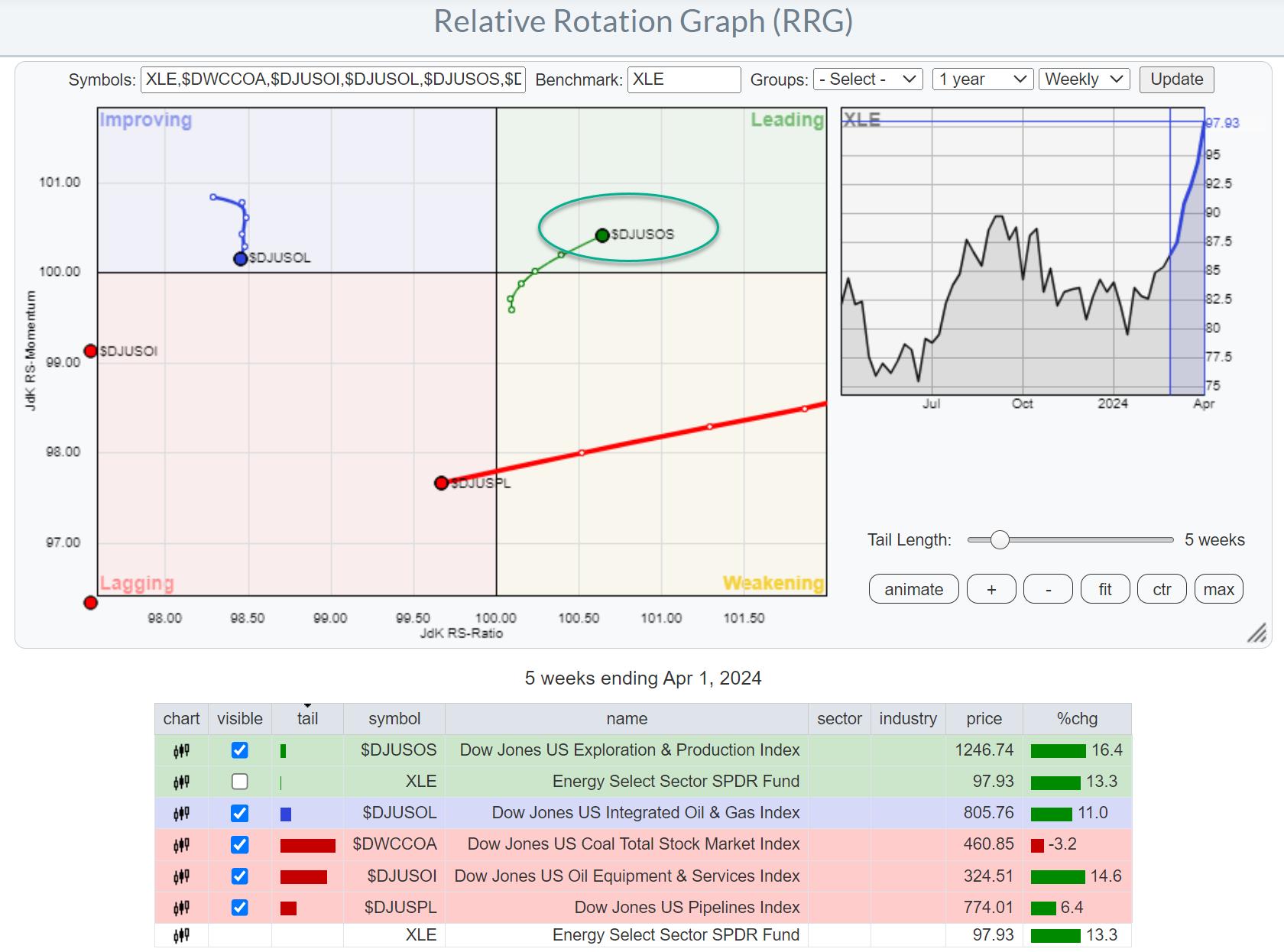
This changes the picture tremendously and immediately shows that there is really ONE group that is leading the Energy sector, and that is Exploration and Production.
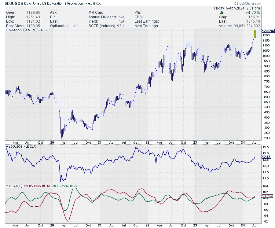
The price chart for this group speaks volumes. The upward break already happened a few weeks ago, and now relative strength is really picking up the pace, with both RRG lines turning higher above the 100 level and pushing the tail further into the leading quadrant on the RRG.
Zooming in on Individual Stocks
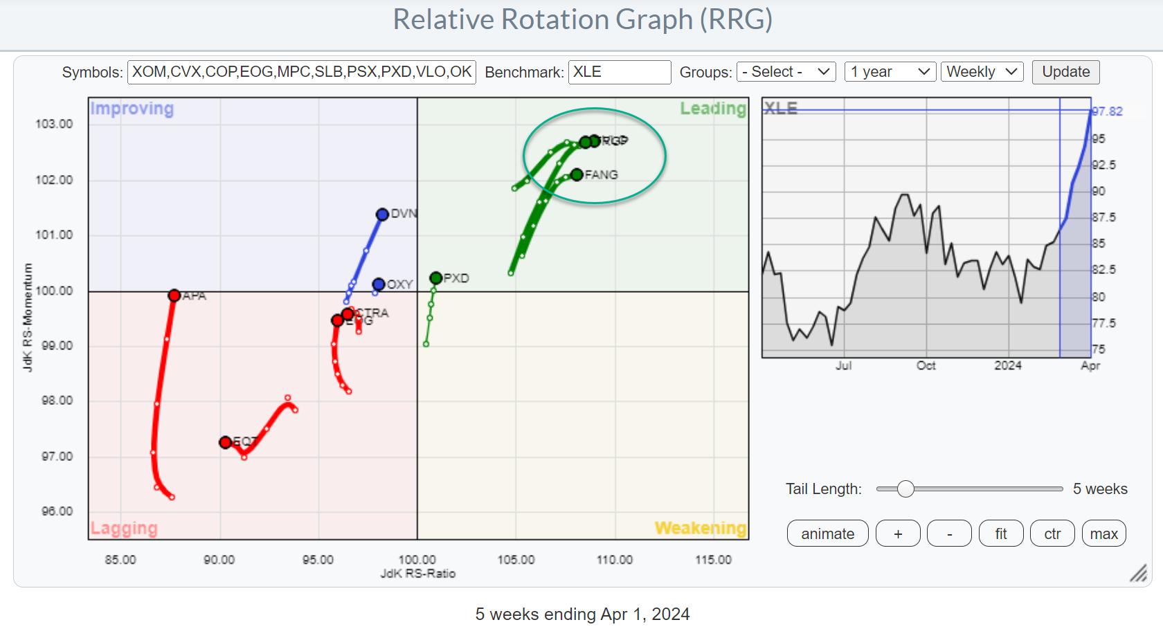
Loading the predefined RRG for members of the Energy sector and then hiding tails/stocks that are not in exploration and production gives the RRG above. Going over the individual price charts reveals that the stocks inside the leading quadrant, the cluster in green, have already made a significant move higher in price terms. They have been leading the initial rally for this group.
When looking for better risk/reward opportunities, the tails a little more to the left and even inside the lagging quadrant probably offer better probabilities. Remember, the sector and the group are already doing well, so these stocks are well inside the improving or leading quadrant and traveling at a strong heading when you use $SPX as the benchmark.
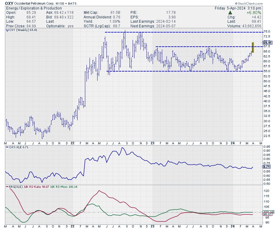
One of these stocks is OXY. Its tail has just moved into the improving quadrant; though still a short tail, it's moving in the right direction. The upward break in the price chart this week will certainly help a further improvement in relative strength and likely make this one of the new leaders in this industry.
#StayAlert and have a great weekend, --Julius
Julius de Kempenaer
Senior Technical Analyst, StockCharts.com
Creator, Relative Rotation Graphs
Founder, RRG Research
Host of: Sector Spotlight
Please find my handles for social media channels under the Bio below.
Feedback, comments or questions are welcome at Juliusdk@stockcharts.com. I cannot promise to respond to each and every message, but I will certainly read them and, where reasonably possible, use the feedback and comments or answer questions.
To discuss RRG with me on S.C.A.N., tag me using the handle Julius_RRG.
RRG, Relative Rotation Graphs, JdK RS-Ratio, and JdK RS-Momentum are registered trademarks of RRG Research.