
Rationales & Targets
We sent out a special email to subscribers on Saturday, September 20th, featuring “The Worst Chart of the Year,” a chart we admitted might be the worst we had ever seen. We ended with the conclusion that “….stocks are extremely vulnerable at this juncture.” Over the following five days, the Dow has had daily changes of –107, -116, +154, -264 and +191 points. Volatility has returned. Rising markets abhor volatility. We see this huge change in character as the first step leading to a far more significant decline in price.
We cannot stress too strongly how lopsided sentiment measures are. For every dollar in Rydex bear funds, there are $16.90 in bull and sector funds. The mutual fund cash reserve ratio at 3.5% is far too small to offer support for stocks. Investment advisor bears have been below the 20% level for 20 weeks. Almost no one believes the downside has a prayer or occurring.
The divergences in new highs and breadth would appear to be the final nail in the bull’s coffin. After averaging 414 new highs for the last 119 weeks back to August 2012, weekly new highs for the NYSE were only 88, versus 315 new lows. There are way too many changes in character to ignore and this clearly includes the Fed’s money pump. We’re still waiting for a break of support, which we have tabbed as Dow 16,587. Our correction and bear market targets remain viable conclusions.
The Most Bizarre Stock Market In History
We’re not about to change our editorial mind. The prospects for U.S. stock prices are extremely poor. Frankly, the consensus that stocks are headed higher, perhaps much higher in the next five years, scares us half to death. Strategists are pinning their forecasts on the dependability of earnings growth and a continued pick up in GDP. However, companies can create the illusion of growing just by buying their own shares, which has been the case for much of the last few years. Worse yet, share repurchases are now taking place at vastly inflated prices. Since the bottom in March 2009, companies have spent roughly $2.3 trillion to repurchase their own shares, one-sixth of the entire increase in total market capitalization. While we can argue the $340 billion of buybacks in 2010 might have been an excellent value, the same sum spent thus far this year is totally bonkers. Buying shares does absolutely nothing for growing a corporation’s business and creating new jobs. It does, however, increase earnings per share. Therein lies the rub. Increased earnings typically lead to higher stock prices. More interest is generated and multiples expand. The cycle perpetuates and the happiest of all are the corporate executives who are able to dispose of stock via options granted at far lower prices. And despite the revelation of robust second quarter growth of GDP, too much else, like the growing ranks of part timers and dropouts from the labor force suggests far weaker growth, if any, is on the horizon. So much of what we see is just an illusion.
At the same time, strategists totally ignore the fundamental significance of valuation extremes and record leverage. Strange, since the exact same circumstances prevailed at the peak in March 2000 and again in October of 2007. Is it truly different this time? The primary difference is a compliant Fed, completely dedicated to the theory that inflated asset values will create jobs and wealth. The evidence is just not there. The lowest labor participation rate in 36 years says precisely the opposite. As well, the wealth created has gone almost exclusively to the wealthiest ten percent. The net worth of most Americans has actually decreased over the last decade. Something is very wrong with this picture.
How can such a dichotomy exist? Simple. The government’s statistics are rigged. Not only for the employment picture, but regarding inflation and employment. We’ve mentioned John William’s Shadow Government Statistics website many times before (see www.shadowstats.com). Mr. William’s alternate GDP chart “reflects the inflation-adjusted, or real, year-to-year GDP change, adjusted for distortions in government inflation usage and methodological changes that have resulted in a built-in upside bias to official reporting.” The alternative GDP chart is frightening, illustrating negative growth for almost the entire period since the tech mania peaked in 2000 and currently running at close to minus 2%. We are not inclined to treat either interpretation as gospel but infer from our own observations that the economy and job growth remain slack.
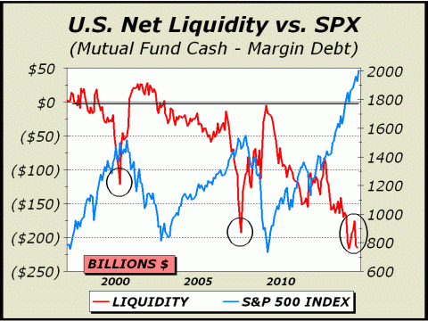
If we are looking for patently obvious statistics, all we need to do is look at pictures like today’s featured chart, solid proof of the most leveraged stock market since 1929, leveraged far higher than in 2000 or in 2007. And if that chart doesn’t convince you, consider that net liquidity has never before been this negative. Since the Fed’s actions have been expressly designed to raise stock prices, this expansion in leverage was a guaranteed side effect. Nevertheless, excessive leverage equates to excessive risk and when leveraged markets turn, they do so with a vengeance as overexposed participants rush for the exits. After the manic peak in 2000, margin debt fell 55%. From peak to bottom in the 2007-2009 bear market, margin debt fell 52%. If we infer an eventual repeat scenario, the draw down in leverage alone would equate to at least $250 billion scurrying for the sidelines. That amount is more than the entirety of net outflows from mutual funds during the previous bear market.
For more information, please contact us:
Alan M. Newman, Editor, Crosscurrents
516-557-7171
www.cross-currents.net