Editor's Note: This article was originally published in John Murphy's Market Message on Friday, October 25th at 5:04pm ET.
A lot of positive groups rotations have taken place in the stock market over the past two months. We've seen new money moving into domestic small caps stocks, as well as economically-sensitive transports. We've also seen cheaper value stocks gaining ground on growth stocks. The most notable rotation has been into financial stocks which have gone from market laggards to leaders over the last two months. There may be one common thread tying all of those rotations together. And that is a steeper yield curve caused mainly by rising Treasury bond yields.
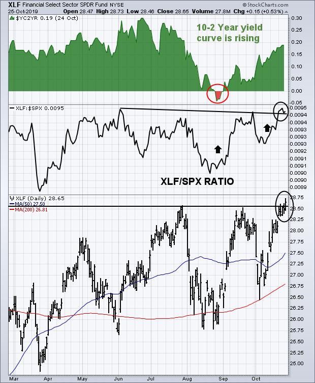
The daily bars in the lower part of Chart 1 show the Financial Sector SPDR (XLF) rising above its July/September peaks to reach the highest level since early 2018. That represents a bullish breakout. The change in relative performance is shown by the XLF/SPX ratio in the middle box. That ratio bottomed during August and is now challenging its early June peak. An upside breakout appears to be taking place there as well. Financial stocks are influenced by the direction of bond yields and the yield curve. Rising bond yields are beneficial, especially when accompanied by a steeper yield curve. And that's just what we're seeing in the upper box in Chart 1.
The green area plots the spread (or yield curve) between the 10- and 2-year Treasury yields. Falling bond yields from June to August flattened the yield curve and caused financial stocks to weaken. The red area during August showed the 10-year yield falling below the 2-year which caused that yield curve to briefly invert and raised fears of an economic slowdown. The upper box, however, shows that version of the yield curve bottoming in late August and rallying sharply since then. That was caused mainly by a rising 10-year yield. Notice the close correlation between the rising green area and the XLF/SPX relative strength ratio just below. And both coinciding with a major upturn in financial stocks. The steeper yield curve over the last two months may account for a more optimistic view on the U.S. economy and the stock market. And may also explain the recent strong performance by small caps and transportation stocks as well as other groups tied more closely to the U.S. economy.
Chart 1