Instead of simply looking at sectors, it also makes sense to keep an eye on segments of the stock market based on different criteria.
The Size Factor
One example is to group stocks based on Market Capitalization, i.e. Large-, Mid- and Small-Cap stocks.
A Relative Rotation Graph of that breakdown is available as a predefined universe in the dropdown on the RRG page, using the Dow Jones US index family - $DJUSL, $DJUSM, $DJUSS - with $DJUS (total market) as the benchmark.
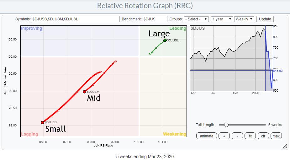
The RRG for this breakdown is sending a very clear message that large-cap stocks are outperforming mid-caps and small-caps. Or, in the light of the recent decline, it is probably better to say that large-cap stocks are holding up better than mid- and small-caps, with small-caps being hardest hit.
The Style Factor
A second breakdown that is often used is to qualify stocks as Growth or Value stocks. A good explanation of the difference between these qualifications can be found in this article from Fidelity: "2 schools of investing: Growth vs Value".
The RRG below shows the DJ US Growth Index ($DJUSGR) and the DJ US Value Index ($DJUSVA), again using the DJ US index as the benchmark.
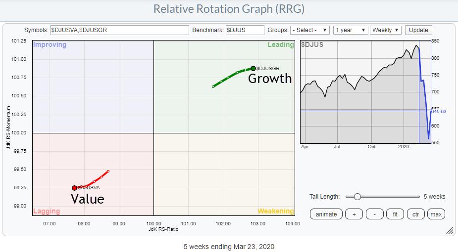
This image also is sending a very clear message: Growth beats Value. Or, perhaps more accurately: Growth is holding up better than Value.
Combining "Style" and "Size"
Combining these two "factors" can give a more granular insight in those breakdowns.
The DJ US Index family also provides indexes for breaking down the size segments into growth and value. If we include the original factor indexes, that gives us a universe of 11 indexes:
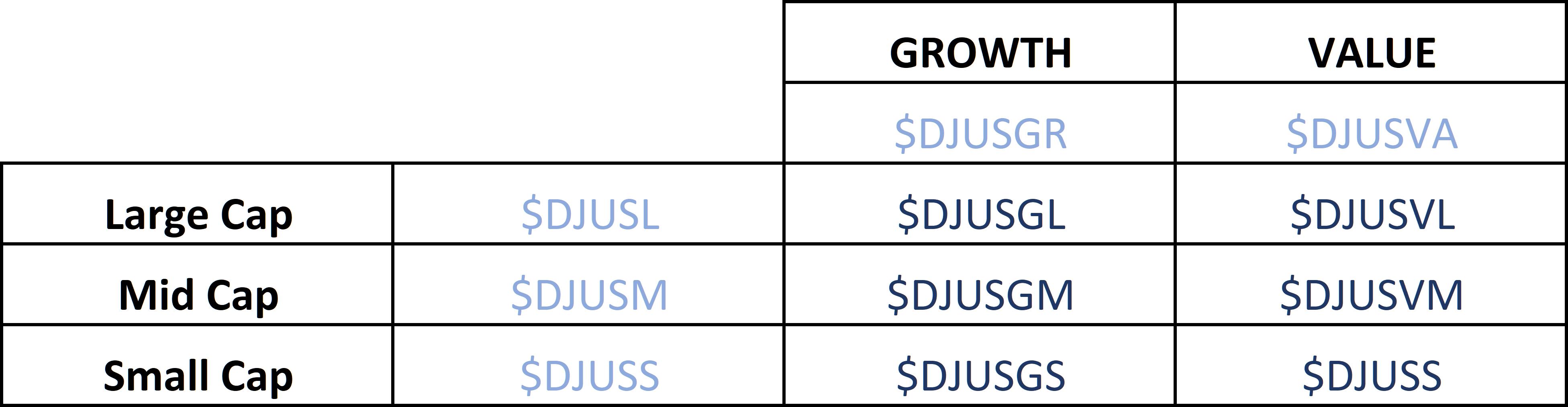
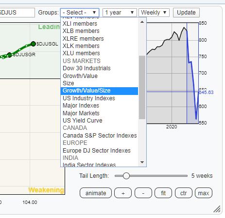 This universe of symbols is also grouped as a pre-defined universe on the RRG page. You can find it under the "Groups" Drop-down under the US Markets section.
Selecting that group will bring up the universe as shown in the table above, breaking down the US stock market into its growth, value and size segments.
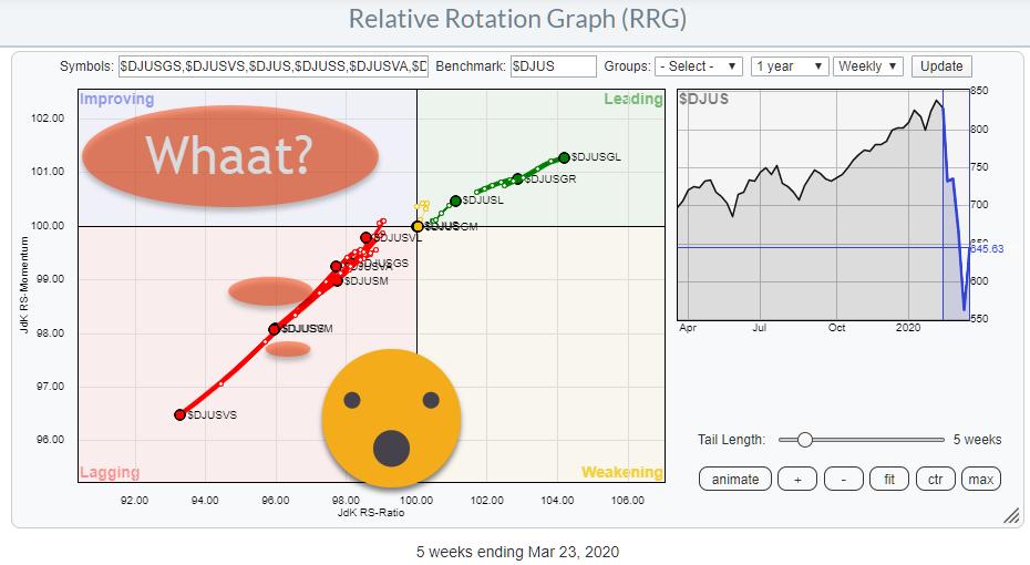
When I opened up that group today, the image at the top of this article popped up.
As you know, I am always interested when specific tails are moving rotating in opposite directions, especially as these tails are at strong (0-90 degrees) or weak (180-270 degrees) headings. And the rotation, as it is currently visible for this universe, could not be more clear.
Here is the RRG again. but now highlighting the tails for US Large Cap Growth and US Small Cap Value.
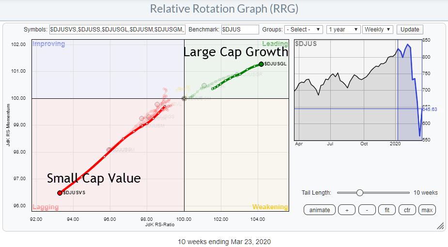
The absolute worst segment of the market to be in at the moment is US Small-Cap Value stocks, while the segment that is holding up best is US Large Cap Growth.
The direction of these two tails is almost exactly opposite, but also note the length of the tail and the increased RRG-Velocity (distance between week-week observations) on Small Cap Value versus Large Cap Growth. It's telling us that there is a lot of power behind this push into lagging.
The straightforward comparison between these two areas of the market also shows an interesting long-term picture.
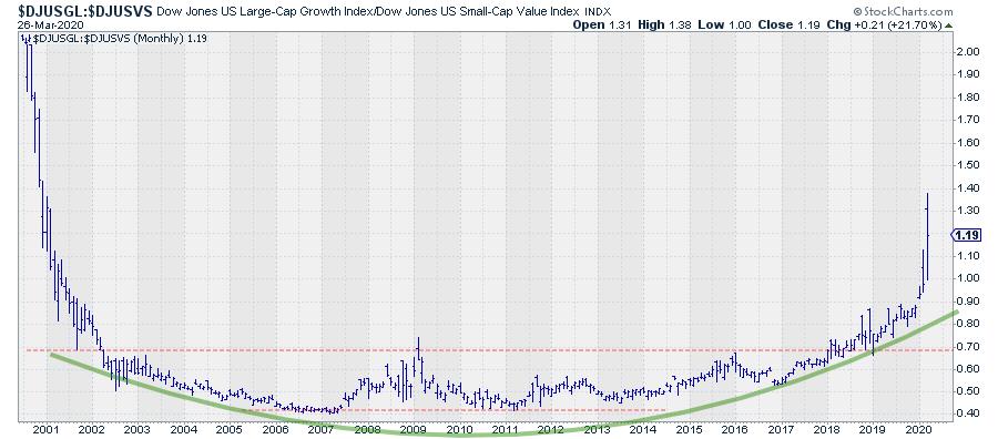
Already back in 2018, this ratio broke out of a very long-term base and crawled steadily higher. Literally at the start of 2020, this relationship started to accelerate higher in favor of Large Cap Growth and it really jumped higher in February and March.
How much more upside is left in this spread is difficult to say. The earliest observations (when the indexes were introduced) shows levels around 2 while we are now around 1.2. That's a lot of upside left. Or, in other words:
There's a lot of risk left in small-cap value stocks.
Please #StaySafe and enjoy your weekend!
--Julius
My regular blog is the RRG Charts blog. If you would like to receive a notification when a new article is published there, simply "Subscribe" with your email address.
Julius de Kempenaer
Senior Technical Analyst, StockCharts.com
Creator, Relative Rotation Graphs
Founder, RRG Research
Want to stay up to date with the latest market insights from Julius?
– Follow @RRGResearch on Twitter
– Like RRG Research on Facebook
– Follow RRG Research on LinkedIn
– Subscribe to the RRG Charts blog on StockCharts
– Watch Sector Spotlight on Youtube
Feedback, comments or questions are welcome at Juliusdk@stockcharts.com. I cannot promise to respond to each and every message, but I will certainly read them and, where reasonably possible, use the feedback and comments or answer questions.
To discuss RRG with me on S.C.A.N., tag me using the handle Julius_RRG.
RRG, Relative Rotation Graphs, JdK RS-Ratio, and JdK RS-Momentum are registered trademarks of RRG Research.
Julius de Kempenaer
Senior Technical Analyst, StockCharts.com
Creator, Relative Rotation Graphs
Founder, RRG Research
Host of: Sector Spotlight
Please find my handles for social media channels under the Bio below.
Feedback, comments or questions are welcome at Juliusdk@stockcharts.com. I cannot promise to respond to each and every message, but I will certainly read them and, where reasonably possible, use the feedback and comments or answer questions.
To discuss RRG with me on S.C.A.N., tag me using the handle Julius_RRG.
RRG, Relative Rotation Graphs, JdK RS-Ratio, and JdK RS-Momentum are registered trademarks of RRG Research.