Stock prices are trading higher again today following a Fed injection of $2.3 trillion dollars into the economy. The question is how far can the rally carry, and are there still risks on the downside. For that, we're going to look at weekly and monthly charts to try to put things into better perspective. Chart 1 plots weekly S&P 500 bars for last couple of years. It shows the SPX trading back above its late 2018 low which is an encouraging sign. So is the fact that its 14-week RSI line in the upper box is bouncing from oversold territory below 30. The weekly MACD lines in the middle box, however, remain very negative. But the red histogram bars have rebounded this week (meaning that the negative spread between the two lines is narrowing) which is an improvement. The chart, however, shows the SPX nearing potential overhead resistance along previous broken support levels ranging from 2822 to 2885. It's also nearing a possible test of its 10-week (or 50-day average) at 2882 (blue circle). In addition, the SPX has already retraced 50% of its first quarter loss.
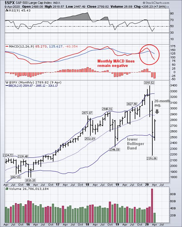
Chart 2 shows a monthly chart of the S&P 500 for the past five years. The chart shows the SPX trading back above its late 2019 low as in Chart 1. It also shows the SPX bouncing off its lower 20-month Bollinger Band which is encouraging. But it also shows the SPX approaching a test of the middle 20-month moving average at 2886 which could provide some overhead resistance (down arrow). The two top boxes show its 14-month RSI line starting to recover near oversold territory. Monthly MACD lines in the middle box, however, remain in their most negative alignment in years. Those negative MACD monthly readings are usually a warning that market risks still remain. So does the history of previous bull markets.
Stocks fell more than 20% during the first quarter which signaled the start of a bear market. Using that same criteria, the 20% gain in the S&P 500 over the last month puts it back in bull market territory. While that's an encouraging sign, it's also highly usual. Historically, bear markets last an average of eleven months. If this week's rebound is signaling a new bull market, that would make the first quarter bear market the shortest in history. So far, the stock market has regained 50% of its first quarter decline which is a pretty normal counter-trend rally. And stock prices are approaching some potential overhead resistance levels which could stall the current rebound. In addition, the current pandemic adds a huge element of uncertainty both for stocks and the economy.
Chart 1
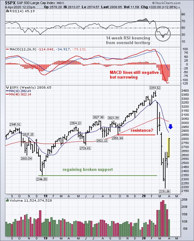
Chart 2
Editor's Note: This is an excerpt of an article that was originally published in John Murphy's Market Message on Thursday, April 9th at 12:28pm ET. Click here to read the full article, which includes further discussion of the economic impact of the COVID-19 pandemic.