 Those of you who follow my blogs and watch Sector Spotlight on StockCharts TV will know that I regularly look at rotations among various asset classes. I talked about that subject in last week's show, focusing on the relationship between stocks and bonds, and I wanted to highlight that ratio in this article as well.
Monitoring the Stock/Bond Ratio is Important.
First of all, monitoring the stock/bond ratio is critical because, I think, it is one of the most important high-level decisions that investors need to take. Also, I believe that a lot of (private) investors are not aware of the importance of this relationship or, if they are aware, are not paying enough attention to it. Finally, I think that this relationship has arrived at an important junction at this moment.
Here is the weekly RRG showing the rotation for all asset classes currently.
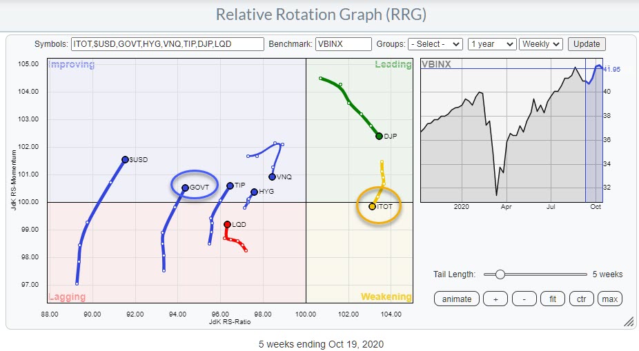
Stocks (ITOT) are in the weakening quadrant after rotating through leading for 15 weeks and at a slightly negative RRG-Heading. Government Bonds are on the opposite side, inside improving at a slightly positive RRG-Heading.
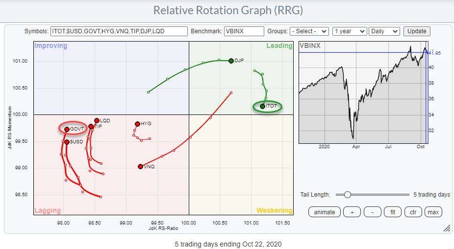
The daily RRG shows ITOT positioned inside the leading quadrant and GOVT inside lagging, at similar headings as they are on the weekly.
These rotations suggest that stocks are taking a breather at the moment, while Bonds are recovering from a period of underperformance.
Comparing Rotations Going into the Elections
However, on both the weekly and the daily versions of the RRG, stocks are at the far right (positive) side and bonds are on the far left (negative) side, with plenty of space to rotate at their respective sides of the graph.
As we are in the final stretch to the US elections, I thought it was interesting to look at the positioning of both asset classes on the RRG at the same time four years ago. To better compare that rotation with the current positioning, I have snapped two images showing only ITOT and GOVT on the RRG, both with a 21-week tail.
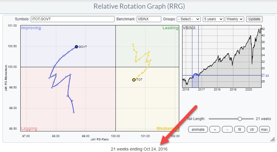
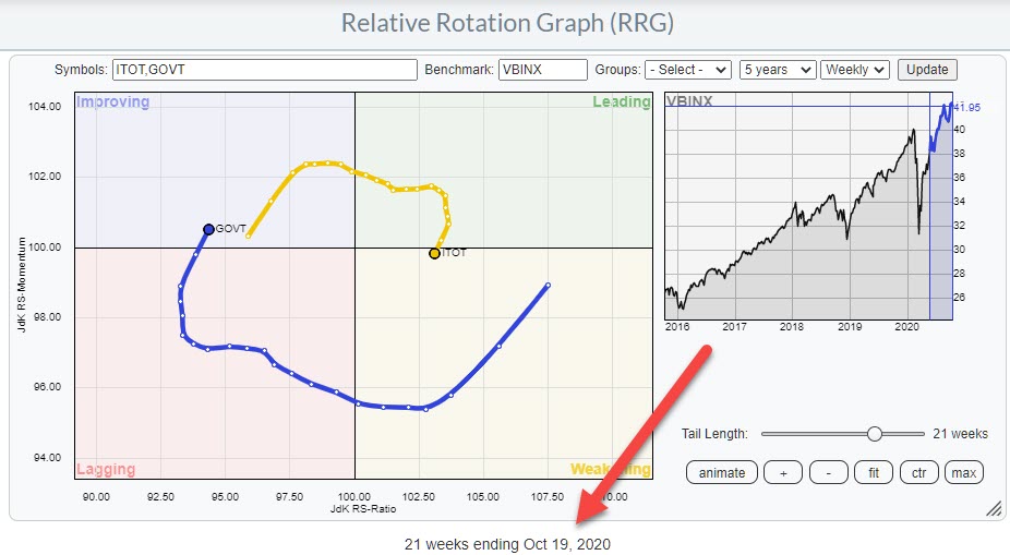
As you can see, the positioning and the headings of the tails is largely similar. In 2016, the tails were a bit more irregular on both sides; they were also at their respective sides for a bit longer already.
More differences can be found in the distance from the benchmark on the JdK RS-Ratio axis. In 2016, both asset classes were in much closer proximity than they are at the moment. This gives the tails even more room to rotate now than they had in 2016.
If you click one of the RRGs above (opening the live version of the chart) and press the animate button, you can see how ITOT curled back up from weakening back into leading, and GOVT rotated in opposite direction, after the elections. The current setup certainly allows for enough room to see a similar rotation in coming weeks.
Will the Stock/Bond Ratio Break Higher Like it Did in 2016?
Another thing I wanted to share with you is the similarity that is showing up on the 1-1 comparisons for stocks and bonds at the same time periods.
The top chart shows the ITOT:GOVT relationships over four years, ending in November 2016. The bottom chart show the same relationship over the last four years up to today.
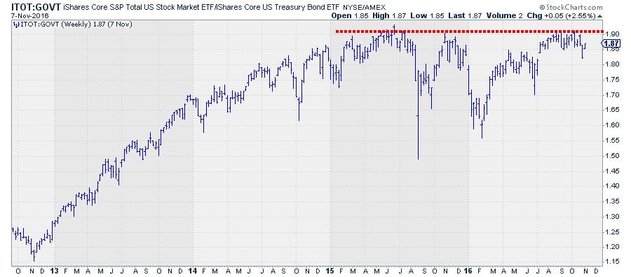
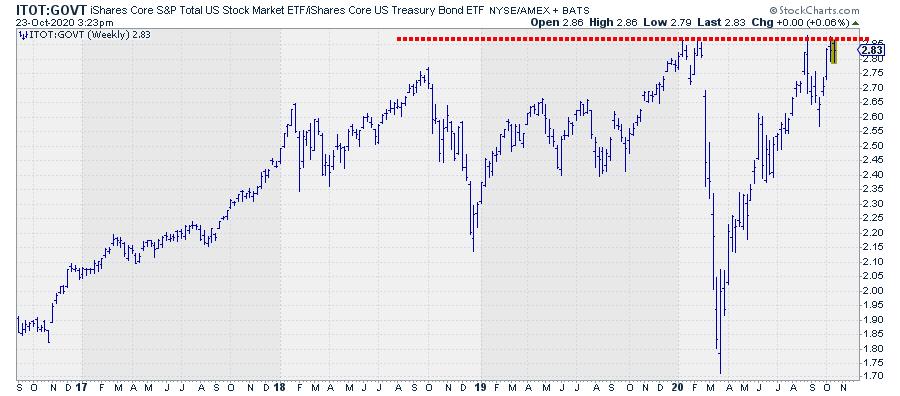
What caught my attention is the fact that this ratio was moving more or less sideways, definitely not UP, in 2015 and 2016 (till November). And we seem to have similar situation right now. ITOT:GOVT managed to get only marginally above its 2018 peak at the start of this year, and we are now pushing against that resistance level as we speak.
If we strip away all our knowledge of what exactly we are looking at here and imagine to see just this chart without knowing what it was representing -- just imagine it is some stock in the S&P 500 that did not move much over the past 2-3 years and is now pushing to break to new all-time highs.... -- what would be our call?
For me, that would be eyeing a break of that horizontal 2+ year barrier as the start of a serious move higher.
The fact that we are dealing with a major relationship in financial markets, with potentially a big impact on markets for months to come, should not blur the judgement..
Coming back to reality and knowing what it is we are looking at, I think the markets could be in for another big move in favor of stocks over bonds when this ratio breaks above its early 2020 peaks. The RRG certainly leaves enough room between ITOT and GOVT to allow for such a rotation.
Please #Staysafe and have a great weekend,
--Julius
My regular blog is the RRG Charts blog. If you would like to receive a notification when a new article is published there, simply "Subscribe" with your email address.
Julius de Kempenaer
Senior Technical Analyst, StockCharts.com
Creator, Relative Rotation Graphs
Founder, RRG Research
Host of: Sector Spotlight
Please find my handles for social media channels under the Bio below.
Feedback, comments or questions are welcome at Juliusdk@stockcharts.com. I cannot promise to respond to each and every message, but I will certainly read them and, where reasonably possible, use the feedback and comments or answer questions.
To discuss RRG with me on S.C.A.N., tag me using the handle Julius_RRG.
RRG, Relative Rotation Graphs, JdK RS-Ratio, and JdK RS-Momentum are registered trademarks of RRG Research.