Stocks are ending the week on a firm note with the S&P 500 and Nasdaq trading in record territory. The Dow isn't far behind. Small cap stocks, however, continue to lead the market higher. The daily bars in Chart 1 show the Russell 2000 iShares (IWM) hitting a new record. Even more impressive is its rising relative strength line in the upper box. That upper line shows the IWM/SPX ratio rising for the last several months. That means that small cap stocks have been rising faster than large caps. A longer range look shows how impressive that performance has been on both an absolute and relative basis.
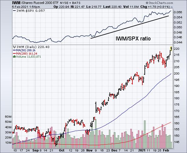 Chart 1
The weekly bars in Chart 2 show how strong the rally in small caps has been over the past few months. It shows the Russell 2000 iShares achieving a major bullish breakout last November (see circle) and rising almost in a straight line since then. It's trading in record territory today. The only potential negative on the chart is its 14-week RSI line having reached overbought territory over 70 which suggests that its uptrend may be stretched on the upside. The overall chart, however, shows a strong uptrend in place. What's especially impressive is how much small caps have outperformed large caps during that uptrend.
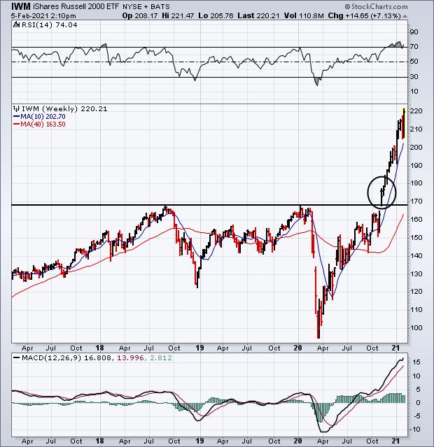 Chart 2
The black line in Chart 3 plots a relative strength ratio of the Russell 2000 iShares divided by the S&P 500 over the last ten years. Two things really jump out on the chart. The first is how badly small caps underperformed large caps during 2018 and 2019; and how much they've outperformed large caps over the last year. The chart shows small caps outperforming large caps by the widest margin in a decade. That's pretty impressive. Small cap strength is usually a sign of optimism on the direction of the U.S. economy. That's because small cap stocks are more dependent on the U.S economy than large cap stocks that do a lot of business overseas.
The green line in Chart 3 plots the 10-Year Treasury yield over the same ten years. It's interesting to see a generally positive correlation between the two lines. In other words, they've tended to rise and fall together. Falling yields have tended to coincide with weaker small caps which was especially true during 2019; rising yields have generally corresponded with stronger small cap performance. That's been the case over the last year as bond yields have started to climb along with small caps. That makes economic sense since rising bond yields usually signal more optimism on the U.S. economy which rises on expectations for stronger economic growth with higher inflation. In a climate of rising bond yields, money tends to rotate out of falling bond prices into rising stock prices. Rising commodity prices also put upward pressure on bond yields which hints at more inflation. Since rising bond yields hint at a stronger U.S. economy, it makes sense for domestic-oriented small cap stocks to do better in that environment.
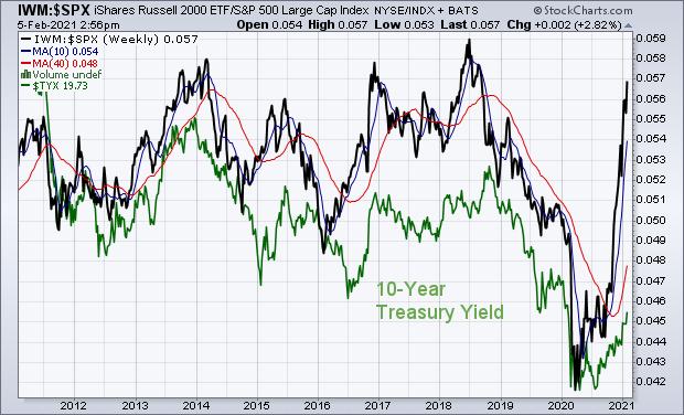 Chart 3
Editor's Note: This is an article that was originally published in John Murphy's Market Message on Friday, February 5th at 2:59pm ET.