The NASDAQ Composite peaked on February 16, sold off and subsequently rallied back to the February high last week. Chart 1 shows that it just missed the earlier peak by a smidgen, whereas the NASDAQ 100 (in the lower window) did marginally take out its February high. Taken together, the peaks of both series netted out at about the same level. That said, when we look under the hood, things are very different between February and April, thereby throwing up the question of whether the NASDAQ has lost its mojo. Let's consider relative action, price momentum, breadth and volume characteristics at both peaks and see where we come out.
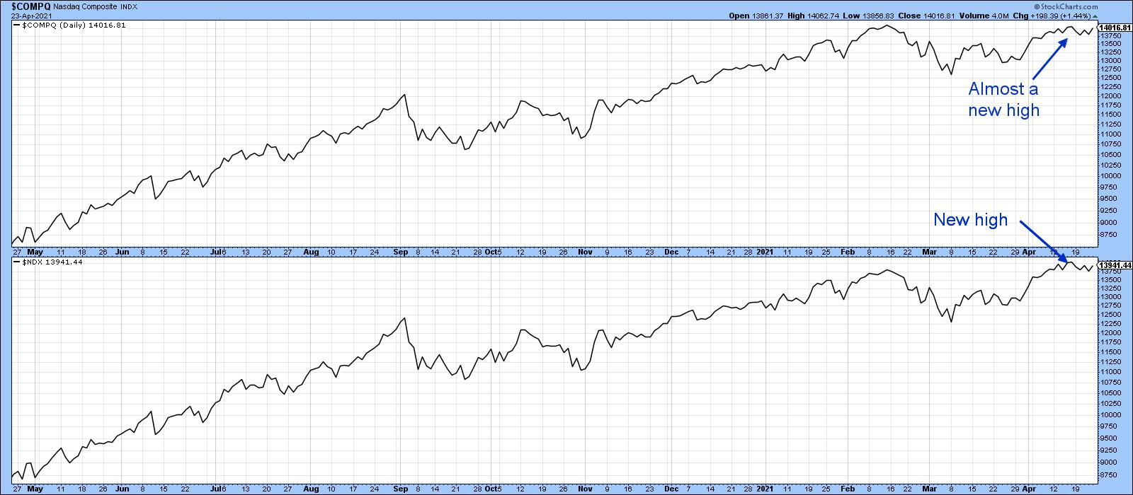 Chart 1
Relative Action
Chart 2 compares the NASDAQ to the S&P Composite. Note how the strong relative action at the beginning of the lockdown foreshadowed a strong performance by the Index itself. Compare that to this year's action. It's true that the April NASDAQ peak was slightly lower than the February one, so it's not strictly speaking a negative divergence. However, the weak relative April action tells us that the NASDAQ has fallen out of favor. The key will be to see if the RS line can hold above the red support trendline. It marks the base of what may turn out to be a head-and-shoulders top.
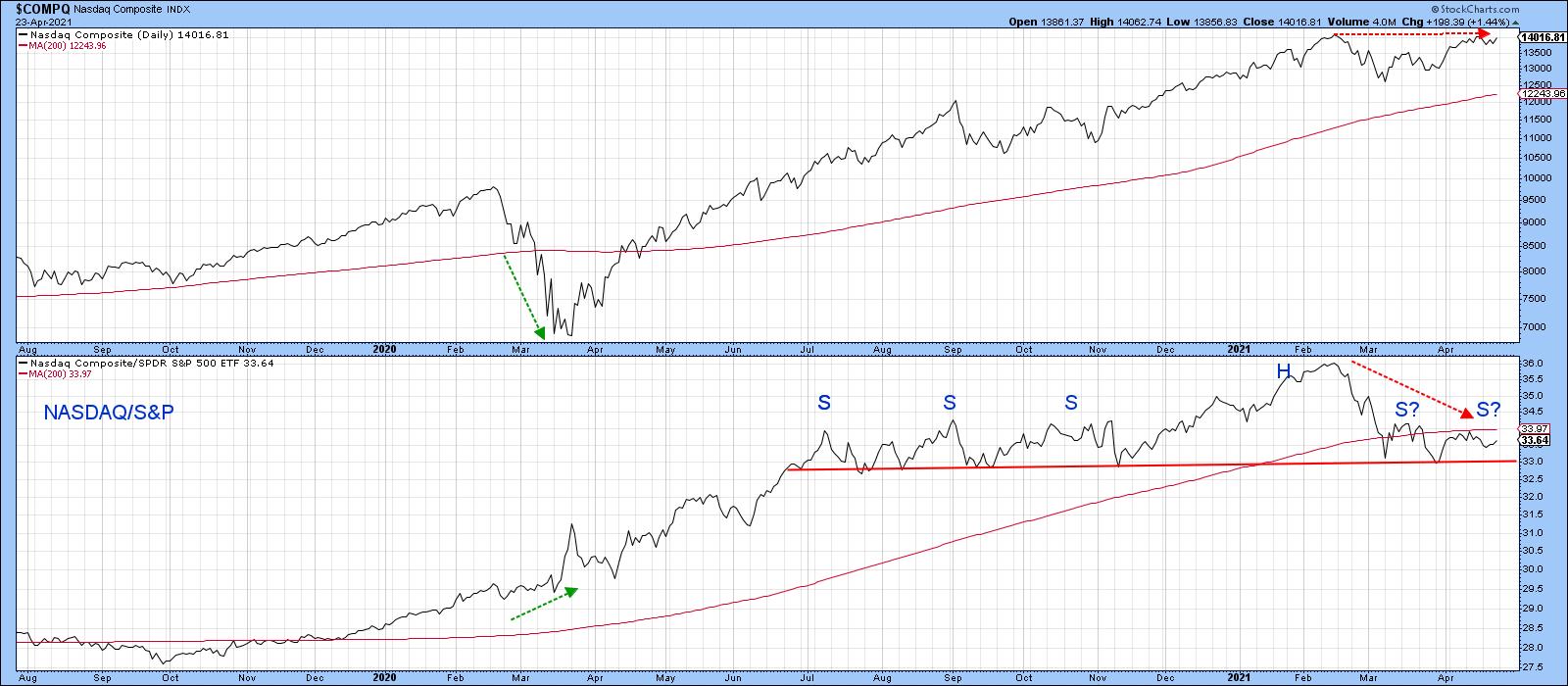 Chart 2
Note that the NASDAQ itself is comfortably above its 200-day MA. That indicates that the main upward trend is intact. However, the RS line is decisively below its MA, which will just increase the significance of any potential neckline downside penetration.
Price Momentum
Chart 3 features a 45-day ROC, which is showing that there was virtually no upside momentum at the April peak. That kind of situation, when confirmed by a trend break in the price, is often followed by an above-average decline. The benchmark I would look for in this case would be a decisive daily close below the two converging trendlines at 13,500. Until that happens, the divergence is inoperative.
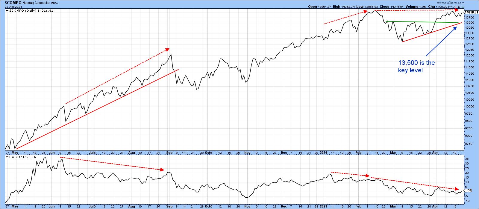 Chart 3
Breadth
Breadth can be measured in many ways, but the most common is through an advance/decline line, as displayed in Chart 4. Most of the time, both series move in tandem. Since February, though, the A/D line has clearly not managed to keep up with the Index. It may well be forming a top, but, until it is completed with a clear-cut penetration of the red support trendline that holds for couple of sessions, recent ranging action should be treated as a consolidation in an ongoing uptrend.
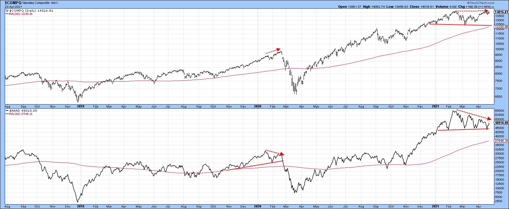 Chart 4
Chart 5 features a 30-day ratio of advances less declines. One thing that sticks out is the fact that the April top was accompanied by very little in the way of upside momentum. Note how a weak performance by this indicator foreshadowed the late 2018 and 2020 selloffs. Once again, we need confirmation, which requires a violation of that 2020-2021 up trendline.
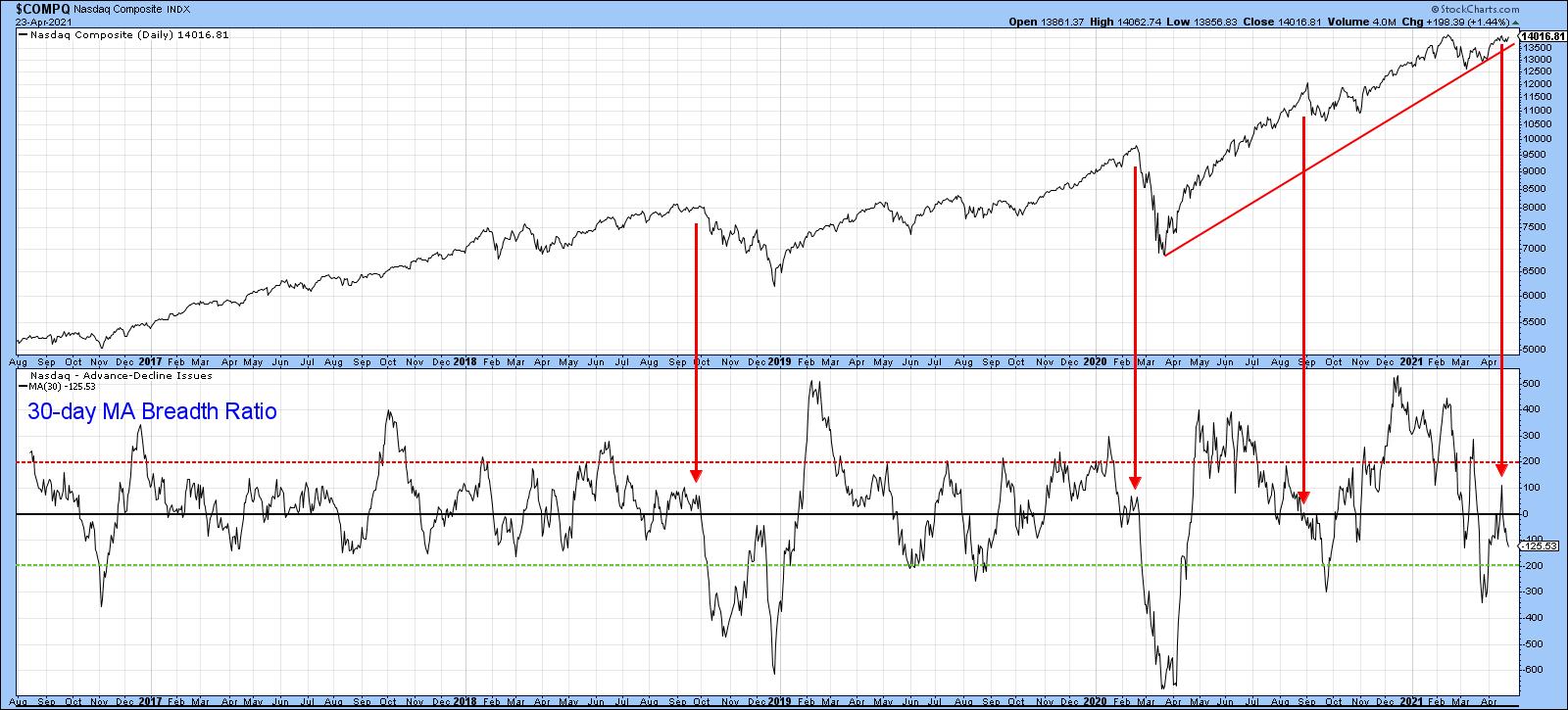 Chart 5
Another way of analyzing breadth is study net new high data. For example, an expanding number of issues touching new highs as the Index approaches a previous peak would be a positive sign. In this instance, we see quite the opposite, in that there was a a substantial shrinkage between the February and April peaks.
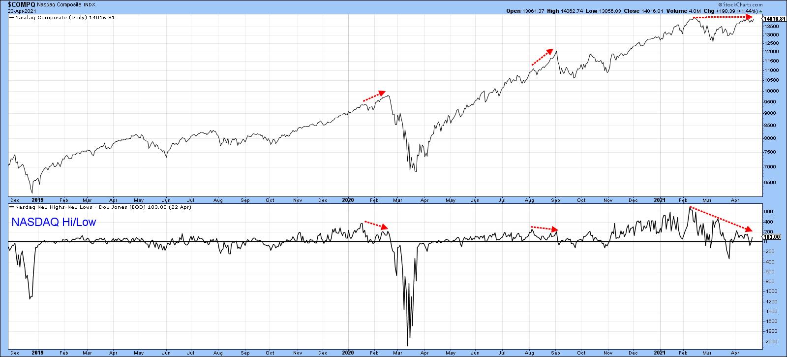 Chart 6
Finally, for breadth, Chart 7 features the NASDAQ bullish percent. Both the Index and the indicator violated up trendlines earlier in the year, thereby indicating a dissipation of upside momentum. Now the indicator is resting on key support in the form of the dashed up trendline. If it holds, that could presage another up leg in the bull market, but a break under the previous low would confirm a series of declining peaks and troughs, thereby suggesting additional weakness.
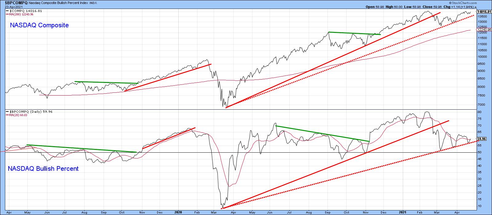 Chart 7
Volume
Chart 8 compares the NASDAQ Composite to a 10-day MA of the NASDAQ McClellan Volume Oscillator. The red arrows flag the principal tops that have developed in the last three years. They have one thing in common, which is that they all developed when the volume oscillator was at or below zero, indicating real lack of upside volume momentum. Currently, the oscillator is well below zero, which is not so good. On the other hand, one could also interpret this reading as being close to the oversold zone and therefore close to a buying opportunity. That was the case last September when the decline, though sharp, was relatively brief.
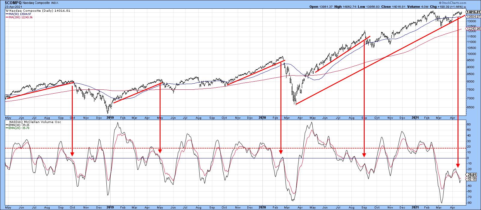 Chart 8
Finally, Chart 9 shows the possibility that the NASDAQ may be forming a double top. It certainly has the expected volume characteristics, with heavy activity on the initial peak and distinctly lower volume on the second. However, final confirmation requires a break below the March low, which has clearly not yet happened.
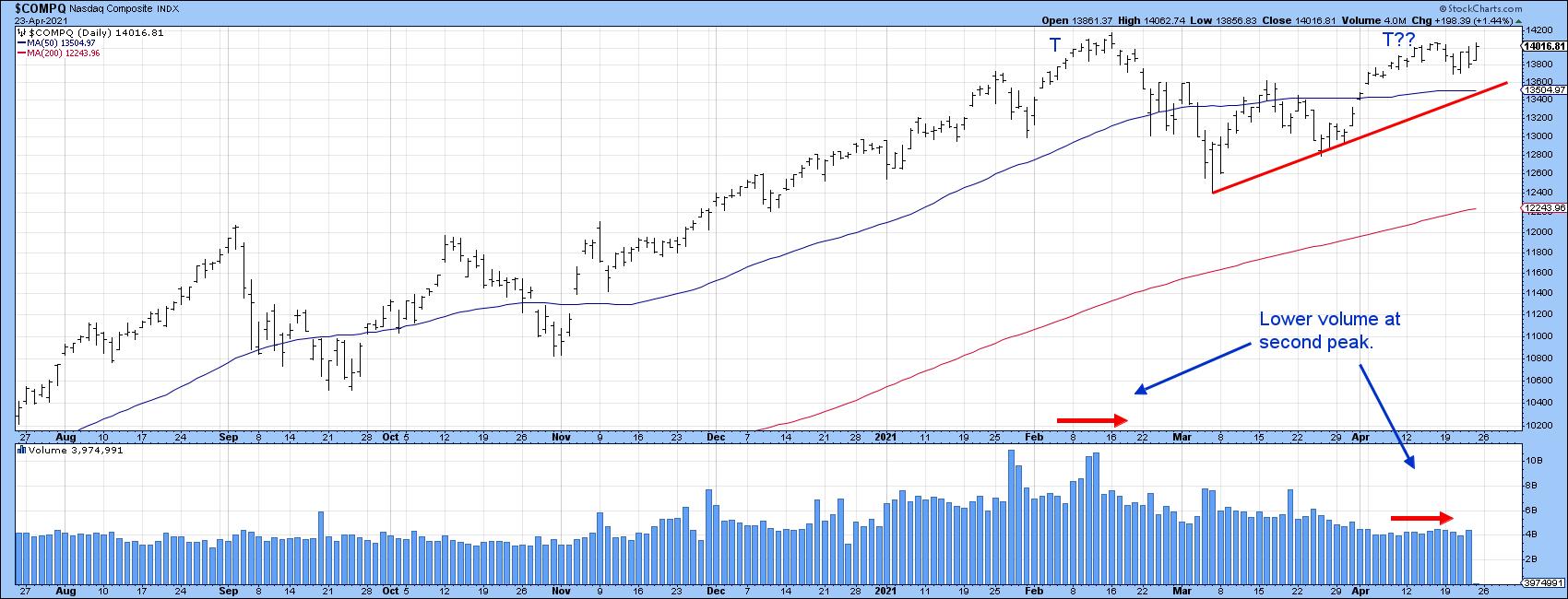 Chart 9
Conclusion
None of the long-term averages have yet been violated and long-term momentum remains in an uptrend, so the NASDAQ remains in a primary bull market. In that respect, higher prices are ultimately likely. That said, the NASDAQ Composite has lost its mojo on many fronts. If seasonal weakness takes hold this year, these charts are telling me that this area of the market could be a leader on the downside, provided that the 13,500 level and 2020-2021 up trendline are, along with the potential neckline in the RS line (Chart 2), both taken out first.
This is an updated version of an article previously published on Thursday, April 22nd at 11:43am ET in the member-exclusive blog Martin Pring's Market Roundup.
Good luck and good charting,
Martin J. Pring
The views expressed in this article are those of the author and do not necessarily reflect the position or opinion of Pring Turner Capital Group of Walnut Creek or its affiliates.