Last week, I pointed out three charts that had triggered bullish signals and suggested that these characteristics were strong enough to power the market higher. Prices immediately sold off, but have subsequently rebounded. Since those charts are still positive, I am sticking to the higher market over the next 2-4 weeks scenario.
For example, Chart 1 features the daily KST for the CBOE Total Put/Call ratio. Last week, it had started to go flat. Now, it has experienced a decisive peak, which indicates that traders have started to become more optimistic. The arrows show that such action has consistently been followed by a 2-to-4-week rally or more.
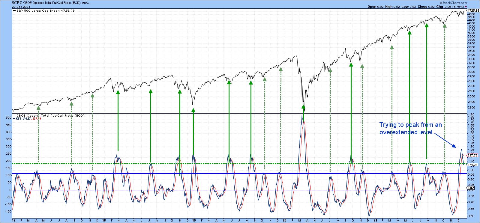 Chart 1
Three Intermarket Relationships to Monitor
Further out, things get a bit murky, as some of the intermarket relationships I follow are deteriorating and need to change course if 2022 is to avoid an early stumble. Chart 2 compares the ratio between the S&P High Beta and its high-quality counterpart (SPHB/SPHQ). Using the benefit of hindsight, the green-shaded areas show instances when the ratio has been in a rising mode for an extended period. That reflects growing confidence, because it means that traders are bidding up risky high-beta stocks over the more conservative high-quality issues. When that happens, that improving confidence spills over into the overall market. A falling relationship does not necessarily mean that the S&P will drop; however, we see two examples of a negative divergence, as flagged by the dashed red arrows. Both were associated with a confirming S&P trendline break and were followed by a temporary setback. A third divergence has been building since the ratio topped out in June; it clearly needs monitoring for possible confirmation from the S&P with another trendline break.
You can also see that this relationship completed a base as it broke above the thick solid green trendline earlier this year. The breakout looked very promising at the time, but now the ratio is back below the breakout point. A rally above the dashed green down trendline up to, say, 1.60, would help put things right. However, a drop below the red neckline of that potential head-and-shoulders top would not be a good sign.
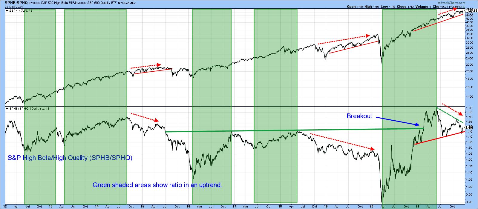 Chart 2
Something like that appears likely because Chart 3 shows that the Special K Indicator has crossed below its signal line, slipping below its 2021 trading range. The chart shows four instances since 2012 when joint ratio/Special K trendline breaks have confirmed major trend changes in the ratio. I have to stress a break for the ratio has not yet occurred, so we should assume that the recent trading range is intact.
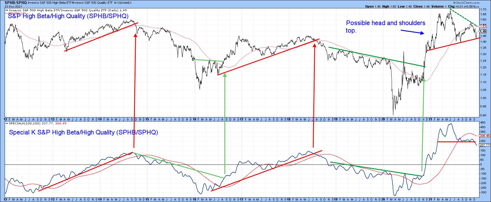 Chart 3
Chart 4 features another confidence relationship. This time, it's the Fidelity Capital and Income versus the Vanguard Treasury fund (FAGIX/VUSTX). The former is heavily weighted in high-yielding (riskier) bonds, while the latter has lower-yielding but relatively safe treasuries. A rising relationship, as represented by the green shading, indicates growing confidence, because it reflects the fact that market participants are favoring the higher-yielding fund and ignoring the possibility of default. Not surprisingly, such an environment is also positive for the S&P itself. In early 2021, the ratio broke out from a multi-year base, but has since been unable to maintain that breakout, which has given way to a declining peak and trough. A falling ratio is not necessarily bearish for the S&P, as we have seen for most of this year. However, it is also clear that all the major declines since 2009 have occurred when this approach has been in a negative mode.
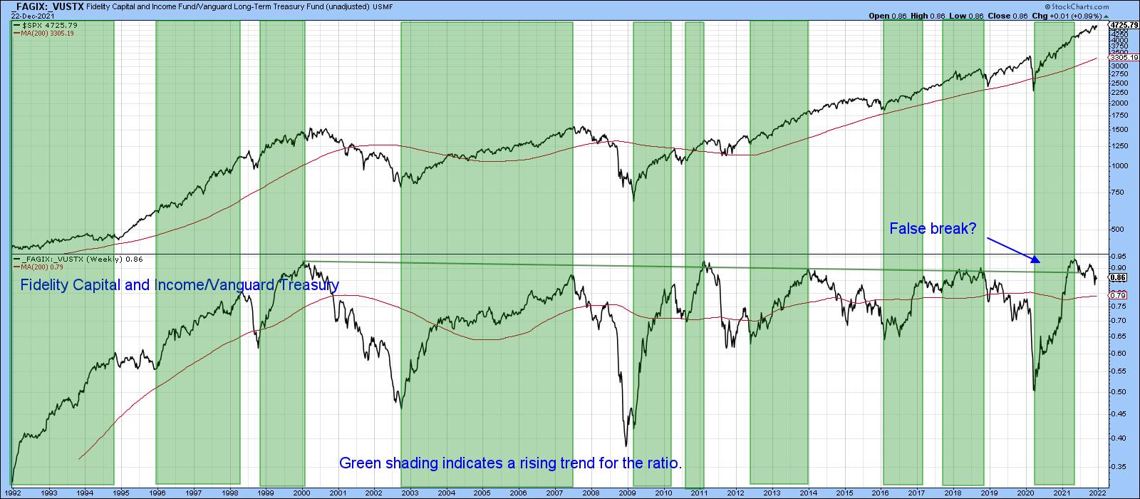 Chart 4
That's why Chart 5 is one of those worth monitoring, firstly to see whether the green or red trendline is violated, and secondly, if it turns out to be the red one, to make sure that the S&P confirms with a break below the red up trendline -- say, with a daily close that can hold under 4,400.
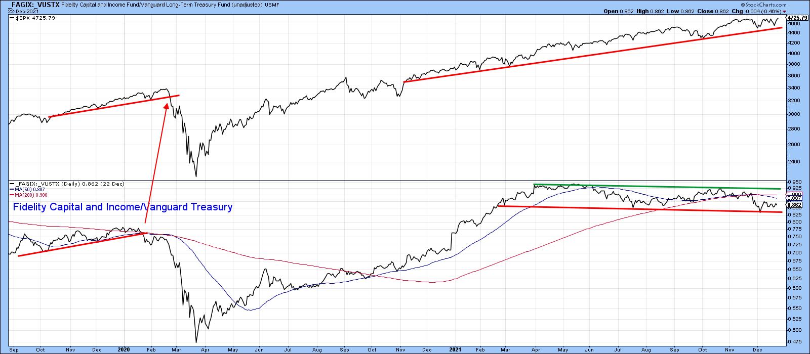 Chart 5
What Will Small-Caps Do?
Finally, the Russell 2000 ETF (IWM) is not an intermarket relationship for sure. However, its recent price action fascinates me and, I think, is worth watching going forward. Chart 6 shows that it recently broke to the upside above the green trendline. I wrote about it at the time and was pretty sure that it was a valid break and, therefore, the precursor to higher prices. Unfortunately, I began to see on the internet that many others had spotted the same chart as we all jumped on the bandwagon. When an investment theme becomes widely popular, it tends not to pan out, which was certainly the case in this instance.
Now, the price has dropped back to the lower region of the trading range. If it penetrates the red trendline, that will confirm the breakout was false and would likely be followed by a really nasty decline. It's already under its 200-day MA and the long-term KST is tentatively bearish. That said, the red trendline has held and the intermediate KST has just crossed above its MA. This offers the opportunity to re-group and re-assert the previous upside breakout. Let's wait and see what happens, because whichever direction the breakout ultimately takes, it is likely to be followed by a big move.
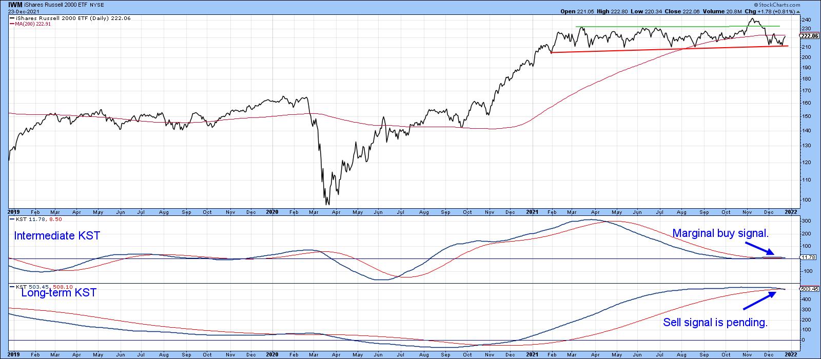 Chart 6
Conclusion
It seems likely that the U.S. stock market will continue to firm up over the next 2-4 weeks. If that proves to be the case, some of the discrepancies that have been developing in the last few weeks and months could be cleared up. However, if they are not, that could set the scene for a challenging 2022.
This article is an updated version of an article previously published on Wednesday, December 22nd at 4:29pm ET in the member-exclusive blog Martin Pring's Market Roundup.
Good luck, good charting and Merry Christmas!
Martin J. Pring
The views expressed in this article are those of the author and do not necessarily reflect the position or opinion of Pring Turner Capital Group of Walnut Creek or its affiliates.