ChartWatchers September 26, 2020 at 12:00 AM
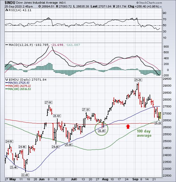
A lot more attention is being paid to moving average lines this month because they help determine where potential support and resistance levels may lie. Two that have been mentioned quite a bit lately are the 50- and 200-day averages... Read More
ChartWatchers September 25, 2020 at 11:33 PM
While economic worries have brought the S&P 500 to the brink of a correction this week (defined as a loss of 10% or more from its 52-week high), there's been one area of the market that's holding in remarkably well with several stocks at or close to new highs... Read More
ChartWatchers September 25, 2020 at 08:34 PM

A consistent imperfect routine is way better than an inconsistent perfect routine... Read More
ChartWatchers September 25, 2020 at 07:39 PM
Ever heard of the old Wall Street adage, "buy on rumor, sell on news"? You most likely have and, in my opinion, it applies more to earnings season than anything else. Wall Street firms send their analysts out to meet with management teams prior to the end of their quarters... Read More
ChartWatchers September 25, 2020 at 12:00 PM
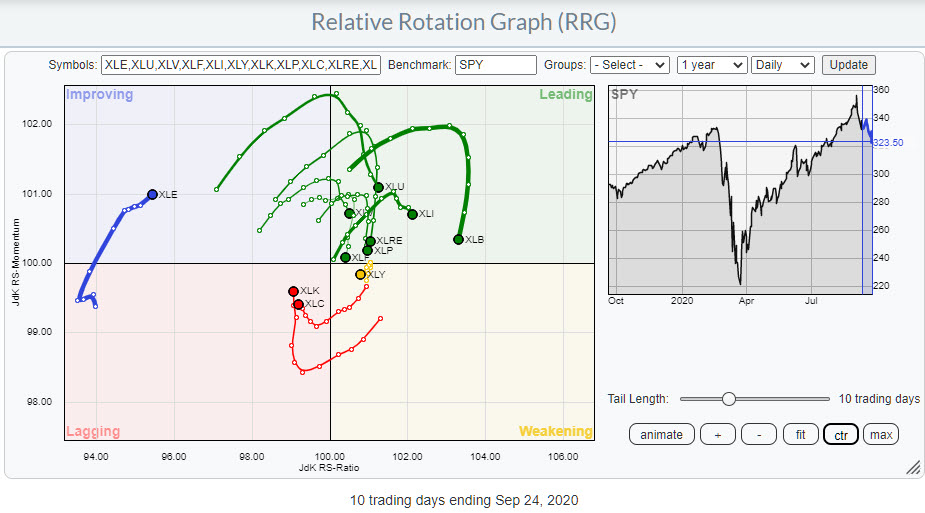
The Relative Rotation Graph above shows the rotation for US sectors on a daily basis over roughly the last two weeks. The most important observation that we can make from this image is that the rotation currently is very erratic... Read More
ChartWatchers September 18, 2020 at 09:00 PM
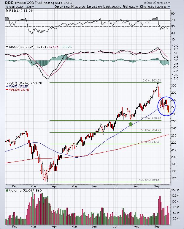
The daily bars in Chart 1 show the QQQ breaking last week's short-term support and falling further below its 50-day moving average today. The two upper boxes in Chart 1 also show its RSI and MACD lines continuing to decline. That suggests more selling to come... Read More
ChartWatchers September 18, 2020 at 07:34 PM
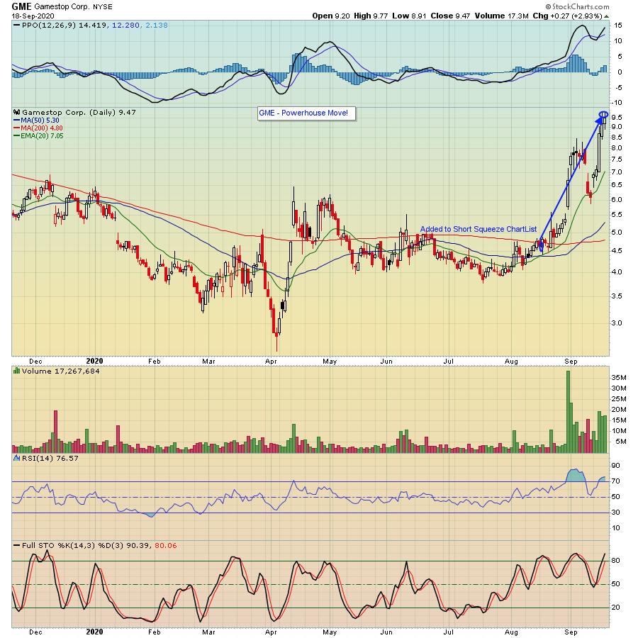
At EarningsBeats.com, we provide our members with various ChartLists of stocks that we believe could give them an upper hand when trading. This includes our Short Squeeze ChartList, which currently has 79 companies that have short percentage of float above 20%... Read More
ChartWatchers September 18, 2020 at 06:45 PM

Chartists are often faced with a choice: wait for the breakout or anticipate using a mean-reversion setup. The Metals & Mining SPDR (XME) broke out of a bullish consolidation this week and the breakout signals a continuation of its long-term uptrend... Read More
ChartWatchers September 18, 2020 at 06:14 PM
Last week, after presenting a "diamond in the rough" in Wednesday's Diamonds Report, Carl texted me and said that it looked like a "pig's ear" chart pattern. I had never heard him use this term (yes, Dad, never!) and decided to investigate further... Read More
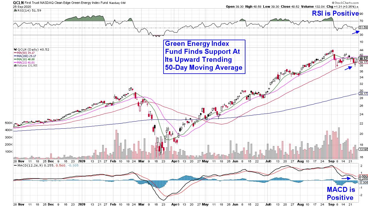
ChartWatchers September 18, 2020 at 01:34 PM
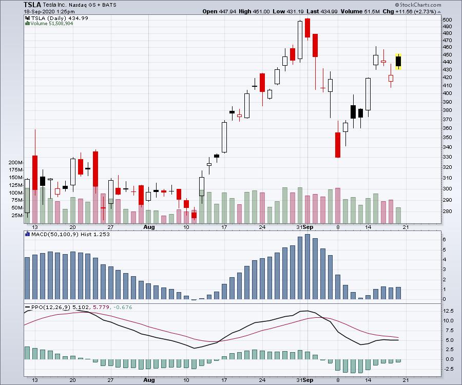
On September 30th, I'll be hosting a free webinar talking about the electric vehicle business. It's a rapidly changing world and there are lots of moving parts at play. We'll have the influence of Tesla's Elon Musk presenting Battery Day for Tesla on the 22nd of September... Read More
ChartWatchers September 12, 2020 at 12:34 AM
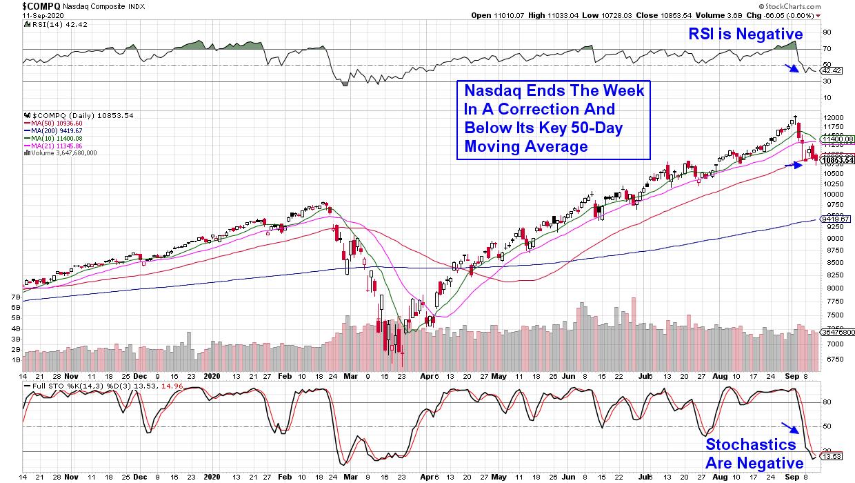
Fast moving Growth stocks have been taking it on the chin with the Tech-heavy Nasdaq now down over 10% from its recent peak in price. The drop puts this Index into a correction which has investors on the lookout for more potential downside... Read More
ChartWatchers September 11, 2020 at 08:00 PM
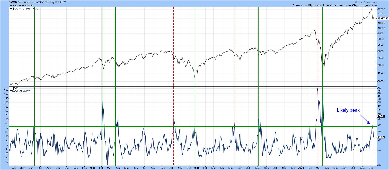
Some Indicators Have Moved to Levels Consistent with a Low Most corrections in a bull market fall in the 5-10% range. On Thursday, the NASDAQ is down 10% intraday and the S&P Composite 7%, so it's not unrealistic to conclude that the correction might be over... Read More
ChartWatchers September 11, 2020 at 06:04 PM
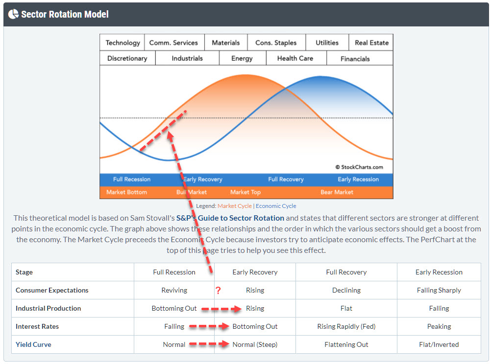
With markets flying everywhere from day to day, I want to take a step back in this article and look at the bigger economic cycle picture, in order to see if we can fit things into the "Sector Rotation Model" as it can bee seen under the PerfCharts... Read More
ChartWatchers September 11, 2020 at 05:00 PM
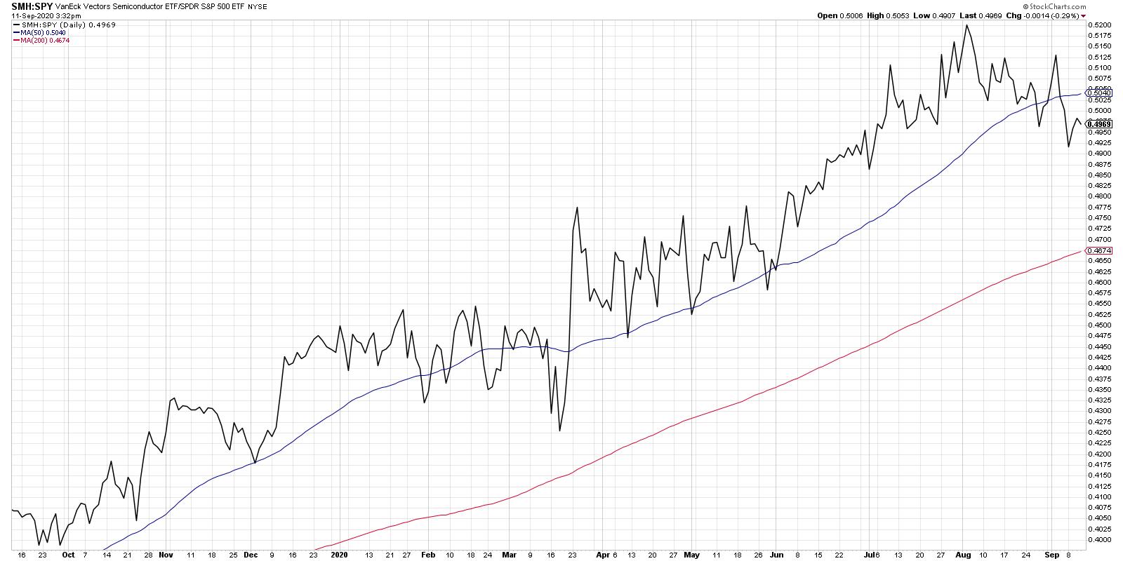
"Great chart, but it seems super short-term. When would you get out of this?" That was the reaction I received on social media when I posted this chart showing the relative strength of semiconductors to the S&P 500... Read More
ChartWatchers September 11, 2020 at 02:46 PM
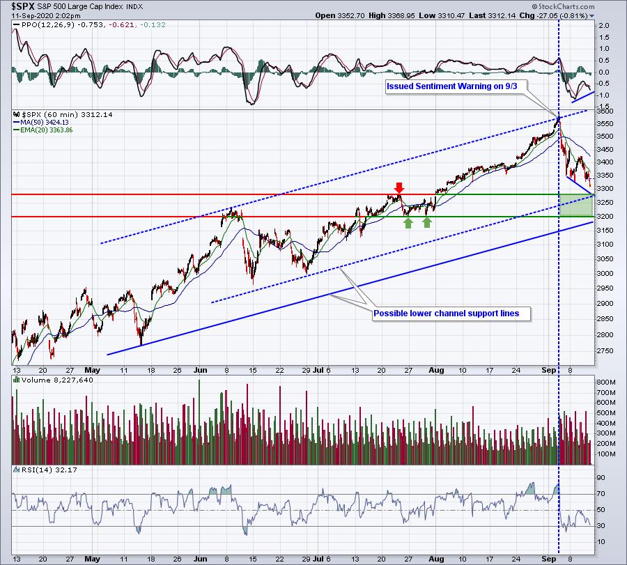
Despite remaining very bullish, I've written several short-term bearish articles lately, mostly dealing with extreme sentiment issues... Read More
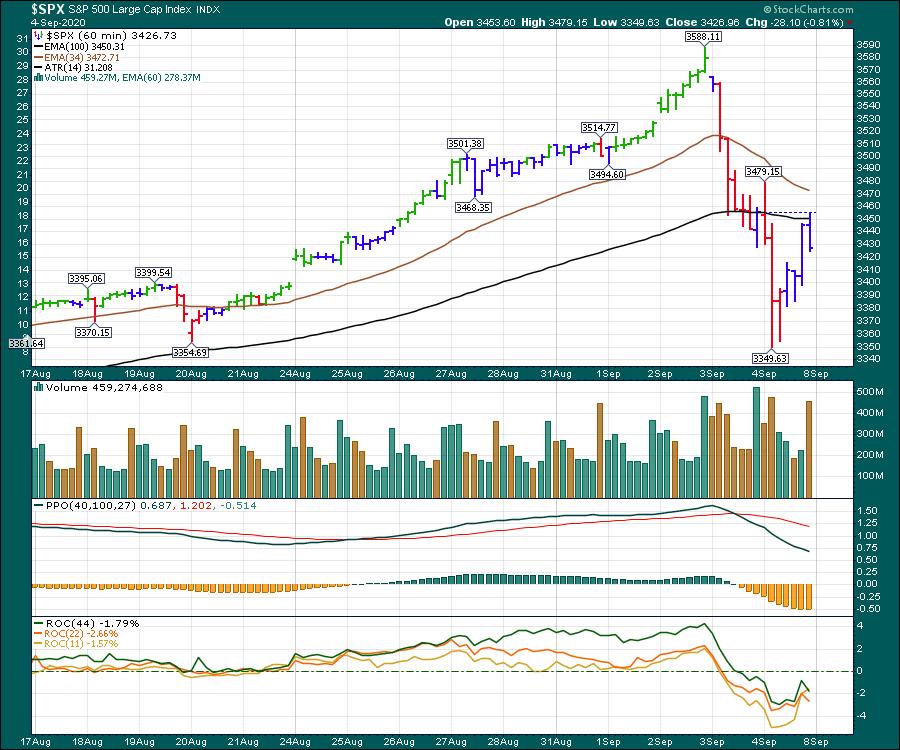
ChartWatchers September 04, 2020 at 10:00 PM
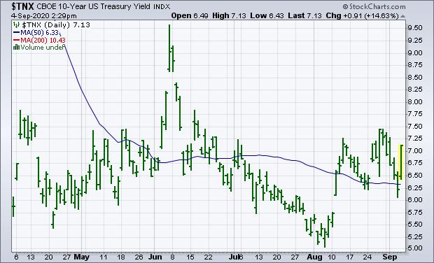
This morning's strong jobs report saw a bigger than expected jump in nonfarm payrolls during August and a bigger than expected drop in the unemployment report to 8.4%. That strong combination helped contribute to today's rebound in bond yields... Read More
ChartWatchers September 04, 2020 at 08:11 PM
Anyone who has followed the market like I have through every possible scenario, from the dot-com bubble to 9/11 to the Great Recession to what we've seen the past few days, should have recognized that the market was getting VERY extended... Read More
ChartWatchers September 04, 2020 at 07:40 PM
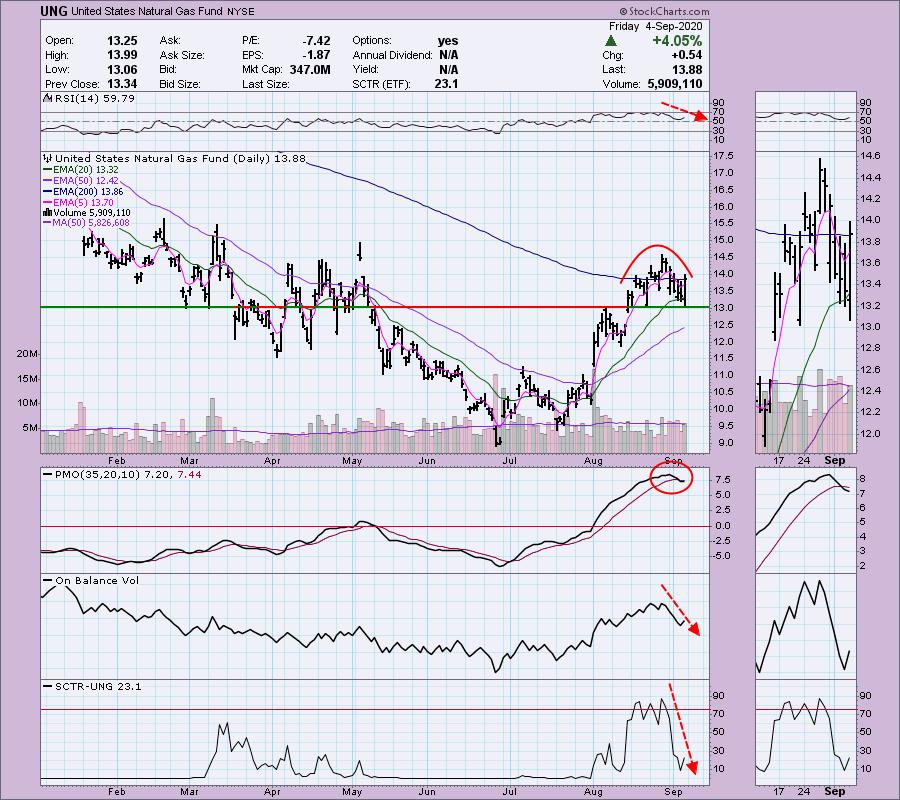
It may seem strange to write a negative review of an ETF after it just made a 4%+ move today, but I wrote to my subscribers earlier this week about the bearish warning signs on Natural Gas (UNG)... Read More
ChartWatchers September 04, 2020 at 04:28 PM

The Bollinger Band squeeze signals a volatility contraction that can lead to a volatility expansion. But which way? For directional clues, we need to analyze price action and other indicators... Read More
ChartWatchers September 04, 2020 at 04:16 PM
In high school, my CB- Radio handle was carrot-topper. As a chartered market technician, we talk about rounded tops and v-bottoms. But the last three stock market tops have been more like solitaire-diamond tops protruding up and priced for perfection... Read More